Fasteer
Self-Checkout App
Overview
Fasteer is a self-checkout app for shops in Azerbaijan. You scan what you pick up, pay with a QR code at a stand, and collect bonuses from partner stores, without queueing. It was my final project at Code Academy, presented on 16 June 2023.
Research
I started by talking to shoppers and store staff to understand what slows people down at the till. A survey and interviews showed where the frustration sat, and benchmarking existing self-checkout products showed what was already out there. Card sorting then helped shape how the app should be organised.
Design Approach
Research, then structure, then screens. I ran a survey and interviews, benchmarked ten products, used card sorting to shape the IA, then designed a landing page and a mobile app and tested it with ten people.
Project Snapshots
The project at a glance: what I delivered, what I set out to do, what made it hard, and where it landed.
90 screens designed from one UI kit of about 30 component groups.
Across 11 real shopping scenarios, from sign up to checkout.
10 people tested the app
Checkout moved from the cashier to a QR code at a stand, with bonuses collected automatically
Till → QR
10 self-checkout products compared across 24 features, to find what competitors were missing.
8 user flows mapped, each with a backup path when a permission is refused.
Heard from before designing: 37 surveyed and 6 interviewed, including a supermarket employee
43 people
UX to UI
9 of 11 test scenarios scored 10/10. The other two led to shorter onboarding and a clearer market location.
-
Till → QR
checkout moved to a stand
Checkout moved from the cashier to a QR code, with bonuses collected automatically.
-
43 people
heard from before designing
37 surveyed and 6 interviewed, including a supermarket employee.
-
10 people
tested the app
Across 11 real shopping scenarios, from sign up to checkout.
Detailed Work
A closer look at each part of the app, from first launch and sign in to plans, driving score and the Car fax. Every screen is built on the same design system, and all prices and figures shown are sample data for the concept.
Research
Pain Points
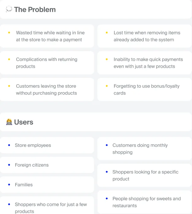
- Self-checkout was common abroad but hadn't reached Azerbaijan yet, so there was no local evidence of how shoppers would feel about scanning their own items. Everything I knew came from other markets, where stores, habits and payment culture look very different.
- It also wasn't enough to hear only from shoppers. A store lives with the consequences of every scanning mistake, and ignoring that side would have produced something shoppers liked but no store would ever agree to run.
What I Changed
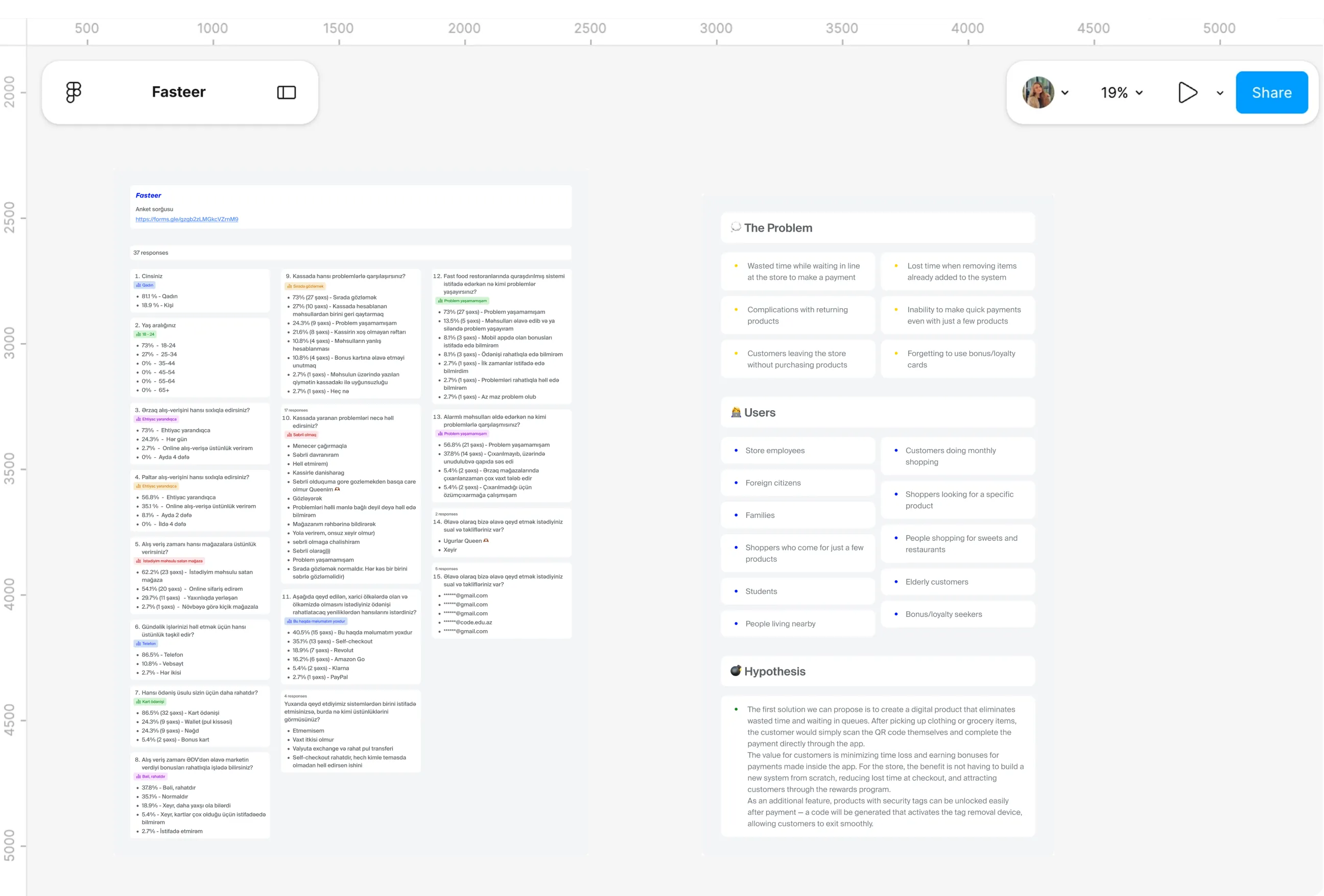
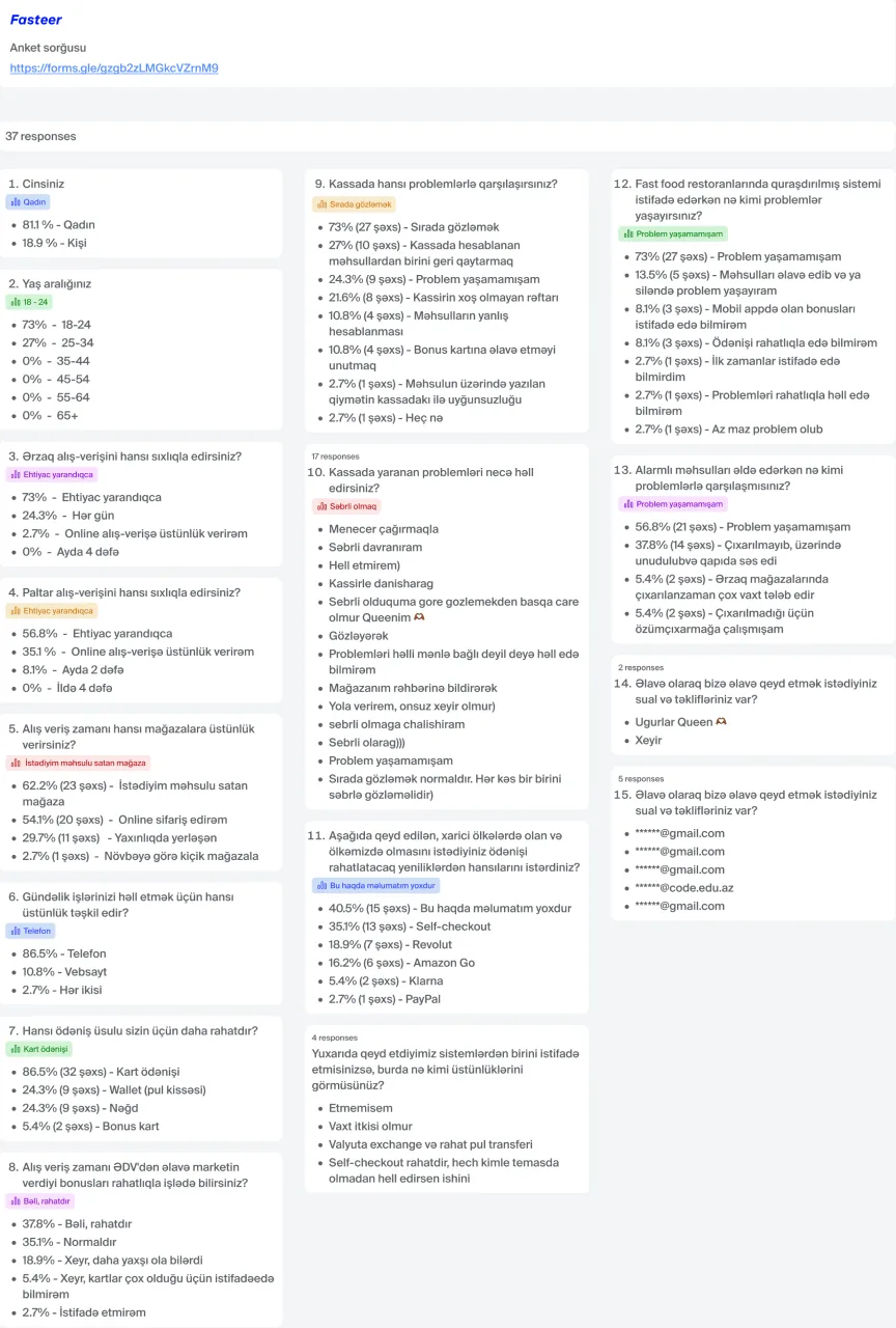
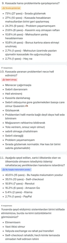
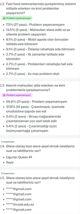
- A 16 question survey collected 37 responses about shopping habits, payment and problems at the till. Six interviews added the detail behind the numbers: five shoppers, plus an HR employee at a supermarket chain who could speak for the store.
- Queues came up first everywhere I looked, named by 73% of respondents and described again in every interview. Just as telling, every interviewee was positive about self-checkout, on one condition: it had to stay simple enough for older shoppers and first time users.
Stakeholders
Pain Points
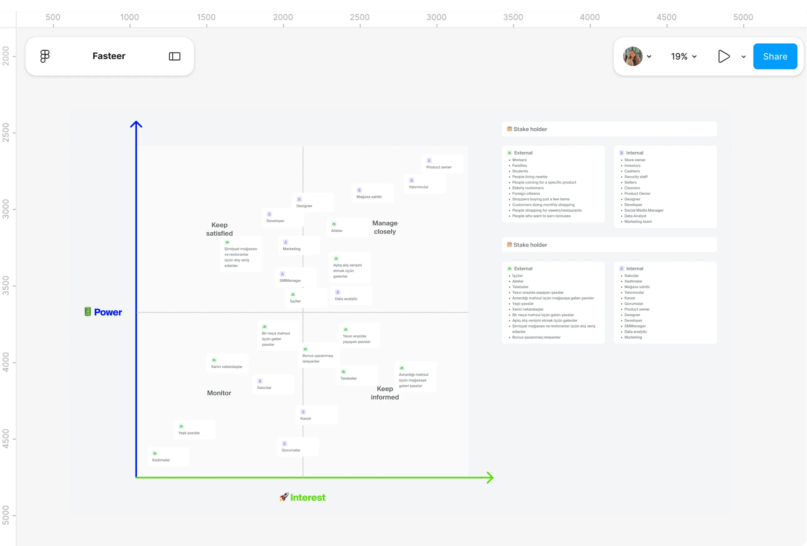
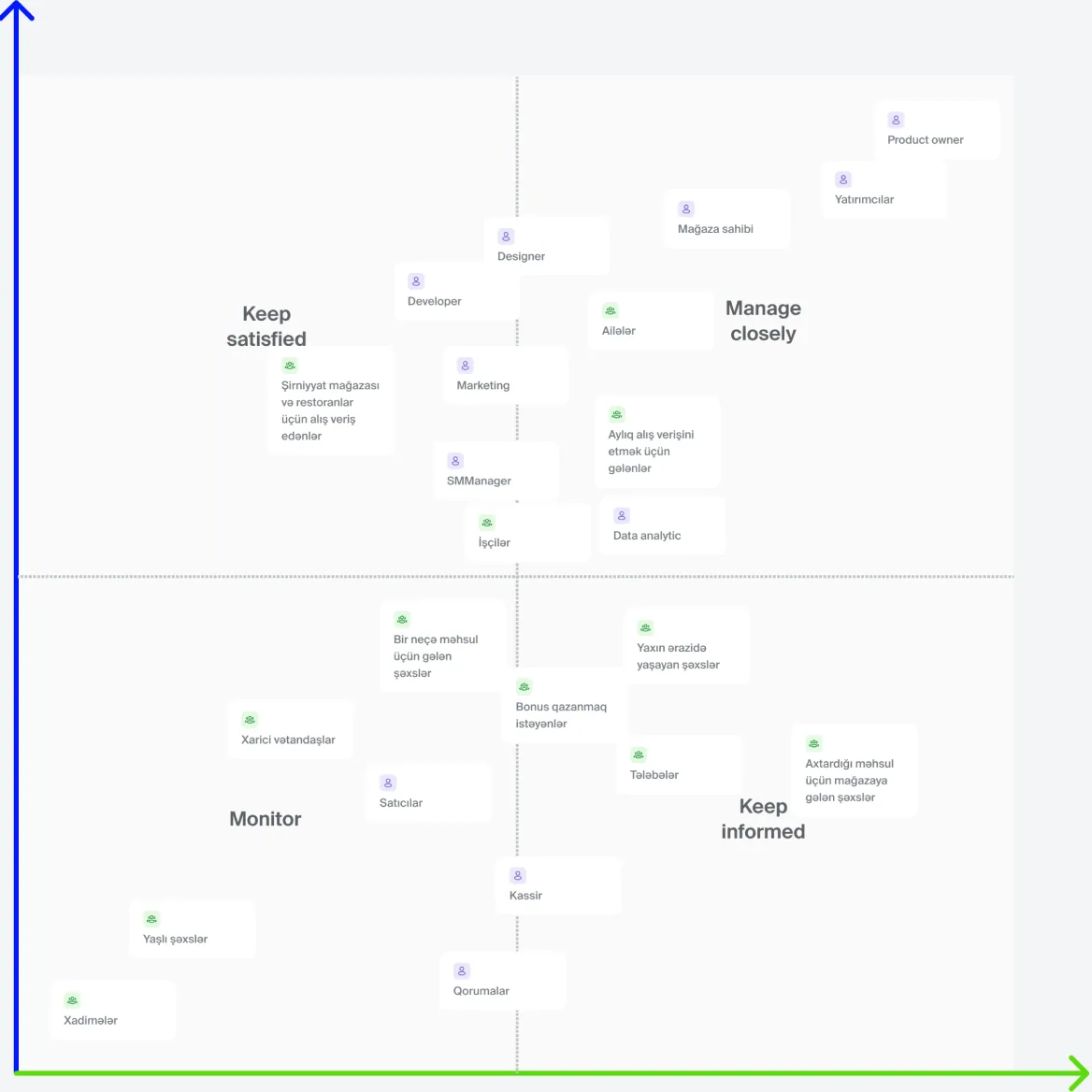
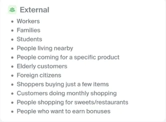
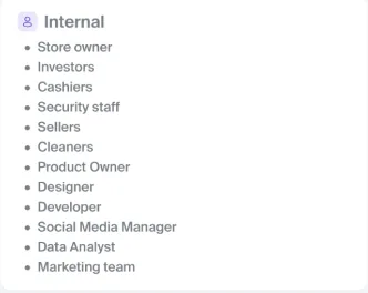
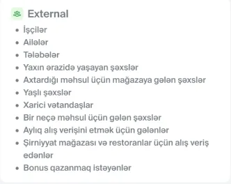
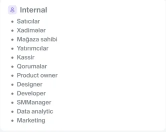
- A checkout touches far more people than the person paying. Cashiers, security guards, store owners, investors and cleaning staff all feel it when the till changes, alongside eleven very different groups of shoppers.
- Families buying a month's groceries and a student grabbing one item need almost opposite things from the same flow. Designing for all of them at once risked designing well for none.
What I Changed
- Twenty three stakeholders went onto a power and interest grid, 12 on the business side and 11 user groups. Product owner, investors, store owners, families and monthly shoppers landed in "manage closely", because their needs would decide whether the idea worked at all.
- Elderly shoppers and foreign citizens sat in "monitor". Because interviewees kept raising older users as the biggest adoption risk, though, they stayed in view throughout. Help, instructions and language choice run through the whole app as a result.
Personas
Pain Points
- The research left two very different voices. Shoppers wanted speed and independence, while the store side wanted satisfied customers and fewer problems at the till. Both mattered, and they didn't always point the same way.
- Raw survey answers can't tell you whether a screen works for a real person with a real afternoon. The patterns needed faces.
What I Changed
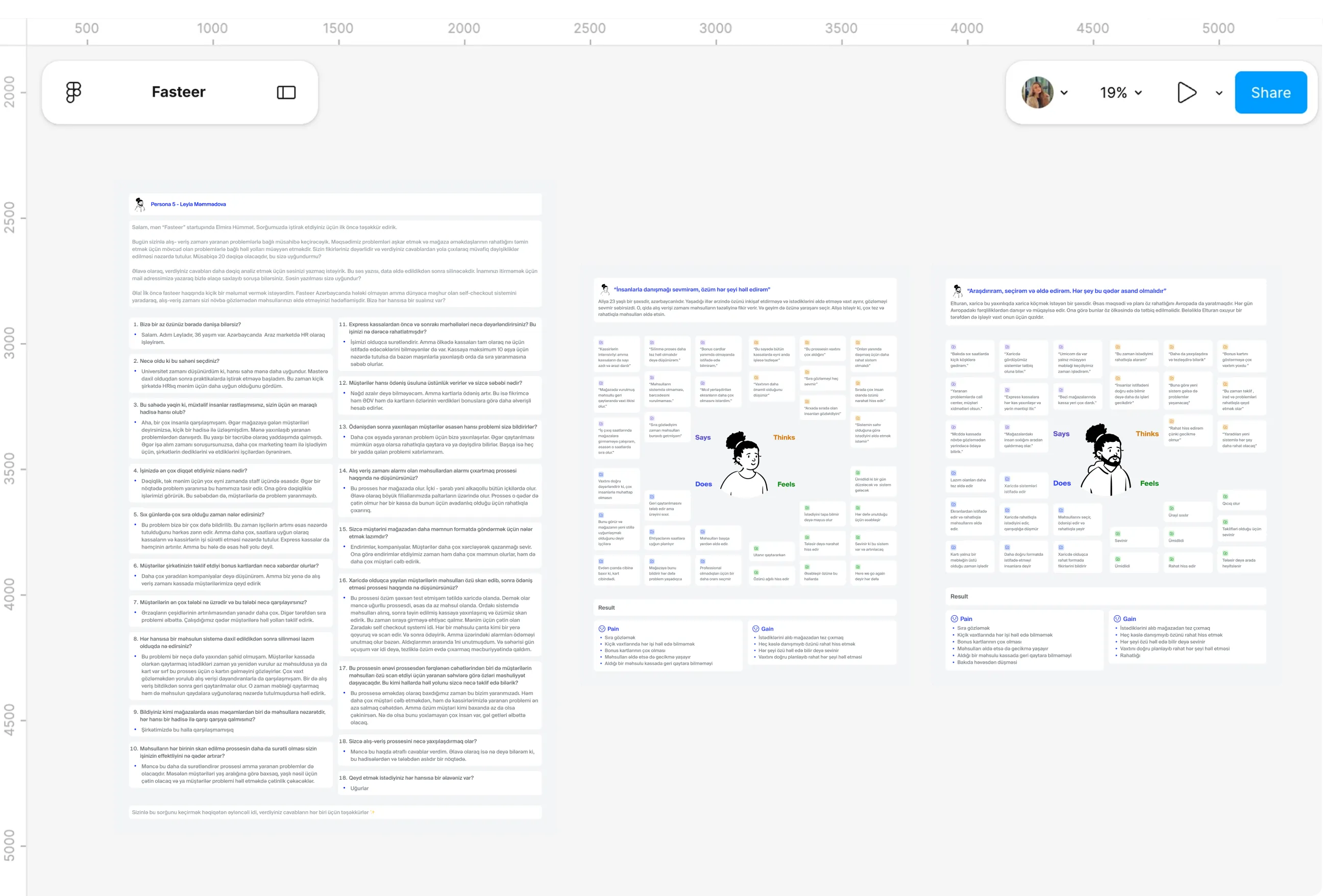
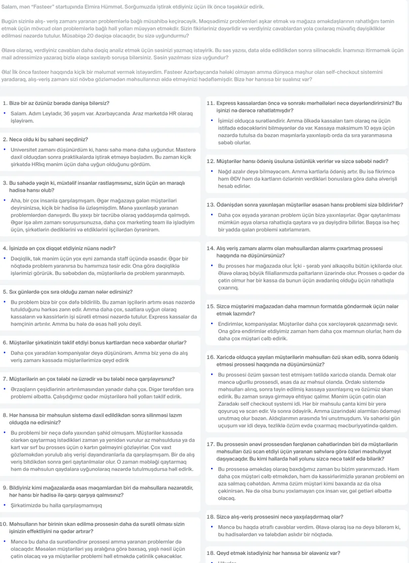
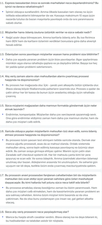
- Aliya, 23, a designer, captures the shopper who would rather solve everything herself than talk to anyone. Elturan studies and works at the same time and wants the systems he's seen abroad brought home. Leyla, 36, an HR manager at a supermarket chain, represents the store and its need to send customers away happy.
- Aliya and Elturan shaped the speed of every flow and the push to keep bonus cards in one place. Leyla kept the store's view in the room, especially around removing items and avoiding problems at the till.
Journey map

Pain Points
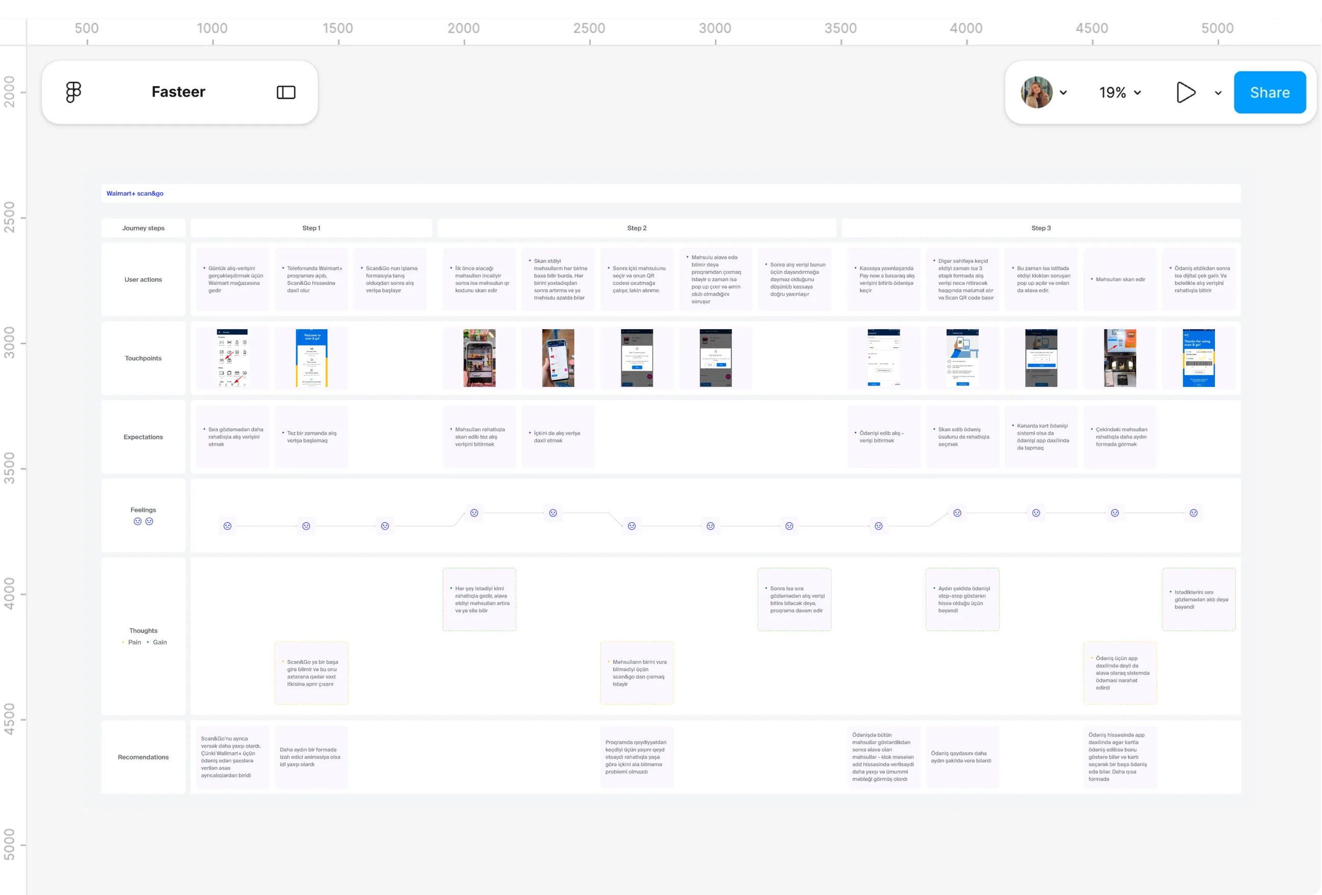
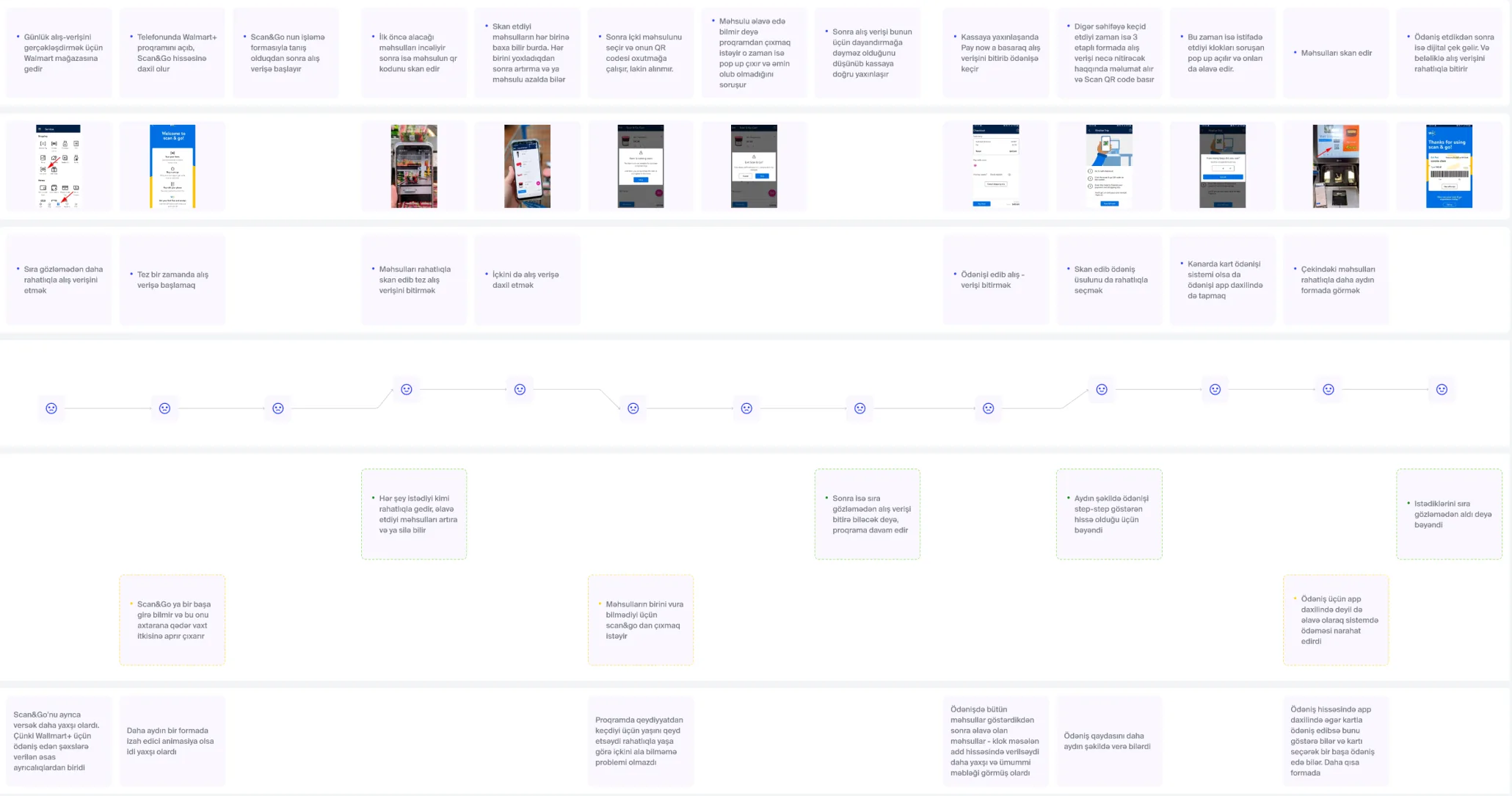
- Walmart's Scan & Go was the closest real product to the idea, so it was worth learning where a phone-based checkout breaks. On paper it looked complete.
- Walking through it step by step told a different story. The feature was hard to find inside the app, an age restricted item stopped the shopper mid-trip, and payment happened in a separate system rather than inside the app itself.
What I Changed
- Each of those low points became a rule for Fasteer. Scanning sits in its own tab rather than buried in a menu, and a how-to-use animation explains it before the first trip.
- Checkout stays in one continuous flow, from basket to bags to a single QR code at the stand, so shoppers never feel handed off to another system. The map's feeling line mattered too: it dipped exactly where shoppers lost control, which is where Fasteer adds the most guidance.
Benchmarking
Pain Points
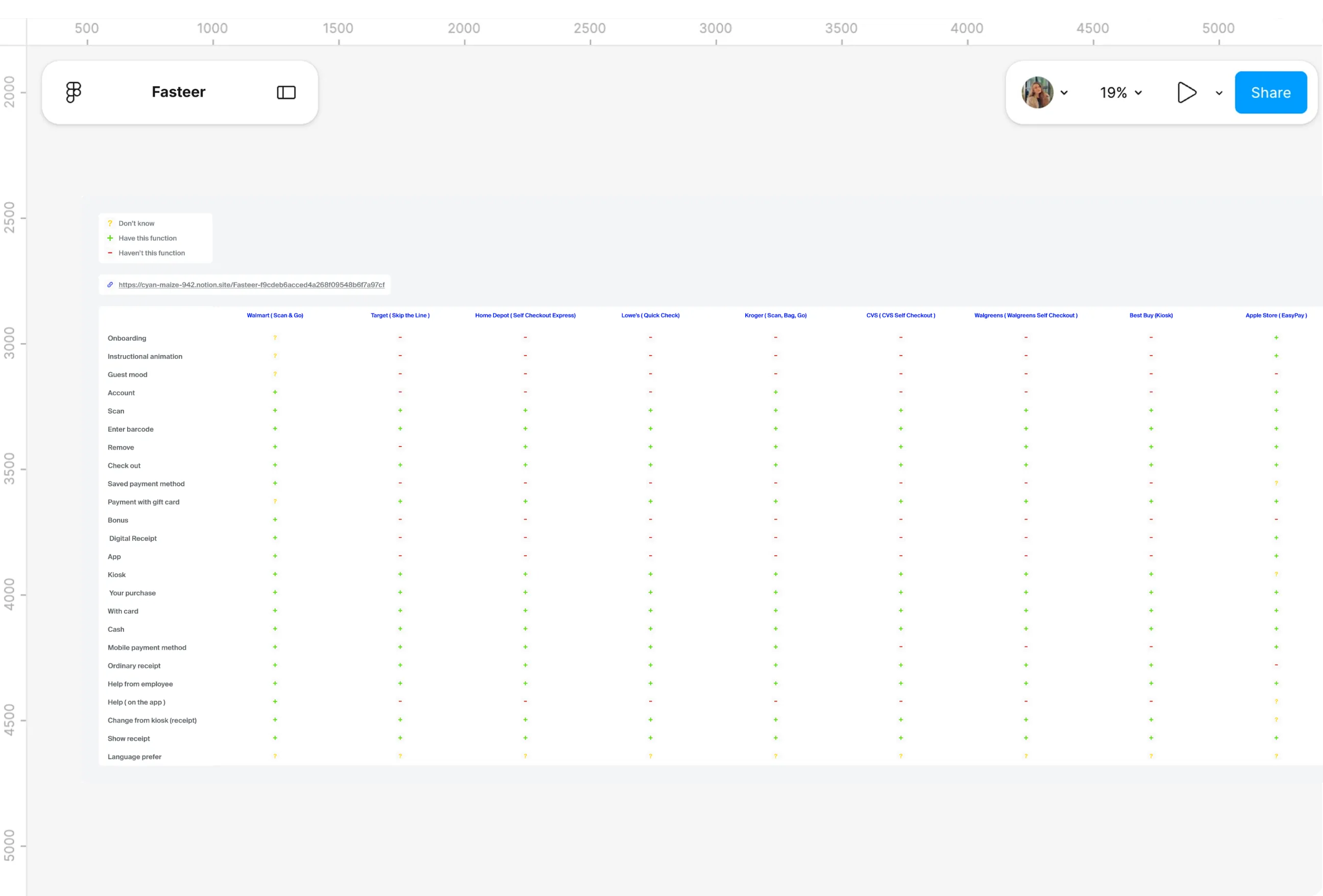
- Ten self-checkout products already existed, from Walmart and Target to Apple Store and McDonald's. Building something that simply copied them would have added nothing.
- Their feature lists looked alike at first glance, since nearly all of them scan, check out and take card payment. The real question was what they left out.
What I Changed
- A matrix compared all ten across 24 features, marking each as present, missing or unknown. The basics were almost universal, but the experience around them was thin: bonuses appeared in just one product, and digital receipts, onboarding and in-app help were rare.
- Those gaps became Fasteer's reason to exist. Onboarding, bonuses on every checkout, downloadable digital receipts and live chat all made it into the app, which is where it stands apart from what shoppers can already use abroad.
Card sorting
Pain Points
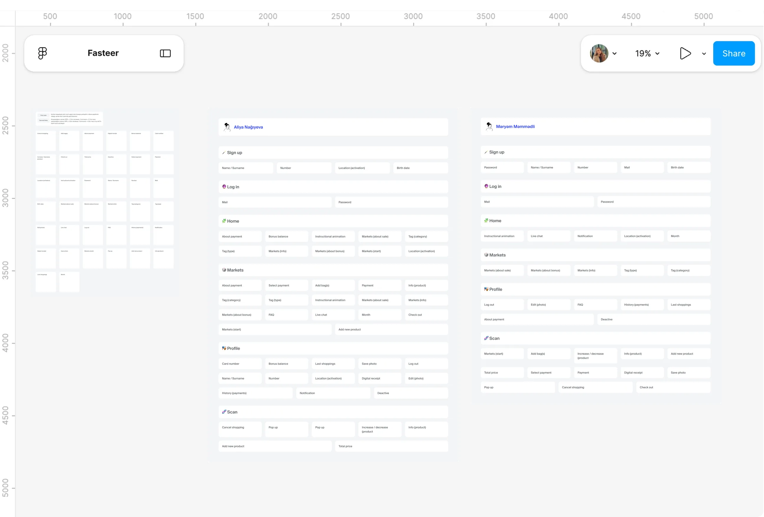
- Around 40 features had to live somewhere: bonus balance, digital receipts, live chat, FAQ, payment, notifications, location and more. Guessing where people expect each one would have produced a structure that only made sense to me.
- Some items genuinely had no obvious home. Payment could belong to the market or to scanning, and support could sit on Home or in Profile.
What I Changed
- Participants sorted about 40 cards in Figma into the sections that felt right to them. They agreed firmly on the basics, like log in, sign up, markets and scanning, and disagreed on exactly the items I'd been unsure about.
- Those disagreements were the useful part. Payment moved into the Scan flow, support and account items gathered in Profile, and the app came down to three pages: Home, Scan and Profile, with markets living inside Home and Scan rather than a tab of their own.
Queues
Pain Points
- Picture someone on a lunch break holding two items, looking at a line that hasn't moved in five minutes. That scene came up constantly: 73% of survey respondents named waiting as their main till problem, and interviewees described avoiding peak hours, walking to a small kiosk instead, or leaving without buying anything.
- Express tills were supposed to help, but opinions were mixed. The store employee explained why: shoppers with full baskets use them anyway, so the quick lane slows down too.
What I Changed
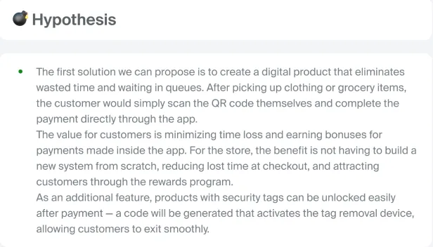
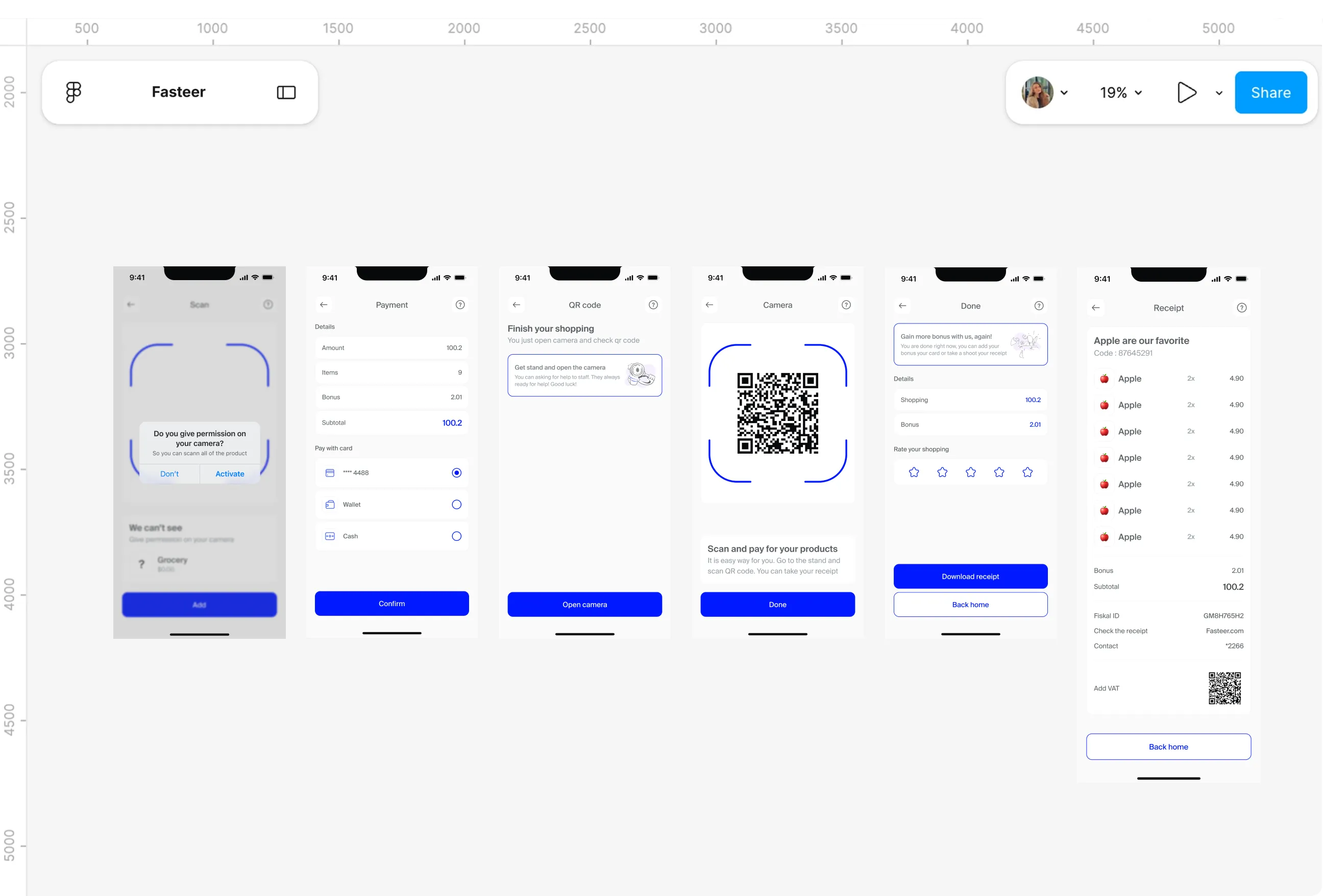
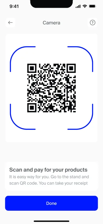
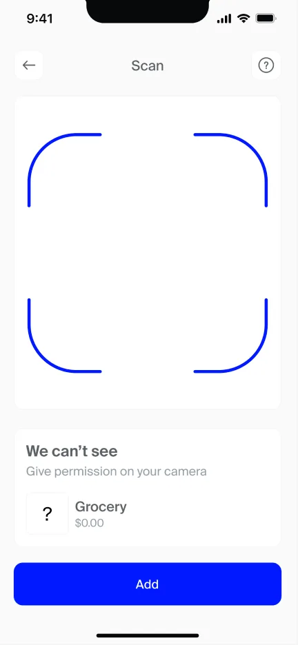
- Fasteer takes the till out of the picture. Shoppers scan each item with their phone as they pick it up, watch the basket and total build as they go, and check out without waiting for a cashier.
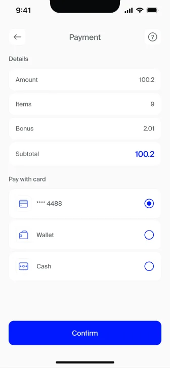
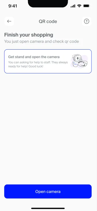
- Payment happens at a stand by scanning a QR code, a habit people in Azerbaijan already have from M10 and their banking apps. There's no new behaviour to learn at the most rushed moment of the trip.
Removing items
Pain Points
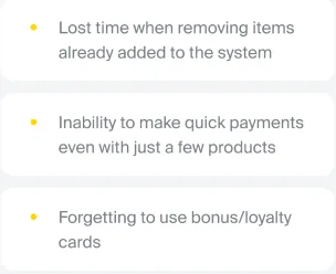
- Removing something that's already been scanned turned out to be one of the most painful moments at a till. Four of the five shoppers interviewed had waited while a cashier called an authorised colleague to take an item off, and one watched 40 items get rung up instead of 4.
- The store side saw the same thing from behind the counter. Shoppers sometimes abandon the whole basket while waiting for a return or removal to be handled, and 27% of survey respondents had struggled with it too.
What I Changed
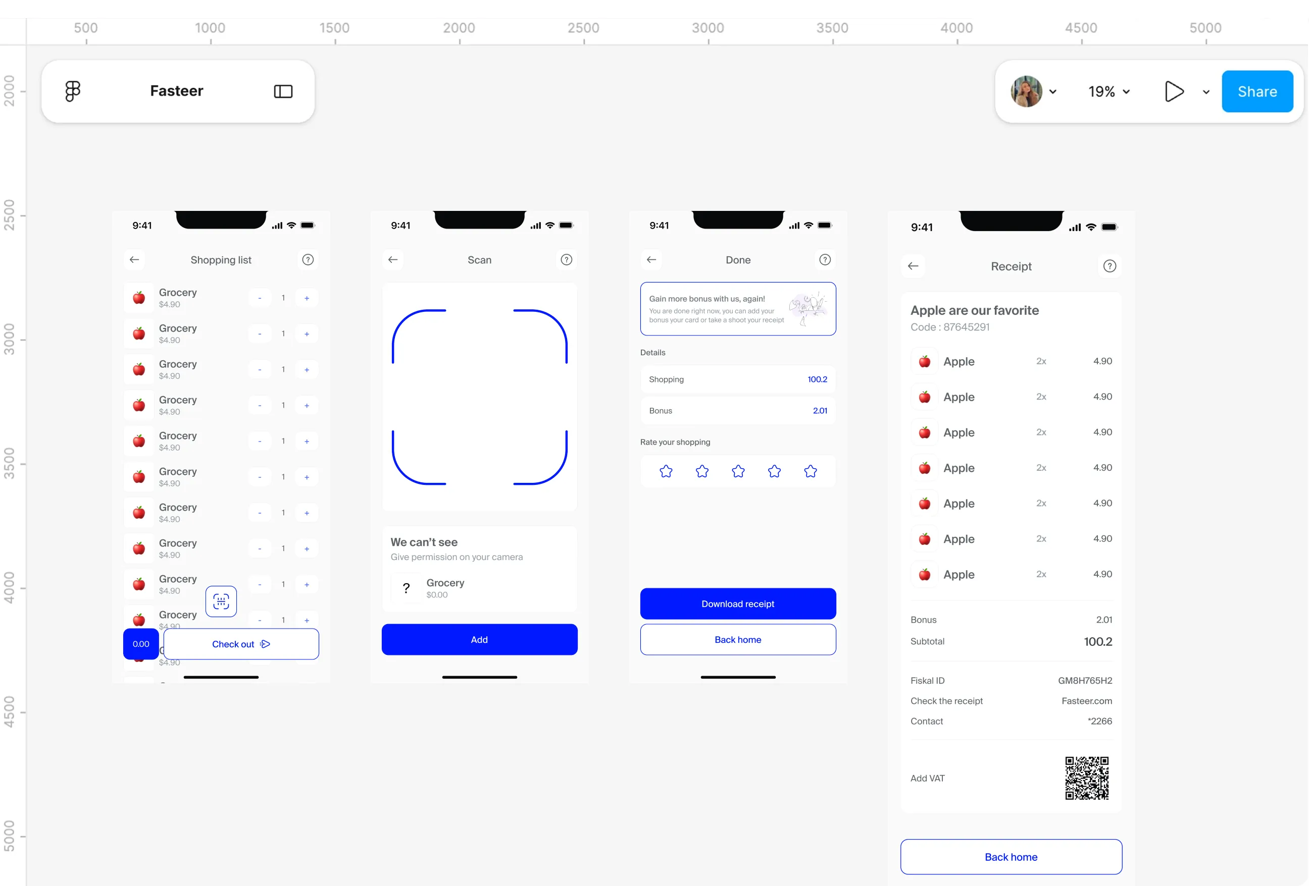
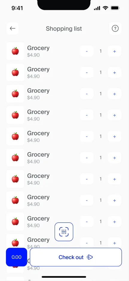
- In Fasteer, the basket belongs to the shopper. Each item shows its price and quantity, can be increased, decreased or removed with a tap, and the whole trip can be cancelled if plans change.
- Fixing a mistake no longer depends on someone else's availability. What used to hold up the queue now takes a second, while the shopper is still standing in the aisle.
Bonus cards
Pain Points
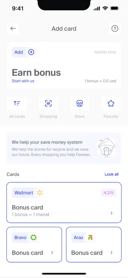
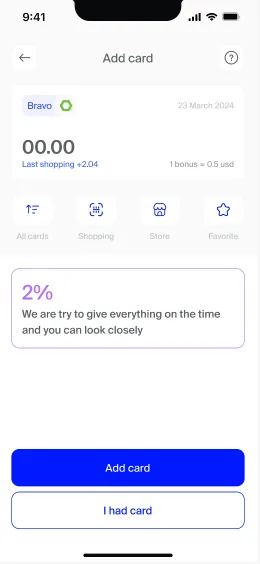
- Most shoppers juggle several loyalty cards, and the physical ones go missing. Interviewees mentioned forgetting a card at home, relying on bank cashback instead, or not bothering with bonus cards at all, while some survey respondents said they held too many cards to use any of them properly.
- Every forgotten card is a small loss that adds up. The bonus a shopper earned simply never reaches them.
What I Changed
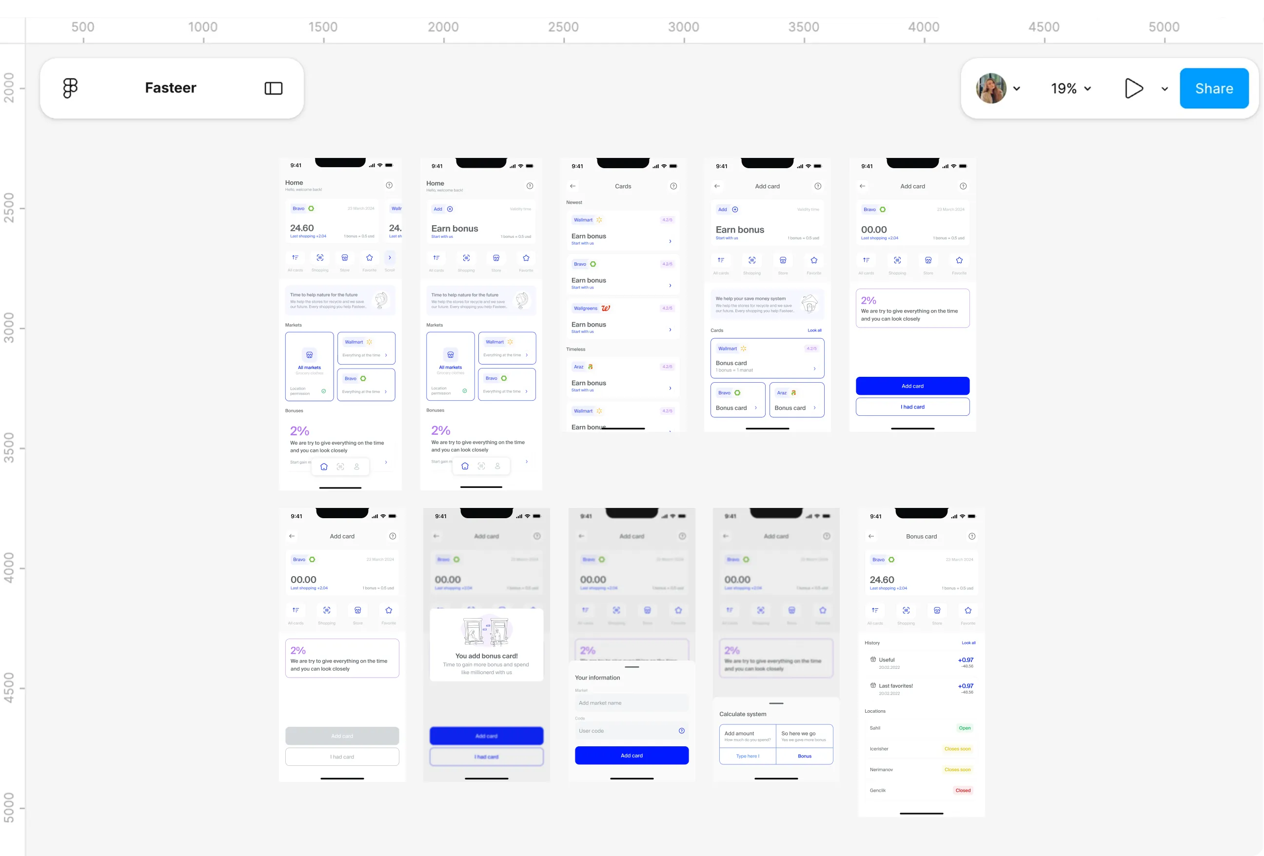
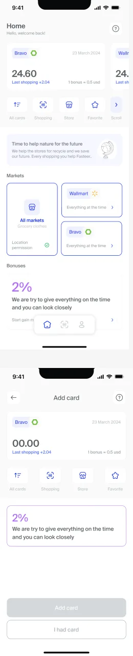
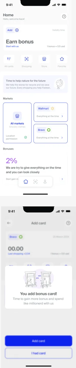
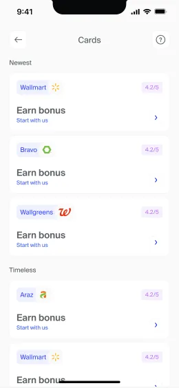
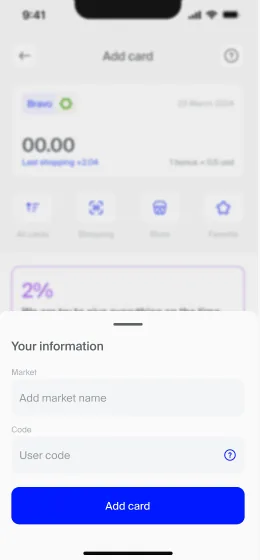
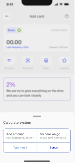
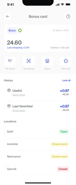
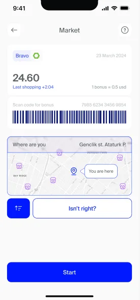
- Home shows the bonus balance with a barcode, ready at the till or the stand. Shoppers can add a card they already have or get a new one, and a calculator shows what bonuses are worth before they commit.
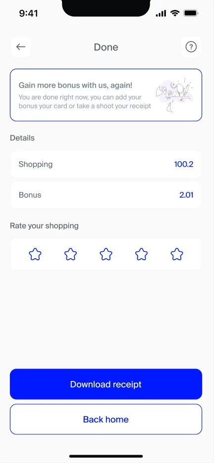
- Every checkout shows the bonus earned alongside the total, so the reward is visible in the moment. History keeps a running record of what was earned and spent.
First time use

Pain Points
- Most people had never used anything like this. Over 40% of respondents had no information about self-checkout or similar tools, and interviewees kept coming back to older shoppers and first time users as the people most likely to struggle.
- Several interviewees suggested the same fixes independently: on-screen instructions, a way to get help, and some kind of introduction before people try a new system for real.
What I Changed
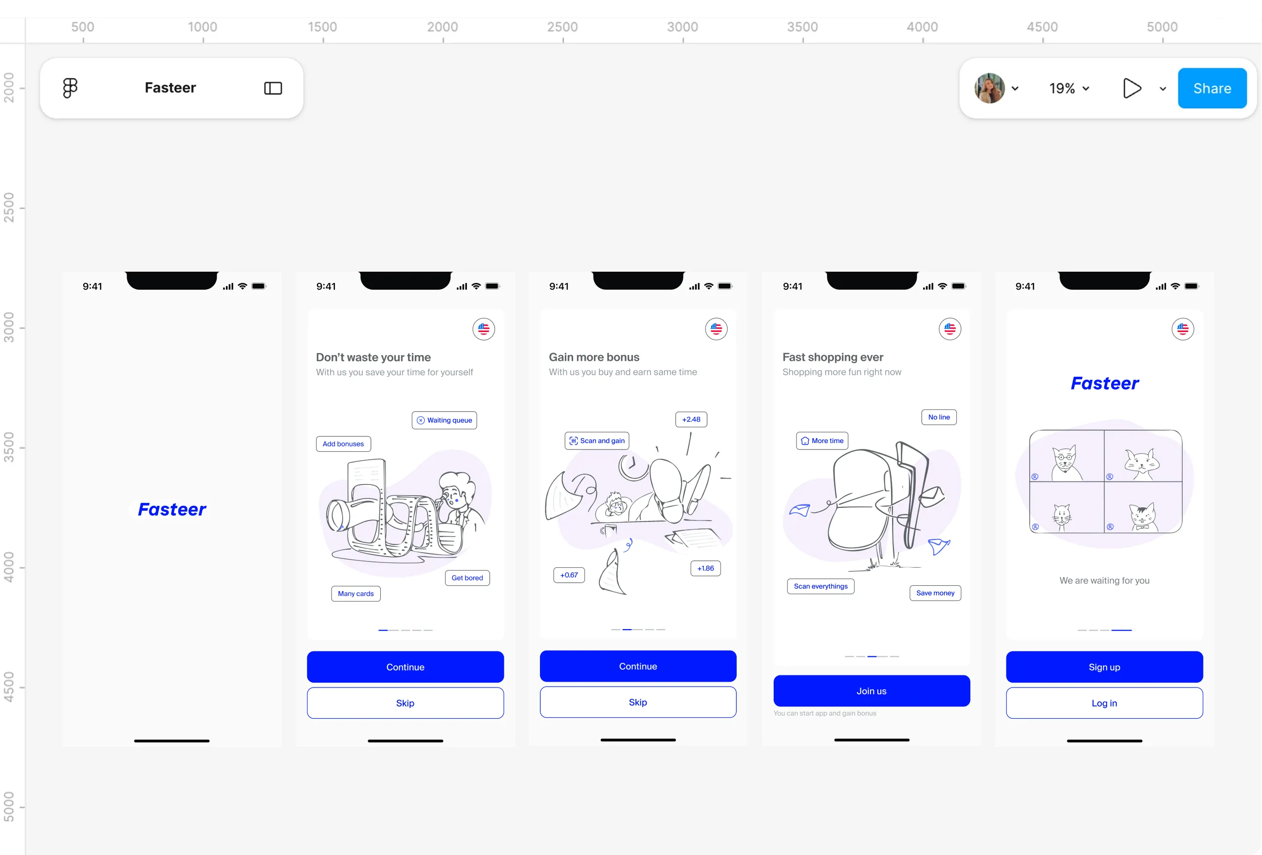
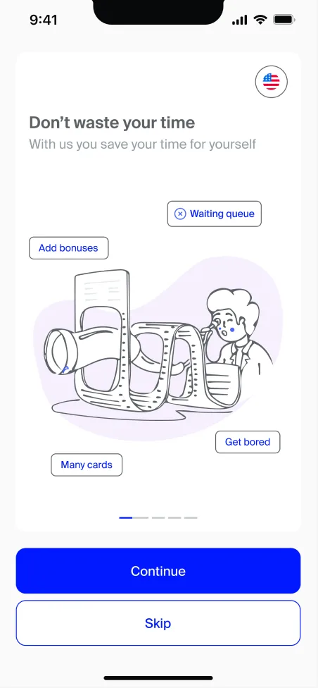
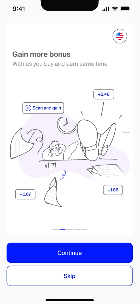
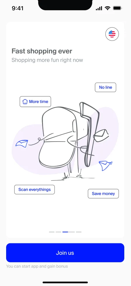
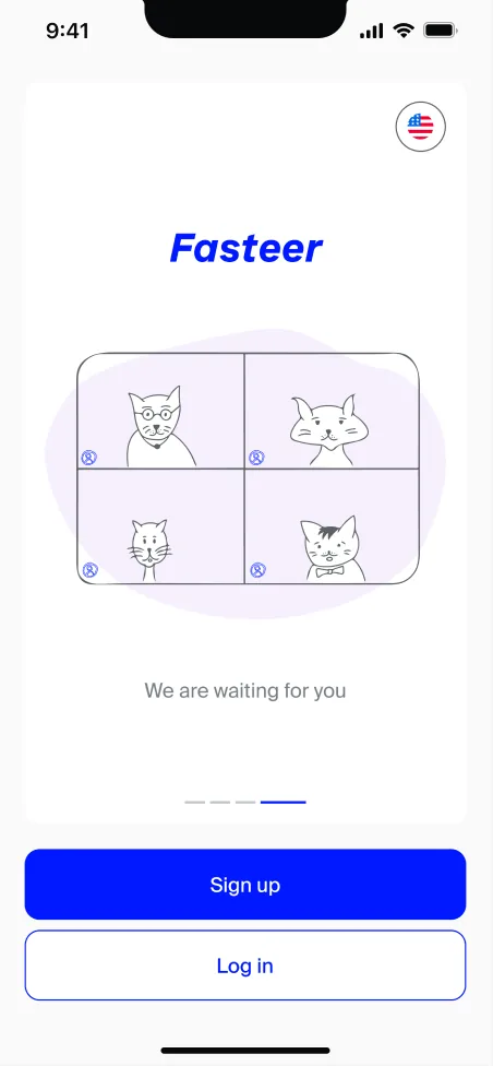
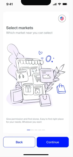
- Three onboarding screens introduce the idea through short, clear messages: don't waste your time, gain more bonus, fast shopping ever. A how-to-use animation shows the scanning process before the first trip, and help overlays can be opened again at any point.
- When something goes wrong, live chat connects shoppers to a named agent who promises a reply within ten minutes. Nobody is left alone with a problem in the middle of a shop.
Location permission
Pain Points
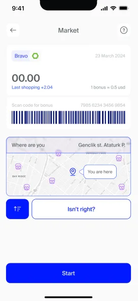
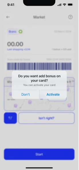
- Finding nearby markets works best with location access, but many people refuse permissions by habit. In a lot of apps, saying no leads straight to an empty screen and a dead end.
- For a new product still earning trust, locking people out over one refused permission would have ended the relationship before it started.
What I Changed
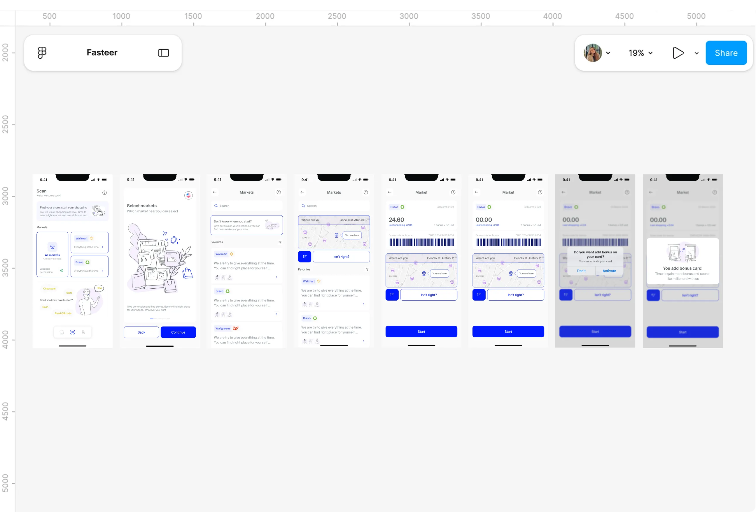
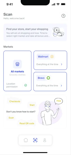
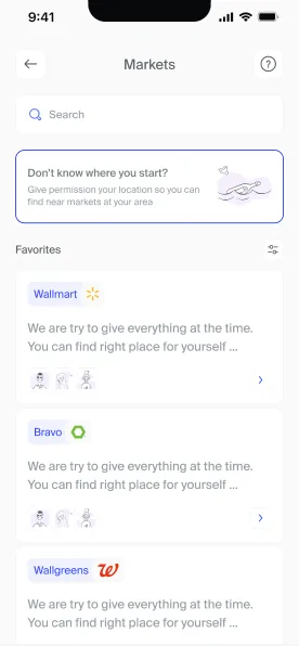
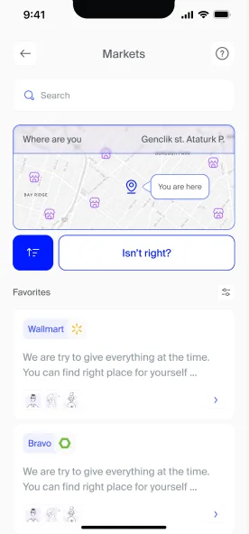
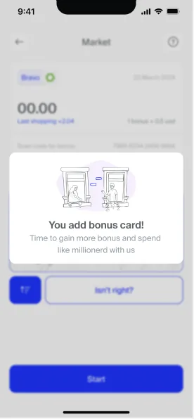
- Without location, Fasteer still lists every market, with a short prompt explaining why location makes the list more useful. Nothing is hidden, and the choice stays with the shopper.
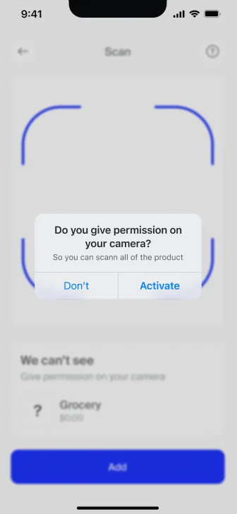
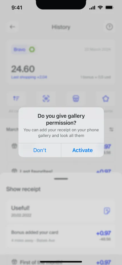
- That thinking runs through all the permissions in the app. Location, camera and gallery each have their own "no" branch in the user flows, so a refusal always leads somewhere.
Receipts
Pain Points
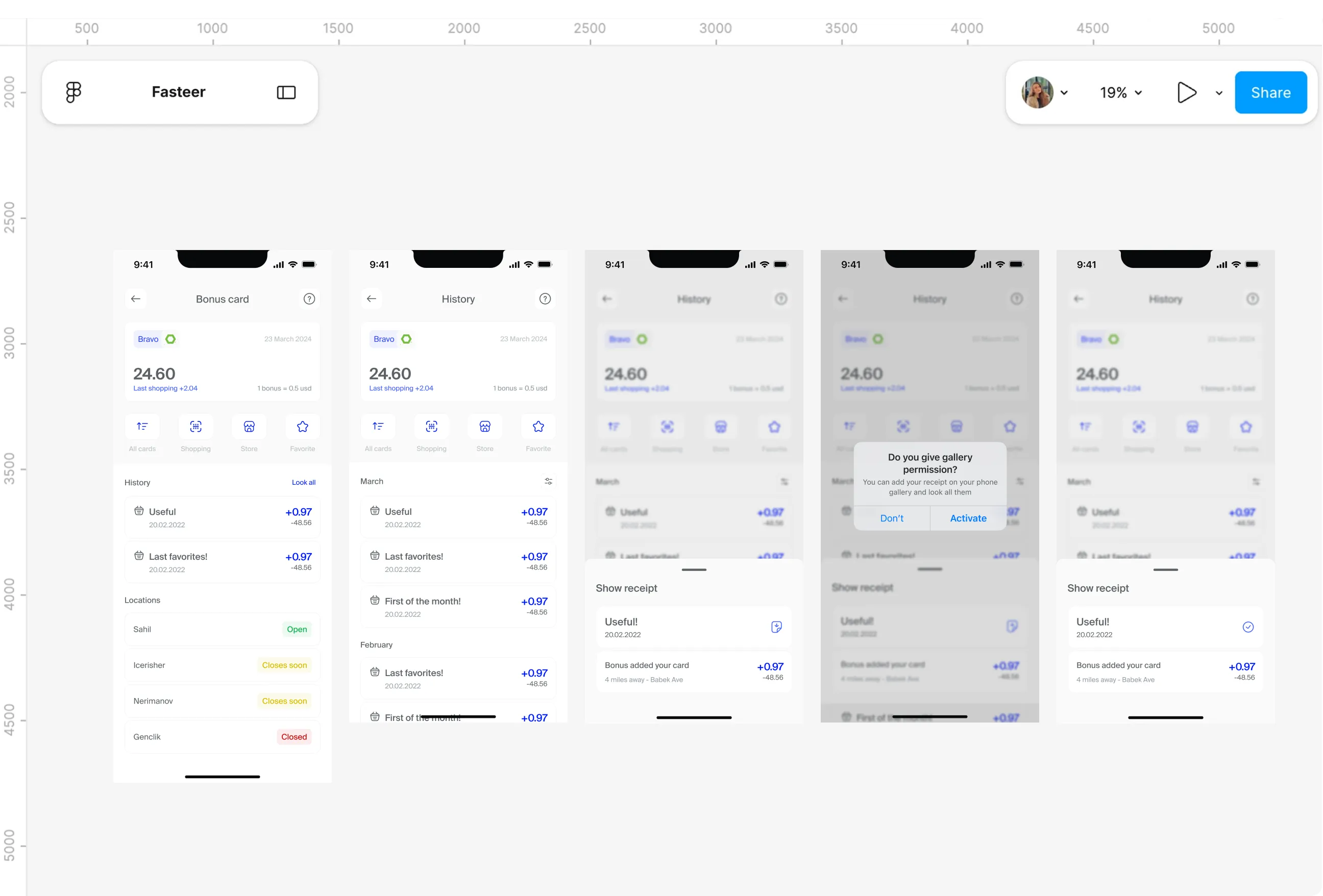
- Paper receipts fade, get thrown away with the shopping bag, or never arrive at all, and the persona built from the research explicitly asked for digital receipts over paper. Returning an item or checking a past price usually means searching through pockets.
- Benchmarking showed how rare the alternative was: only two of the ten products offered a digital receipt.
What I Changed
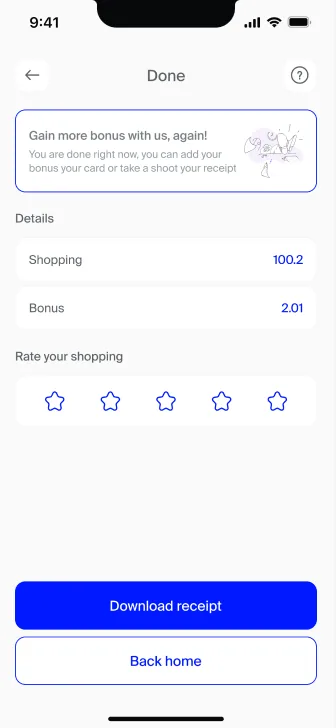
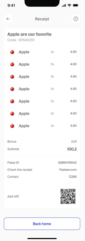
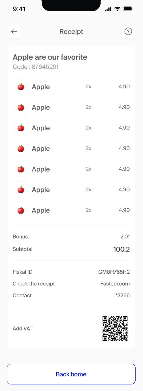
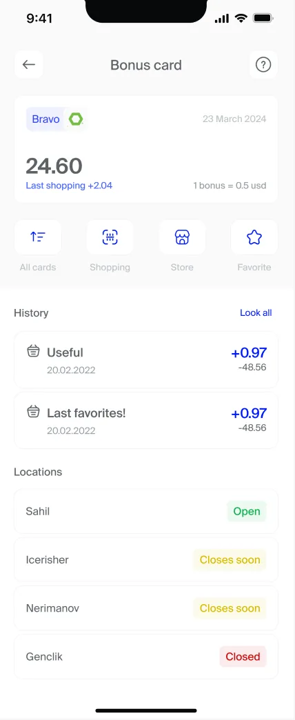
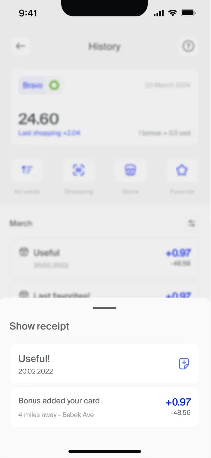
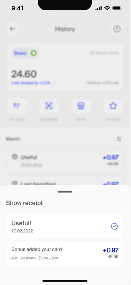
- Every Fasteer checkout ends with a digital receipt, available to download from the Done screen.
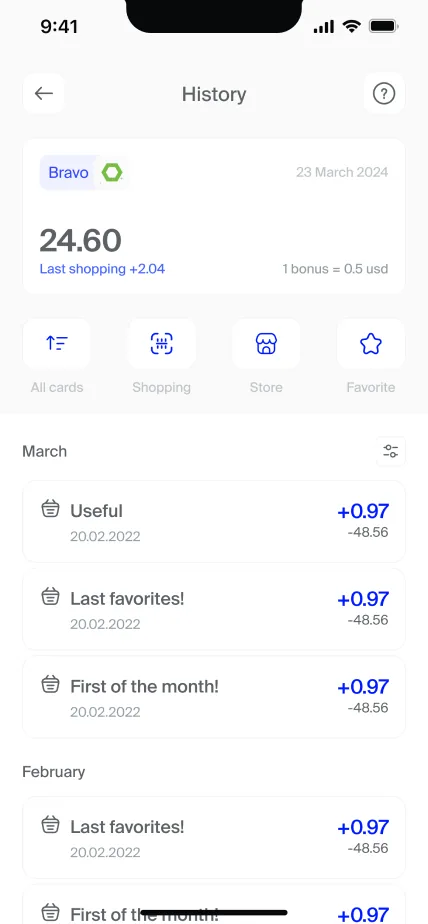
- History keeps each past shop together with the bonus earned and spent, and any receipt can be opened and downloaded again later. The record lives in the app, not in a drawer.
Landing page
Pain Points
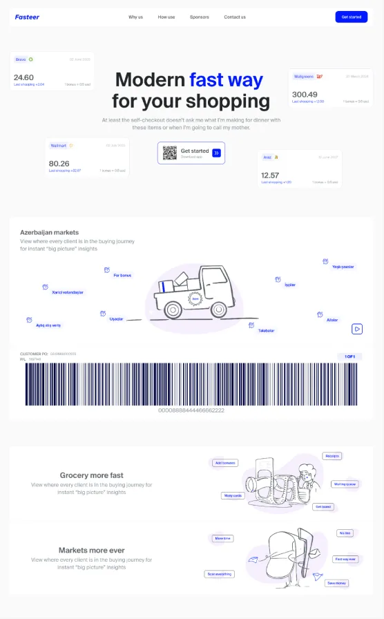
- A new idea needs explaining before anyone downloads it. With so little awareness of self-checkout, a shopper landing on the site needed to understand what Fasteer does, and why it's worth trying, within seconds.
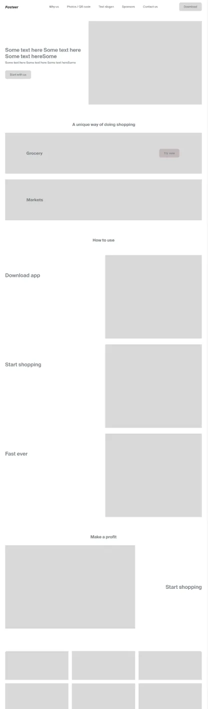
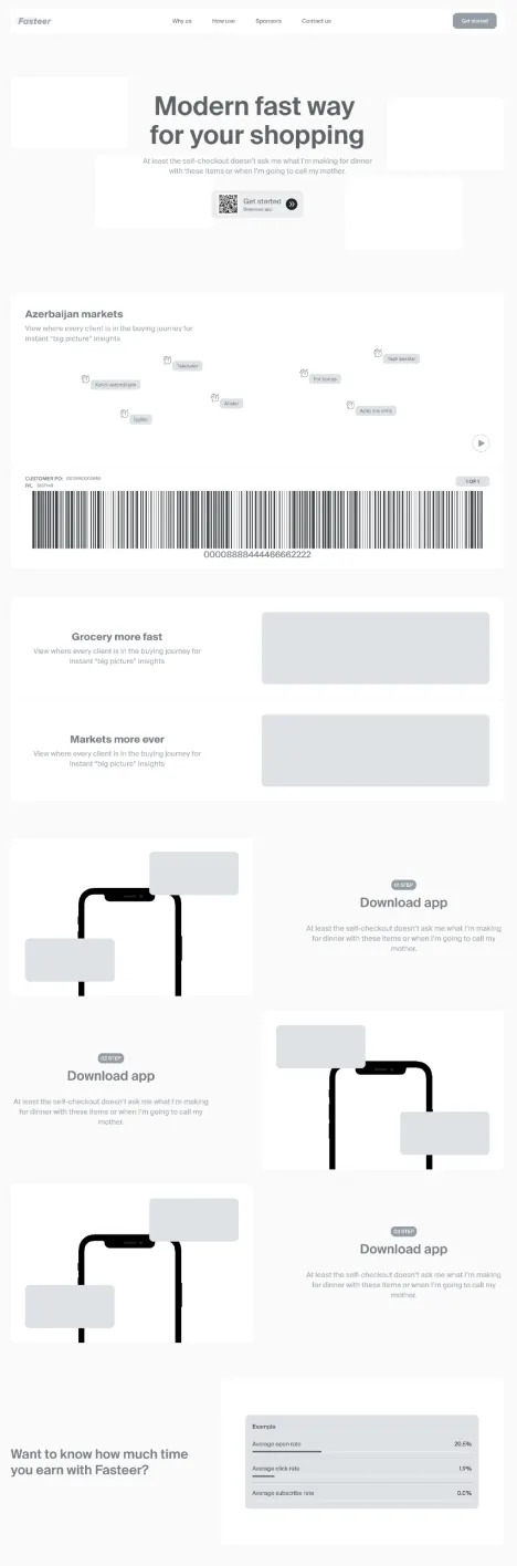
- The first drafts tried to say too much. Early wireframes listed every benefit before the page had even explained how the app works.
What I Changed
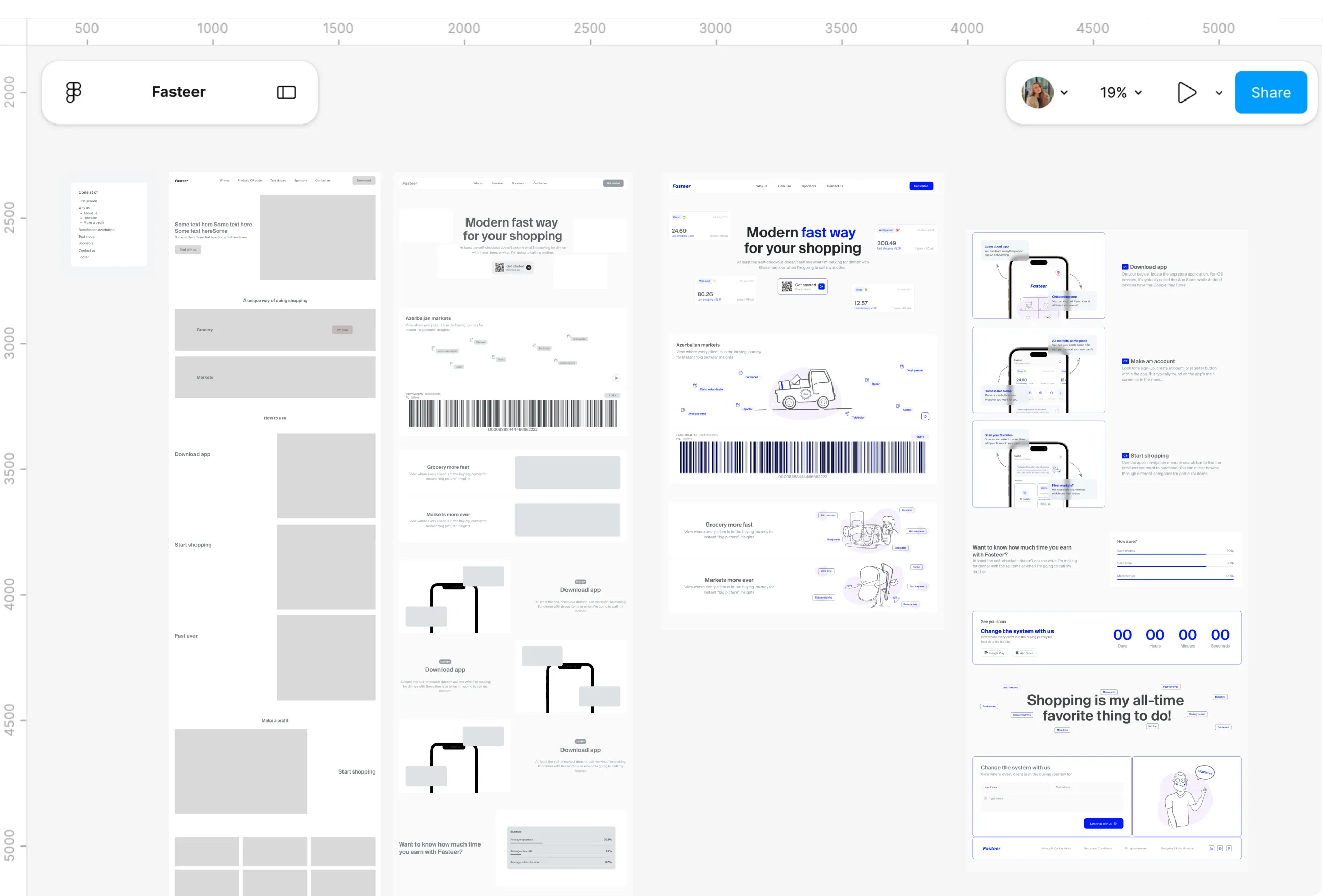
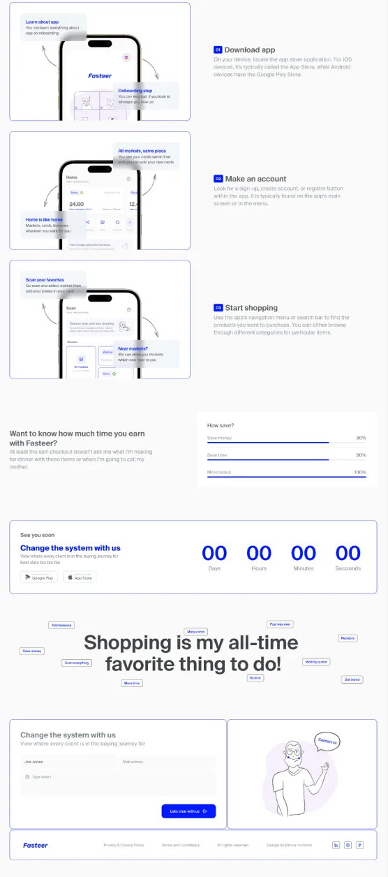
- The page moved from a low wireframe to a high wireframe to a final design, simplifying at each step. The hero leads with one promise, a modern, fast way to shop, and a Get started button with a QR code sends visitors straight to the app.
- How it works became three numbered steps, each with an app screen and callouts. Small tags around the slogan echo what the research found, like waiting queues, many cards and receipts, so visitors recognise their own frustrations on the page.
User flows
Pain Points
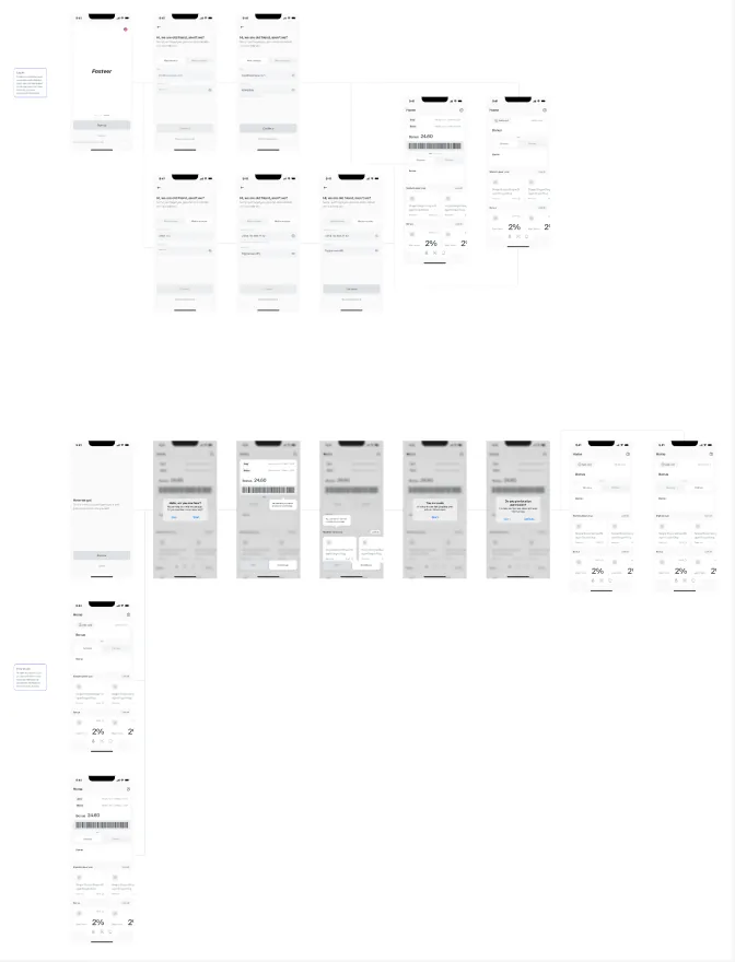
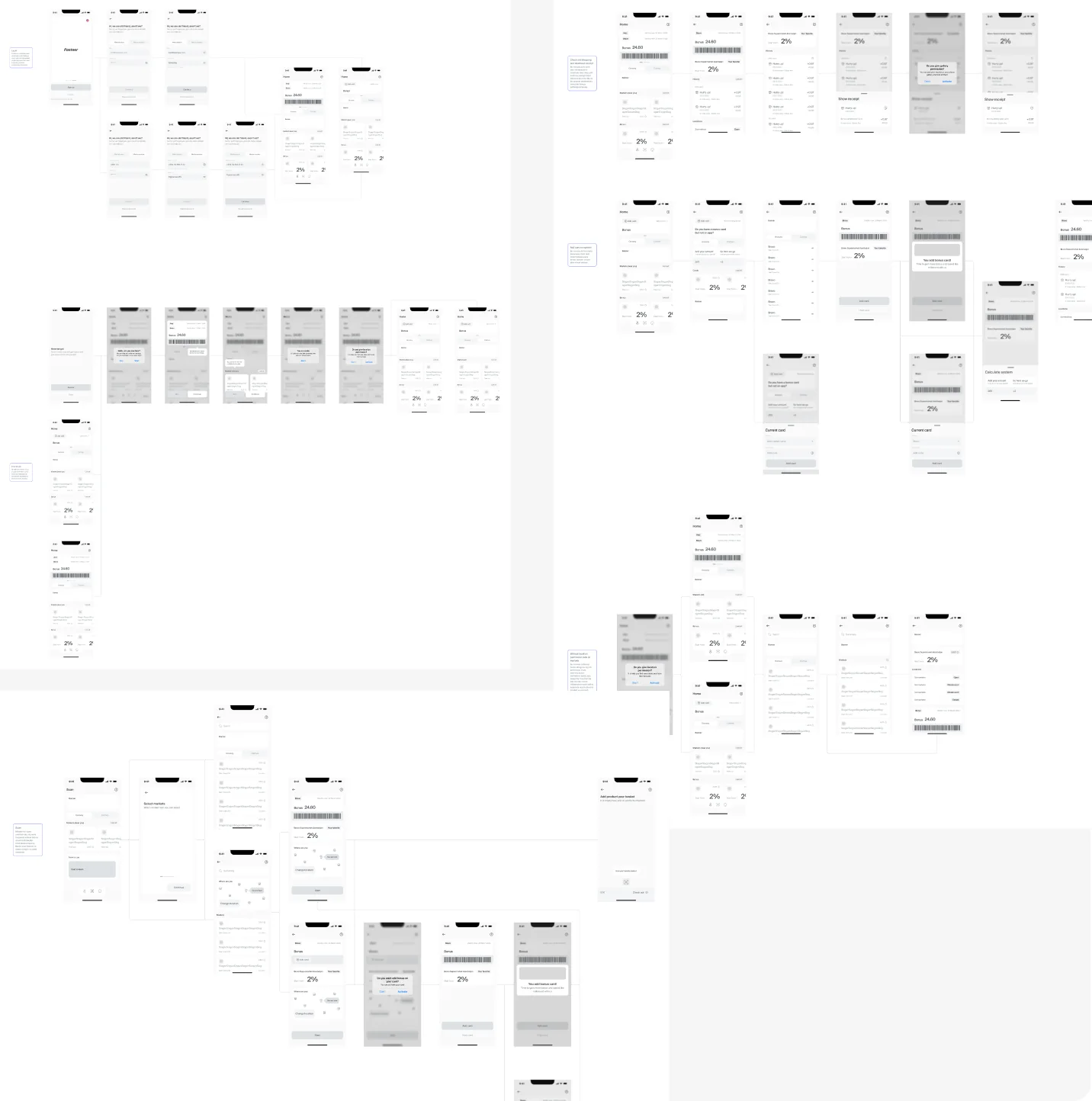
- The core journeys had to hold together before any screen existed. Starting to shop alone involves choosing a market, checking for a bonus card, scanning, adding bags and paying, with decisions at almost every step.
- Permissions and cards added more branches. What happens if location is refused, or if a shopper wants bonuses but hasn't activated a card yet?
What I Changed
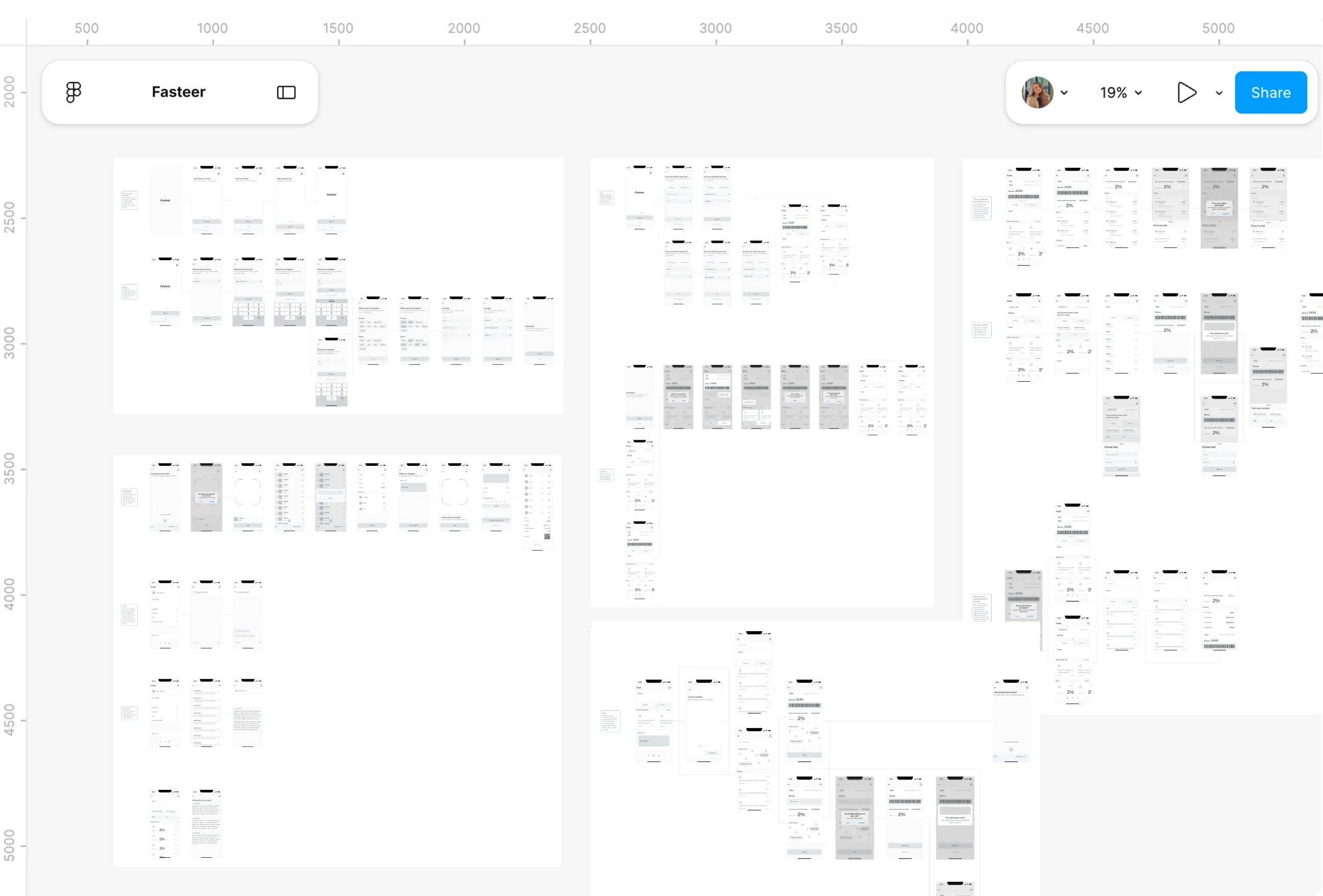
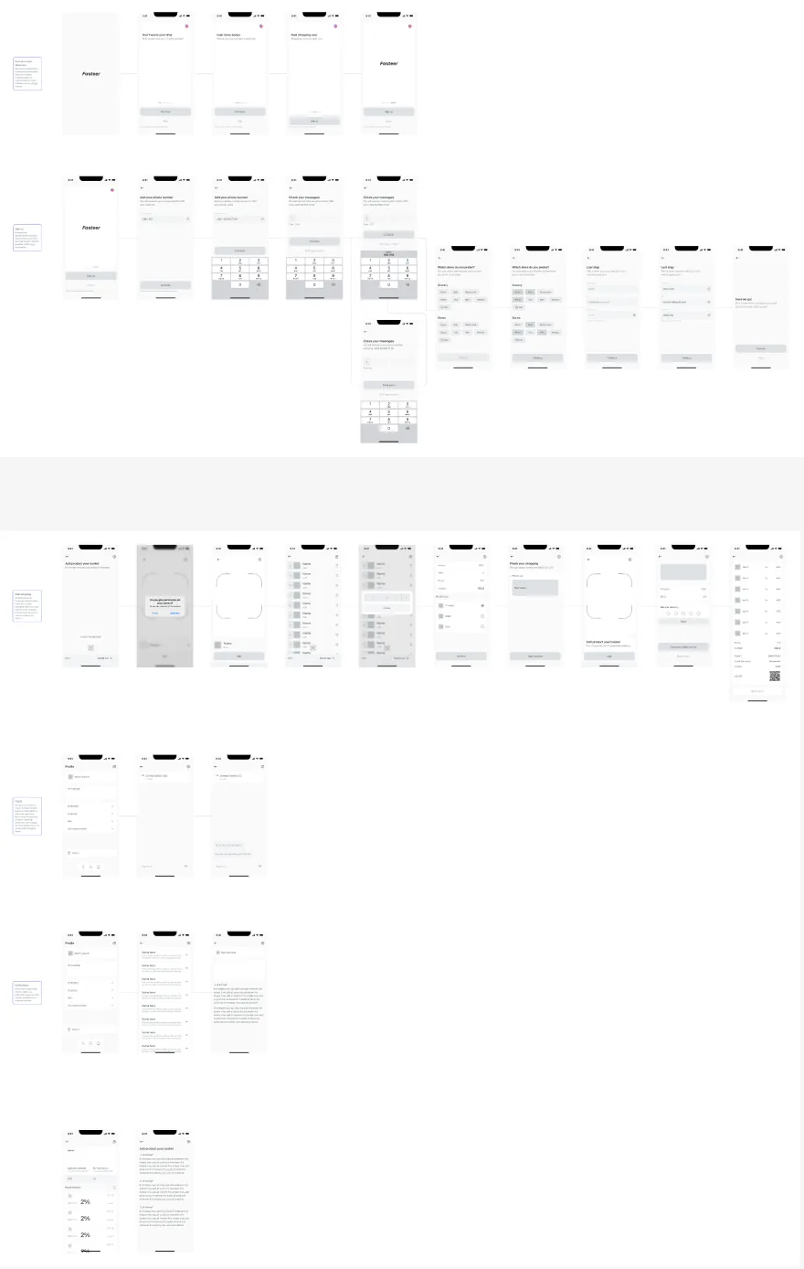
- Eight user flows mapped every main journey, from signing up and reporting a problem to downloading an old receipt and starting to shop. Each one showed its pages, inputs and yes or no decisions.
- The start shopping flow became the longest, checking whether the shopper has a card, whether it's activated and whether it's been added, before scanning begins. Mapping it this carefully meant no path ended in a dead end.
Wireframes and wireflow
Pain Points
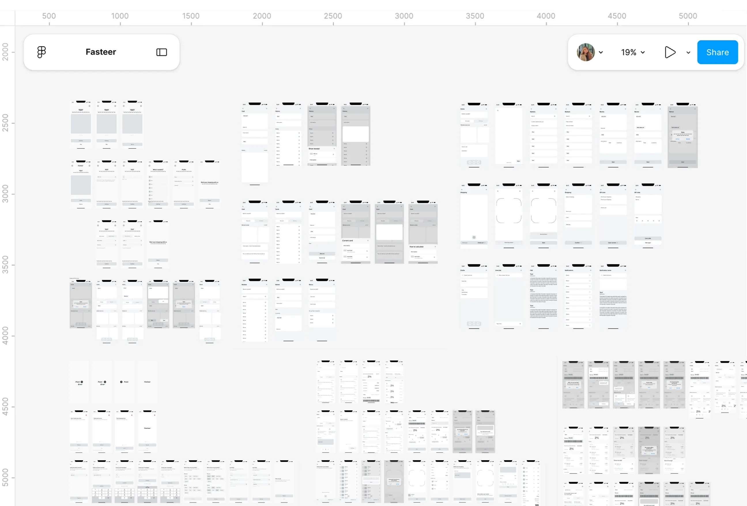
- Around 50 screens needed a settled structure before any colour or illustration could distract from it. And screens alone don't prove that journeys work, because the problems usually sit in the gaps between them.
- States were easy to forget. A home screen without location, an empty basket and a missing card each needed their own design.
What I Changed
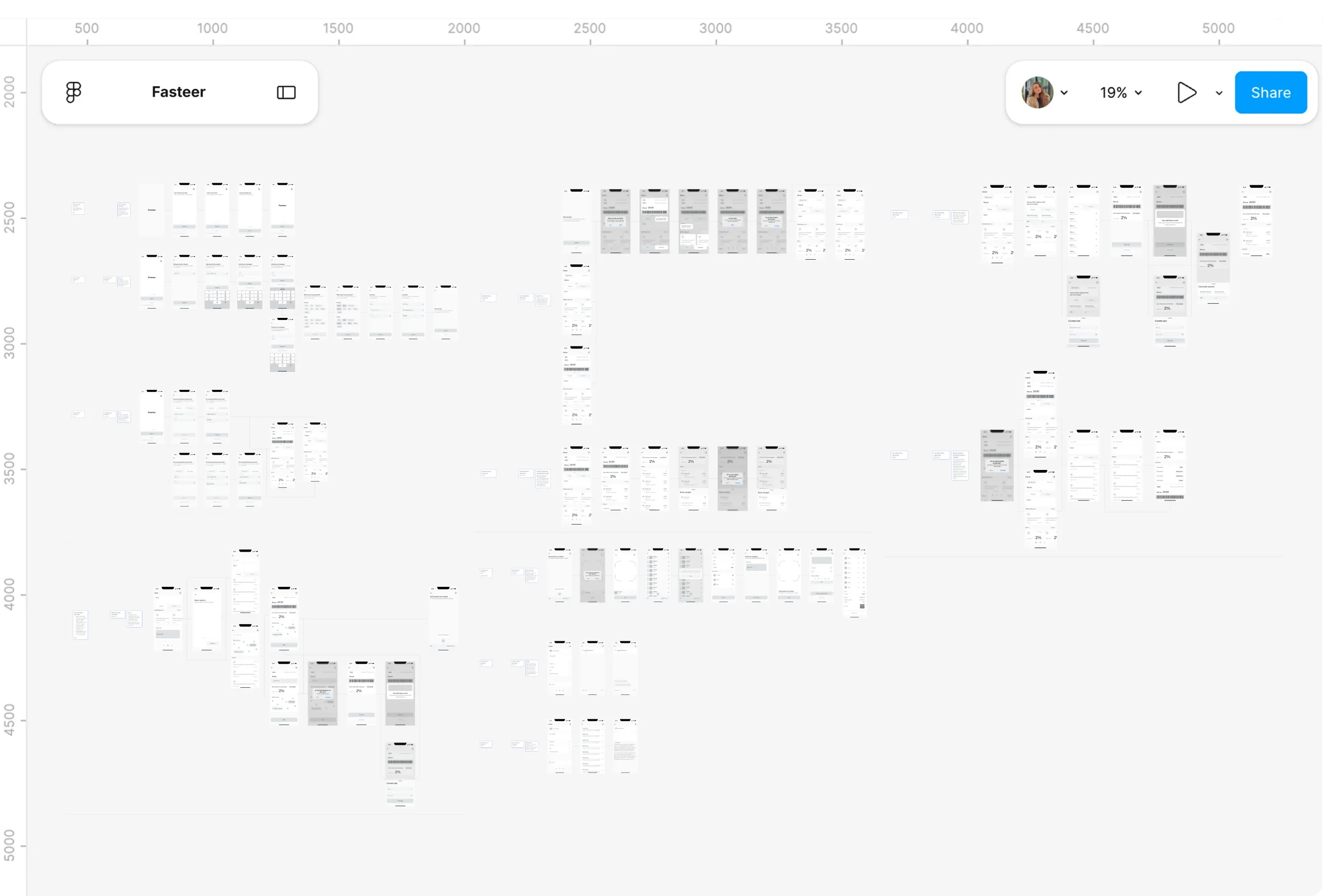
- About 50 low fidelity screens came first, then roughly 70 high fidelity ones that added the missing states: sign up steps, empty and full baskets, and home without location permission.
- All of them were linked into a wireflow of well over 100 screens and states. Eleven written scenarios beside it described what to test in each part of the app, which later became the tasks for user testing.
User testing
Pain Points
- A flow that feels obvious to its designer can confuse someone seeing it for the first time. With so few people familiar with self-checkout, that risk was higher than usual.
- Friendly feedback wasn't enough. The testing needed concrete tasks and scores that would show exactly where people struggled.
What I Changed
- Ten people worked through the eleven wireflow scenarios, from sign up to checkout, and each was scored out of ten with a comment. Of the recorded scores, nine were perfect tens.
- The two eights were the most useful results. One asked for a shorter delay between onboarding screens, and the other for a larger location area on the markets screen, since for that tester the market's location mattered most.
Design System
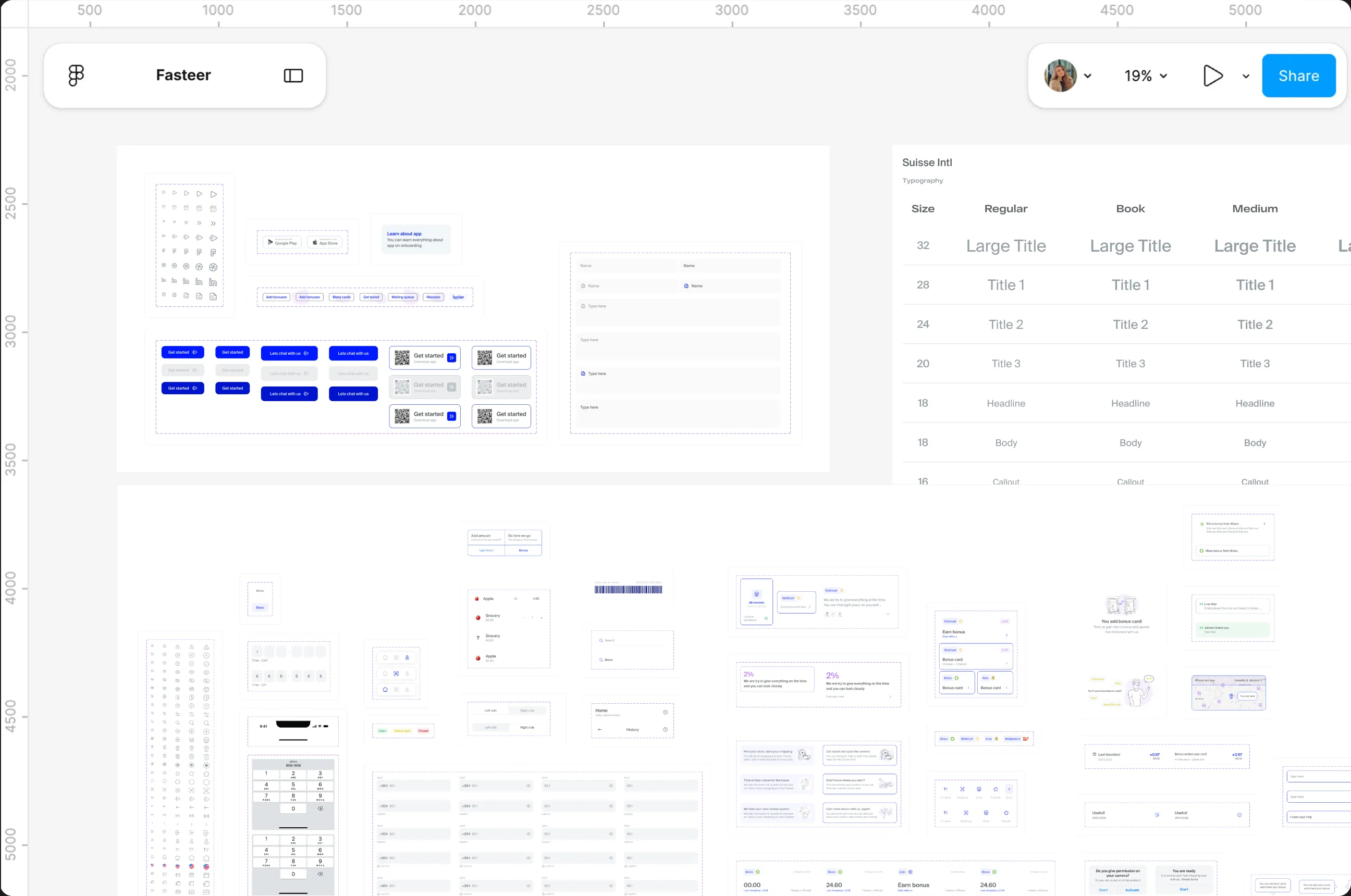
The design system keeps Fasteer's landing page and app consistent under one brand. Colours, typography and reusable components were defined early, so every screen shares the same look and new screens are quicker to build.
Role and Working Context
I designed Fasteer alone as my final project at Code Academy, presented on 16 June 2023. I covered everything myself, from the logo and research to the landing page, the mobile app and user testing.
-
Discover
I started by listening to shoppers and the store side. A survey of 37 people and six interviews, including a supermarket employee, showed what slows people down at the till. I also benchmarked ten self-checkout products and mapped Walmart's Scan & Go journey to see where similar apps break.
I listened to shoppers and the store side: a survey of 37 and six interviews, plus benchmarking ten self-checkout products and mapping Walmart's Scan & Go journey.
-
Define
The findings came together in three personas and empathy maps. Three problems stood out: long queues, waiting for staff to remove a scanned item, and bonus cards scattered across wallets. Card sorting then shaped the app into three pages: Home, Scan and Profile.
The findings became three personas and empathy maps, pointing to three problems: long queues, waiting on staff, and scattered bonus cards. Card sorting shaped the app into three pages.
-
Design
Eight user flows came first, each with a backup path when a permission is refused. The landing page and app then moved from low to high fidelity wireframes, and the app screens were linked into a wireflow of over 100 screens and states to check that every journey held together.
Eight user flows with backup paths, then low to high fidelity wireframes, linked into a wireflow of over 100 screens and states.
-
Deliver
Ten people tested the app across eleven scenarios, and their feedback shaped the final UI of about 90 screens, built from one UI kit. I presented the whole project in three parts: UX research, the landing page and the mobile app.
Ten people tested the app across eleven scenarios, shaping a final UI of about 90 screens from one UI kit, presented in three parts.