PaySmile
Pay As You Drive Insurance App
Overview
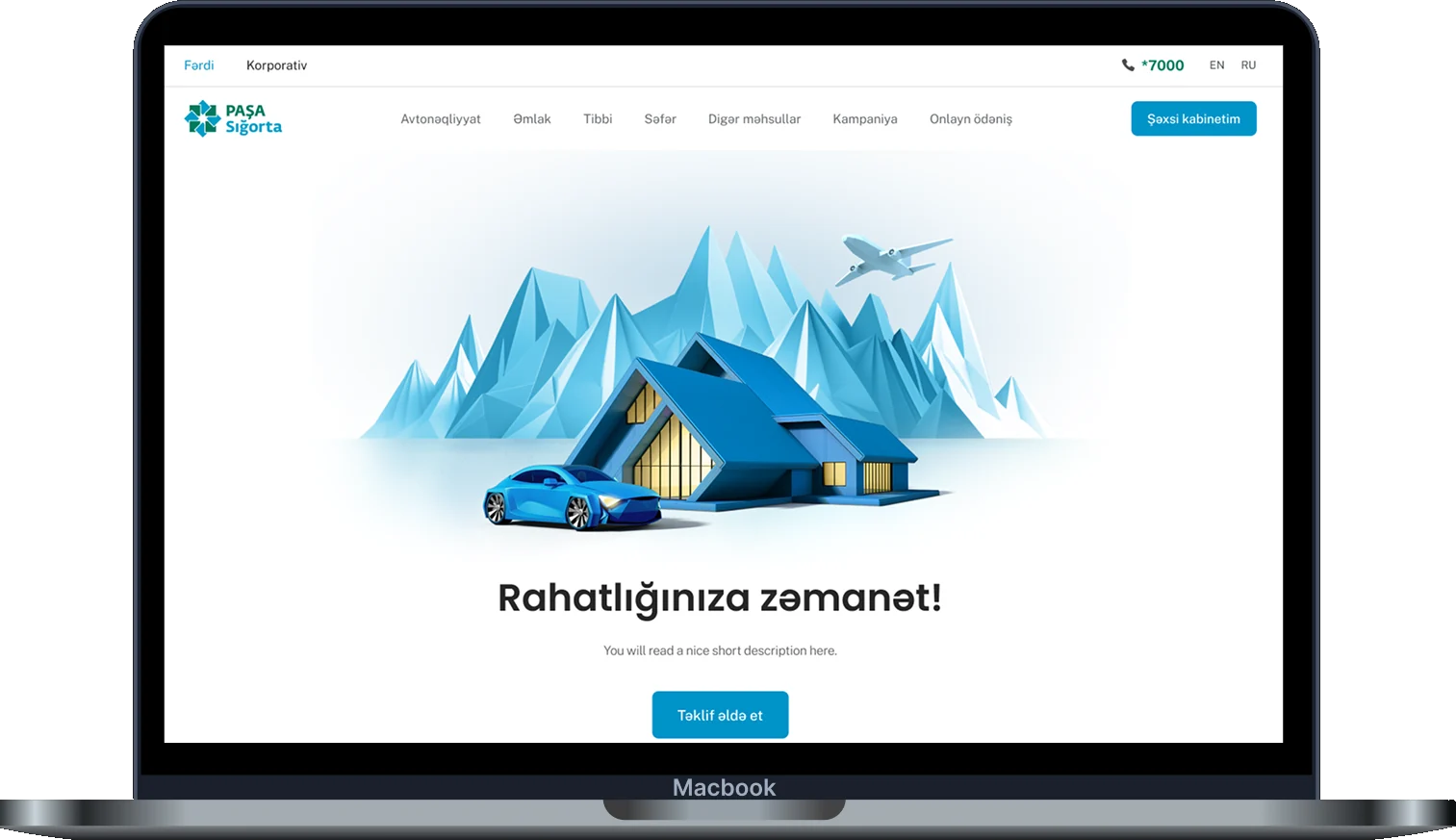
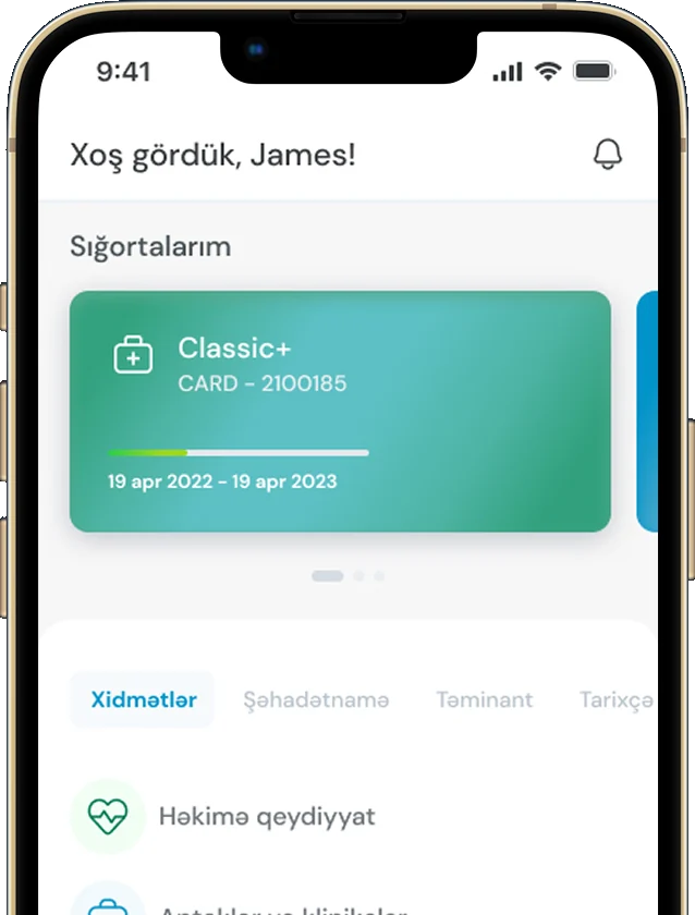
Paysmile is a concept app for pay-as-you-drive Kasko insurance. A car device scores your driving, which sets your monthly price. It was PASHA Insurance's take-home task during my application, done in about a week. Not a shipped product.
Research
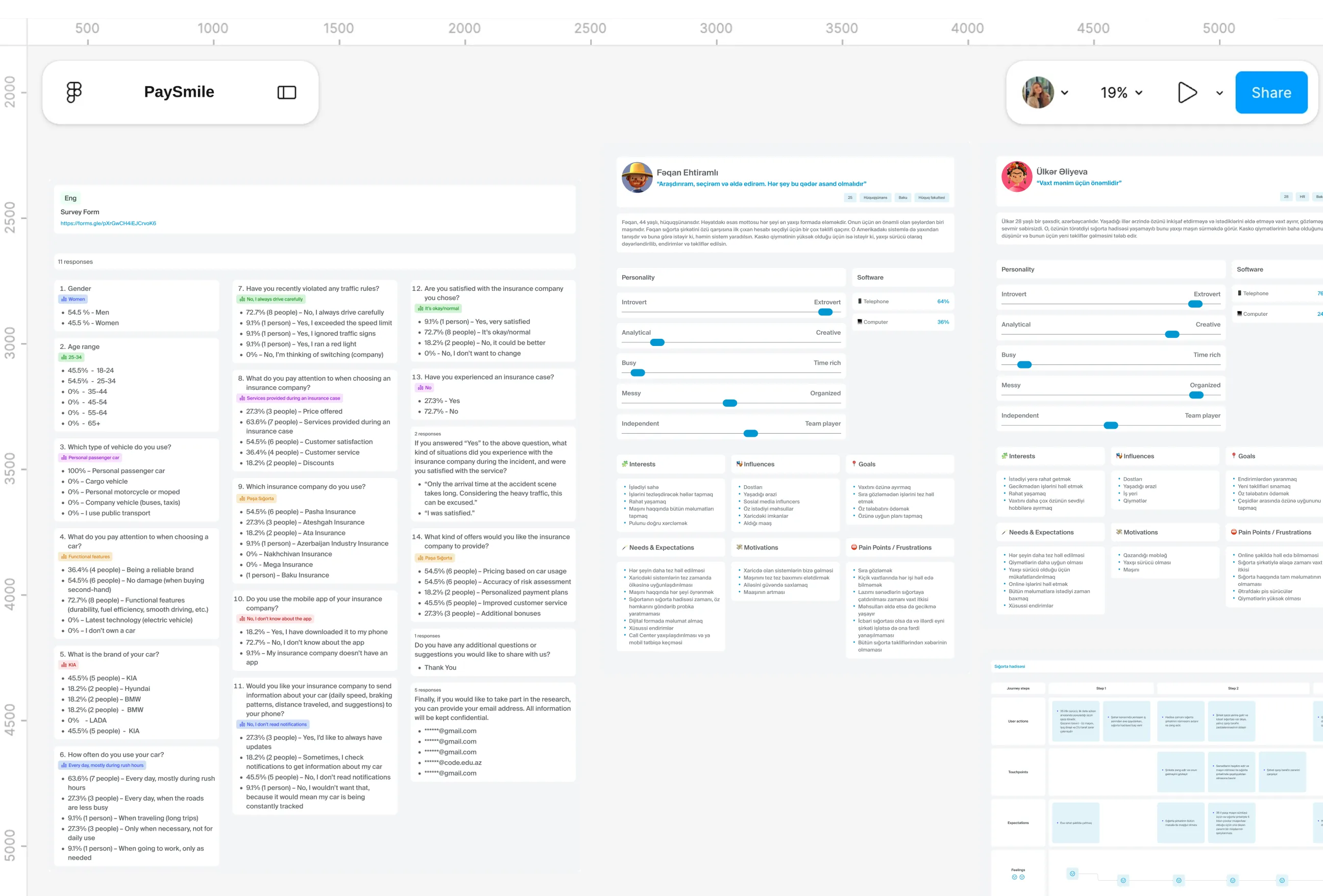
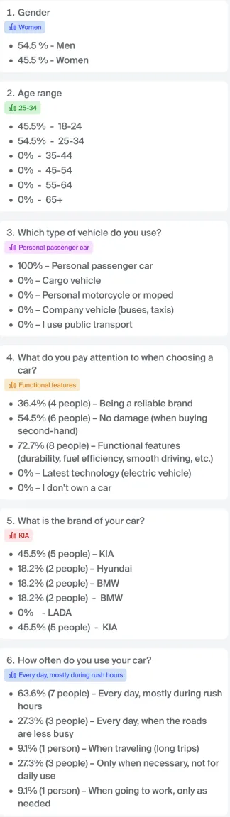
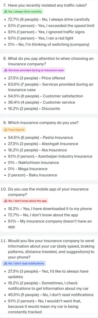
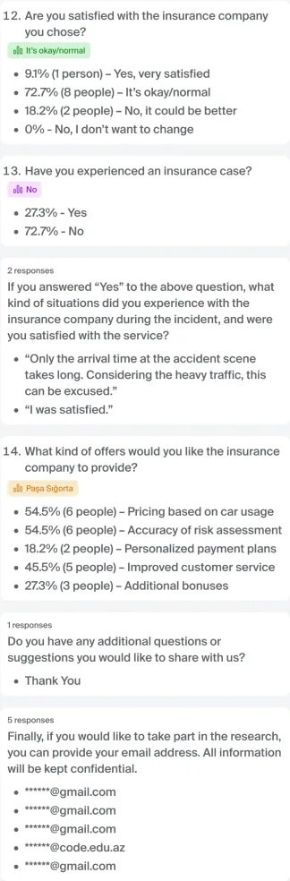
I surveyed 11 drivers and interviewed four. Over half wanted usage-based pricing, and most did not know their insurer had an app. The biggest pain came after an accident: waiting, then paperwork. I also mapped 27 stakeholder groups and built two personas and a journey map. A small sample, so direction, not proof.
Design Approach
Research first, then structure, then screens. A survey and four interviews shaped two personas and an incident journey map. From there I built the IA and flows, tested structure in ten low fidelity screens, then moved to high fidelity, a wireflow and final UI on the PASHA brand.
Project Snapshots
The project at a glance: what I delivered, what I set out to do, what made it hard, and where it landed.
A full concept, end to end. From naming and research to a design system, in one week.
UX to UI
Design decisions traced to research. Emergency call, Car fax and chat with attachments all came from interview findings.
For bringing PAYD to PASHA customers.
8 adoption proposals
Make the price feel fair. Careful drivers pay less, and can see exactly why.
Cut waiting after an accident. Reach the insurer, share the location and document the scene from the app.
From brief to a complete UX and UI deliverable.
1 week
-
8
adoption proposals
Concrete ways to bring usage-based pricing to PASHA’s existing customers.
-
1 week
brief to complete deliverable
A full UX and UI concept designed solo, start to finish.
-
5
core feature areas
Emergency call sits at the centre, with everything else built around it.
Detailed Work
A closer look at each part of the app, from first launch and sign in to plans, driving score and the Car fax. Every screen is built on the same design system, and all prices and figures shown are sample data for the concept.
Research
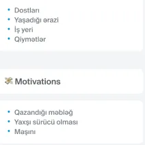
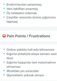
Pain Points
- Usage-based pricing did not exist anywhere in Azerbaijan, so every idea I brought into the brief was borrowed from other markets. A price that shifts with how you drive touches money, trust and privacy all at once, and guessing how local drivers would react to that felt far too risky, even for a one week task.
- What I was missing was the everyday picture: how people here actually choose an insurer, when they open an app, and what goes wrong when they need help. Without it, the design would have answered questions nobody here was asking.
What I Changed
- A 17 question survey reached 11 drivers, and four one to one interviews added the stories behind the numbers, from a young driver to someone with 35 years behind the wheel. Two signals repeated across both: over half the respondents wanted usage-based pricing, and almost three quarters had no idea their insurer even had an app.
- The interviews then pointed somewhere I hadn't expected. Frustration clustered around the hours after an accident, not the moment of buying, and survey comments about slow arrival in traffic said the same. That moved the brief from pricing alone to pricing plus real help when it matters most.
Stakeholders
Pain Points
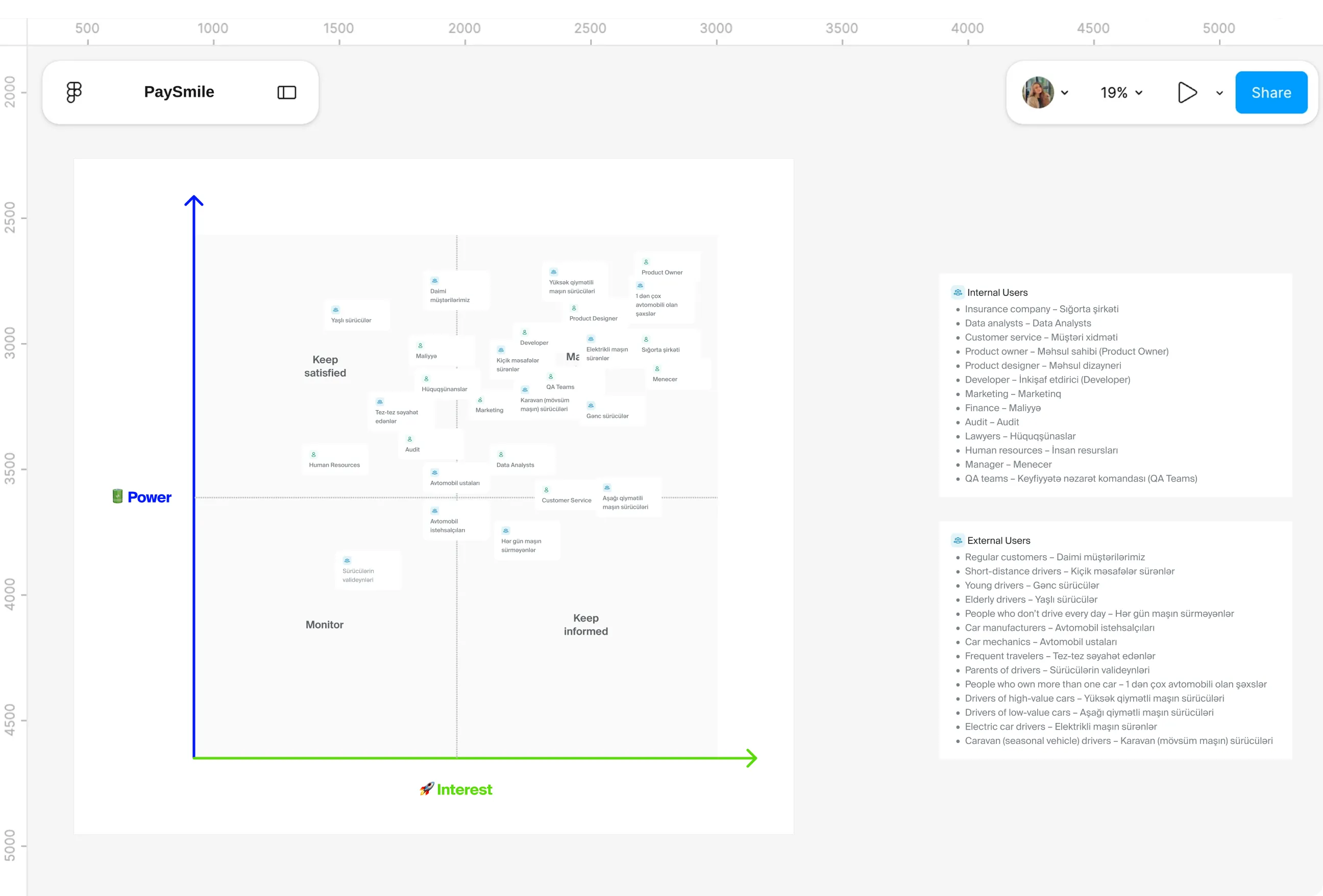
- A product that prices by driving reaches far beyond the person holding the phone. Mechanics could introduce it to customers, finance and legal would have to approve it, and parents of young drivers would care about every score their child earned.
- Trying to satisfy all of them equally would have produced an app that suited no one. Somebody had to come first, and the research alone didn't say who.
What I Changed
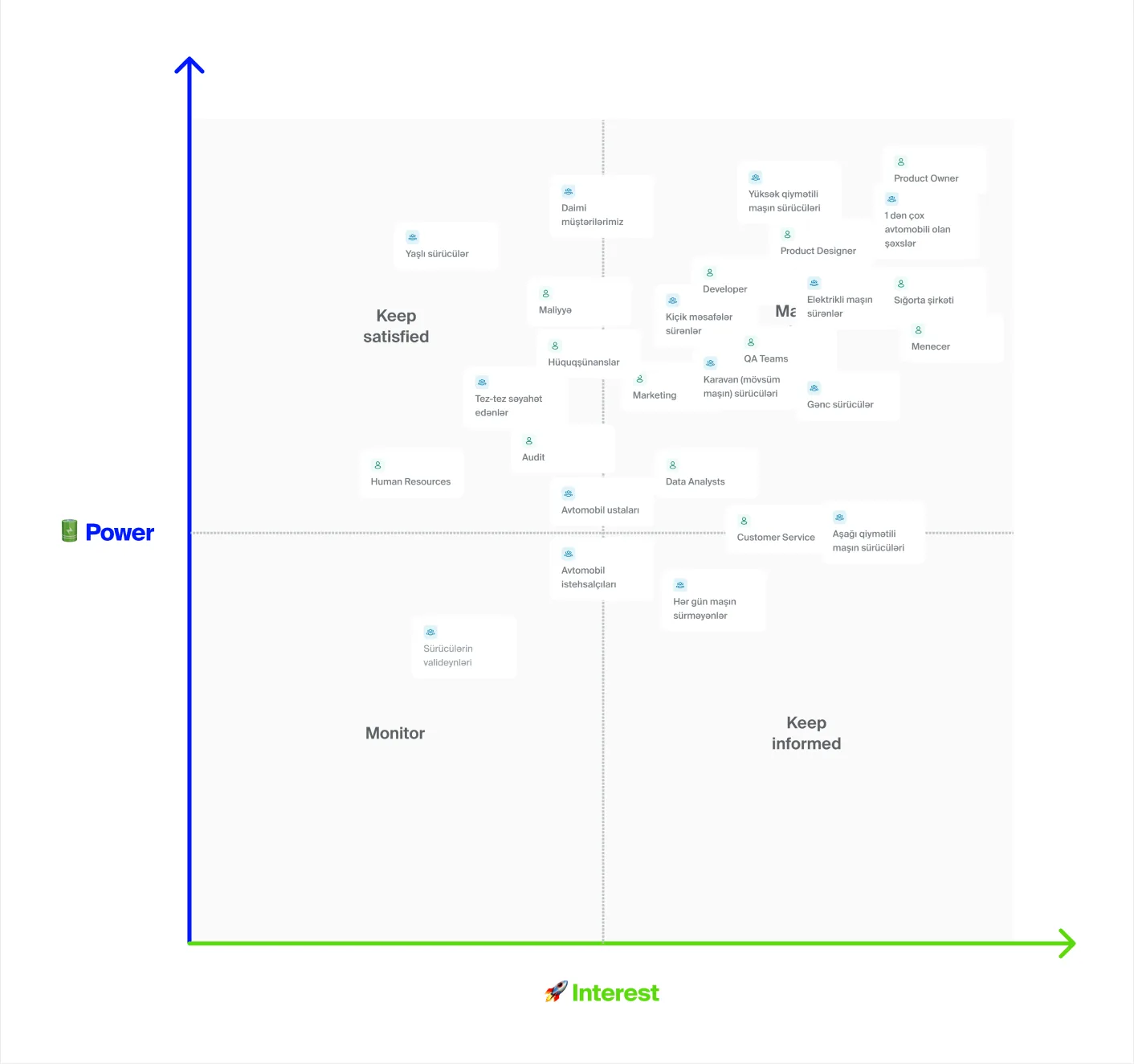
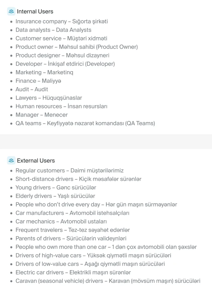
- Twenty seven groups went onto a power and interest grid, 14 external and 13 internal, each with a line on why a usage-based product would matter to them. Low mileage, young, multi car and seasonal drivers all landed in "manage closely", because paying only for what you drive rewards exactly how they use their cars.
- Older drivers told a different story: plenty of influence, but little familiarity with the idea. So savings sit front and centre for the drivers most likely to switch, while every explanation stays plain enough for someone meeting the concept for the very first time.
Personas
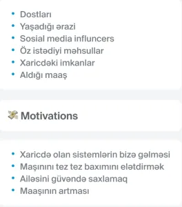
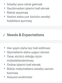
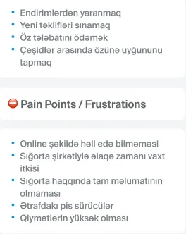
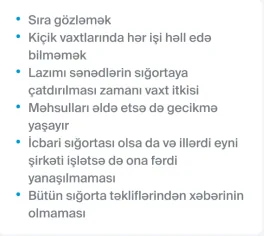
Pain Points
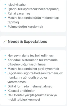
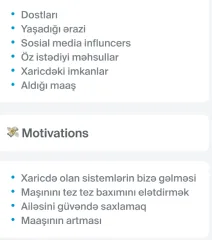
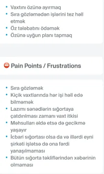
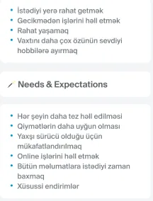
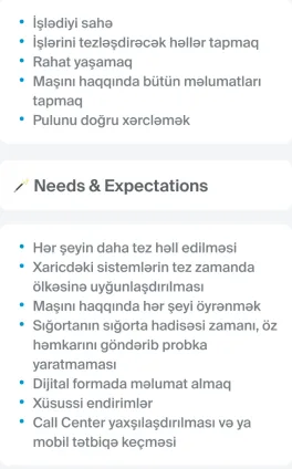
- By the end of the research, the findings lived in a sheet of survey answers and four long conversations. Some needs overlapped neatly, like the shared dislike of waiting, while others pulled apart: some people wanted speed above all, others wanted years of loyalty to finally count for something.
- Designing screen by screen against raw notes meant every decision risked becoming a guess. The patterns needed faces.
What I Changed
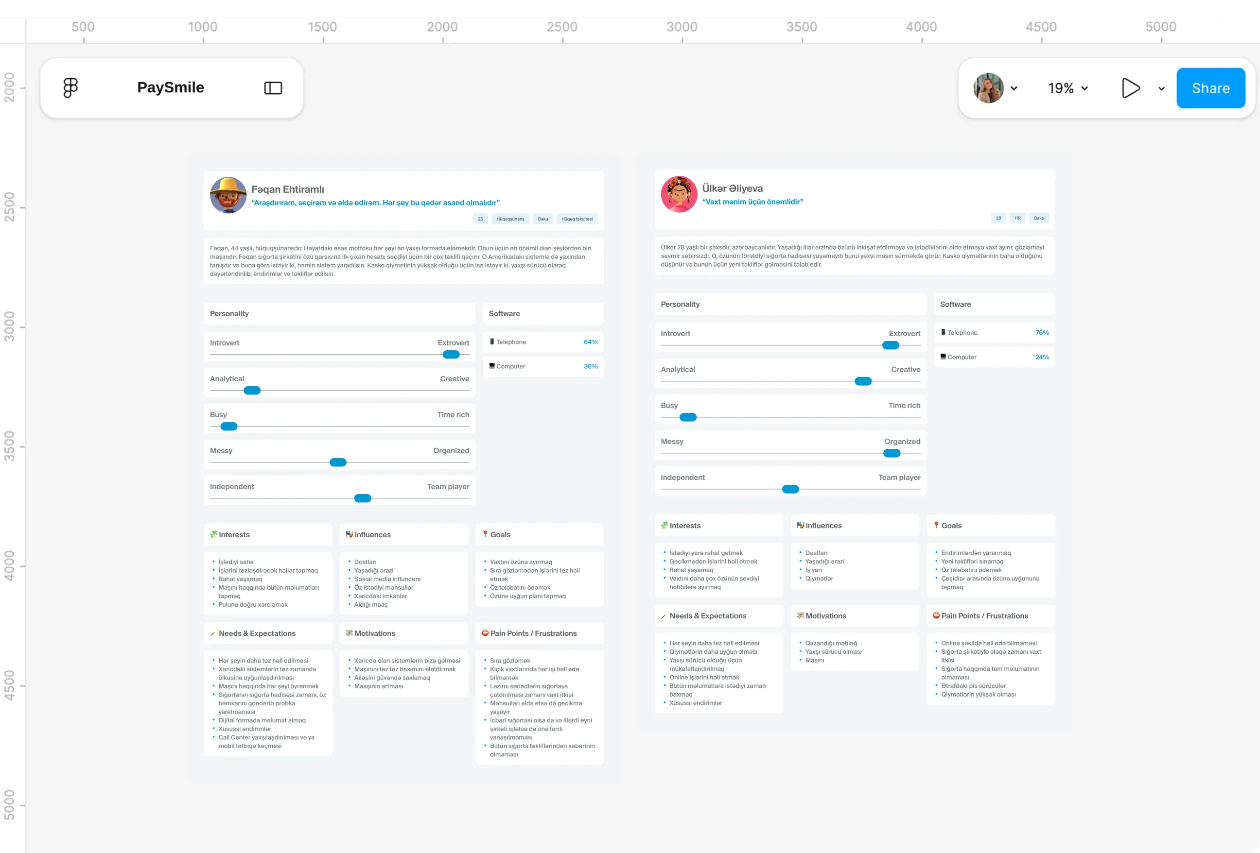
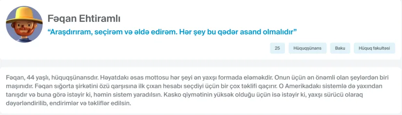
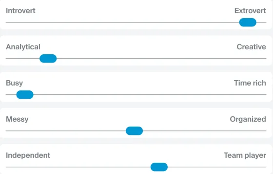
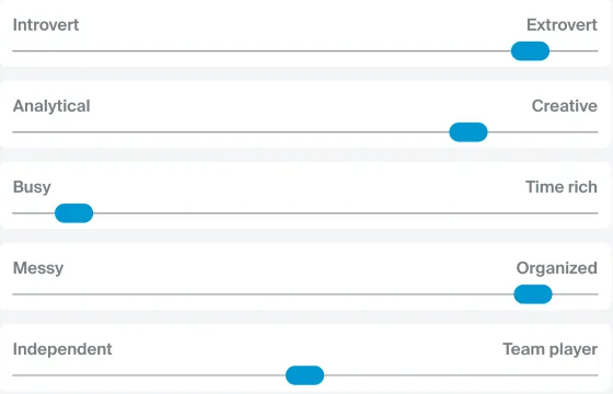
- Ülkər, 28, came first: she values her time, has never caused an accident, and thinks Kasko is simply too expensive for someone who drives carefully. Elvin, 44, is a composite of the two male interviewees, a lawyer who took the first insurer he found years ago and now feels his loyalty earns him nothing.
- Every screen was checked against both. Ülkër's impatience set the pace of the flows, and Elvin's sense of being overlooked shaped how visible savings, history and discounts needed to be.
Journey map

Pain Points
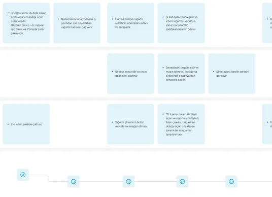
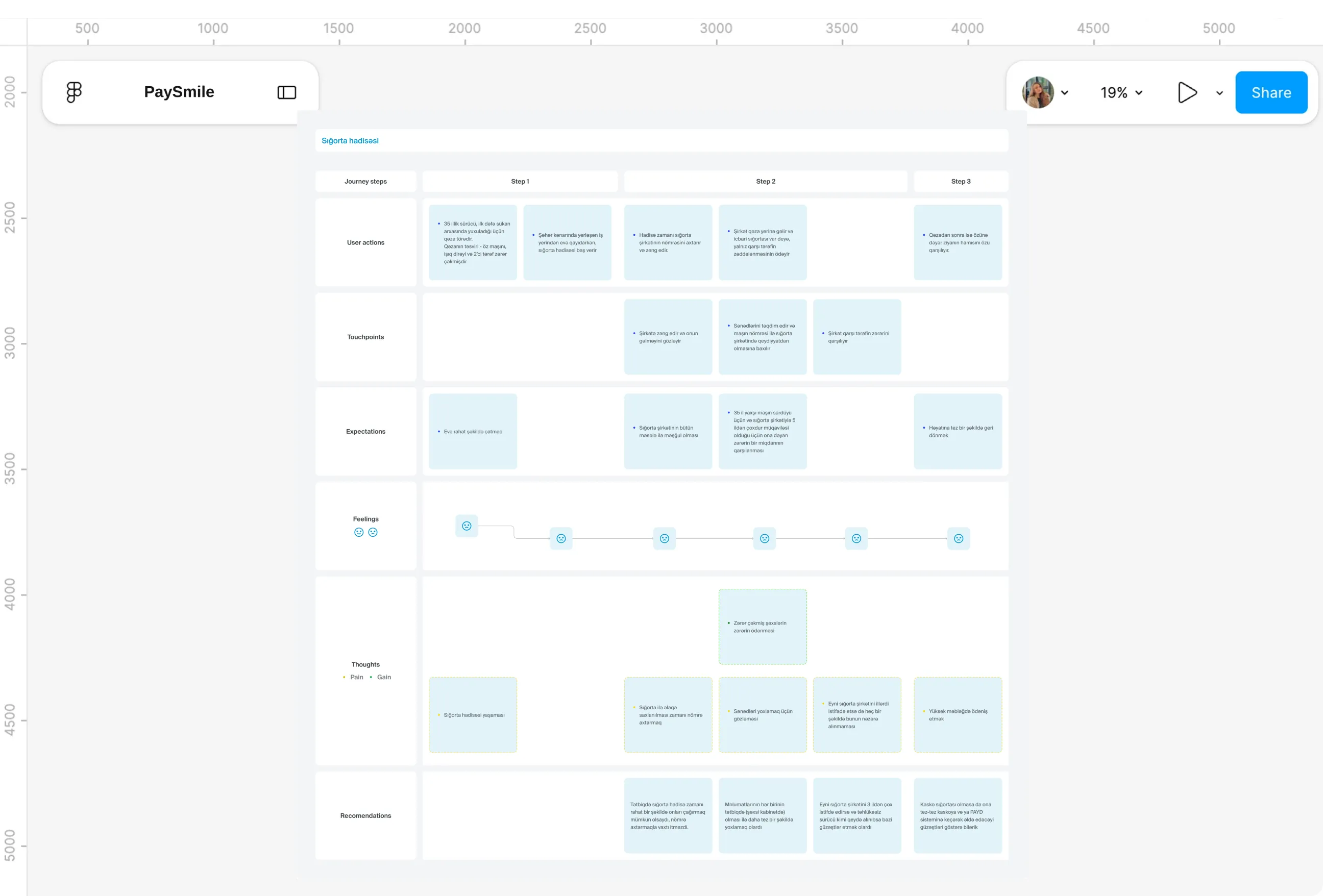
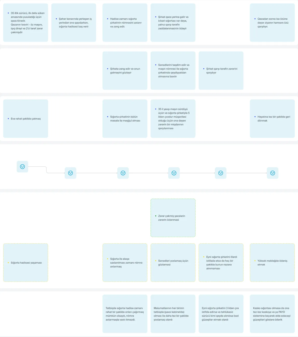
- Picture a driver with 35 years of experience who, heading home after work, falls asleep at the wheel for the first time. His car hits a lamp post and another vehicle, and he holds only compulsory cover, so his first problem at the scene is simply finding the insurer's number.
- What followed matched what survey respondents and interviewees described: waiting for staff through traffic, waiting again while documents were checked, and finally paying for his own damage out of pocket despite years with the same company.
What I Changed
- Mapping that evening step by step showed exactly where the experience broke, and each low point turned into a design decision. Searching for a number became an emergency call in the navigation, checking documents became records already stored in the account, and years of careful driving became a visible discount.
- The map also surfaced something beyond the incident itself. Drivers with only compulsory cover rarely see what they'd gain from Kasko or a usage-based plan, so the app makes that comparison easy to find.
Incident response
Pain Points
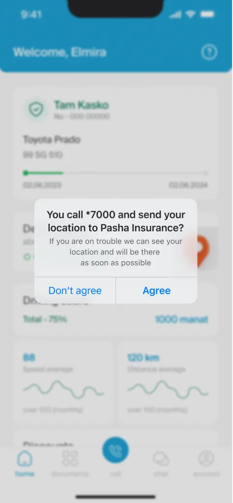
- Service during an incident was the top reason respondents gave for choosing an insurer, ahead of price. Yet those who had been through one described the same scene: both cars blocking the road, traffic building, and nobody able to move until someone from the insurer arrived.
- Interviewees added the texture. They wanted fewer documents, faster and more flexible help, and a way to send evidence from the scene instead of standing beside a damaged car waiting for staff and police.
What I Changed
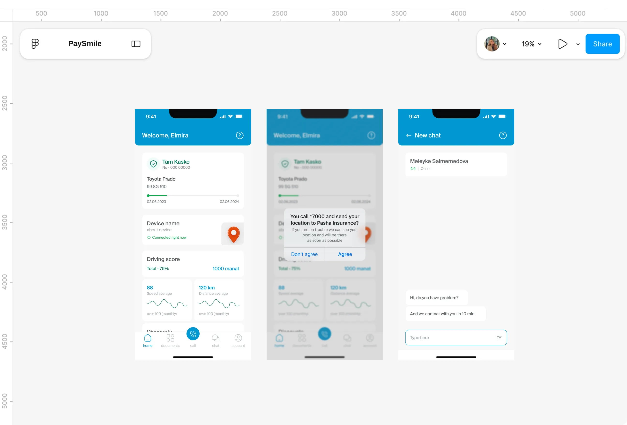
- An emergency call sits raised in the centre of the navigation, reachable from every screen. One tap confirms the call and shares the driver's location with PASHA straight away, so there is no number to search for and no address to explain.
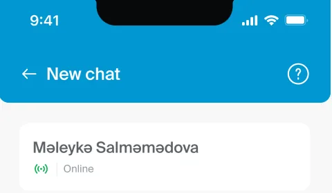
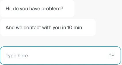
- Chat accepts photo, video and PDF, which lets drivers document the scene while it's still fresh and clear the road sooner. The car's documents already live in the account, so nothing needs to be dug out of a glovebox with traffic waiting behind.
Price
Pain Points
- Kasko came up as poor value again and again. Among the interviewees, one dropped it for financial reasons, another felt it wasn't worth it for a low value car, and a third said paying a full year upfront with no claim felt like money thrown away.
- The problem framing pointed the same way: high price, and customers expecting a personal approach rather than one rate for everyone. Careful drivers were paying exactly what careless ones paid.
What I Changed
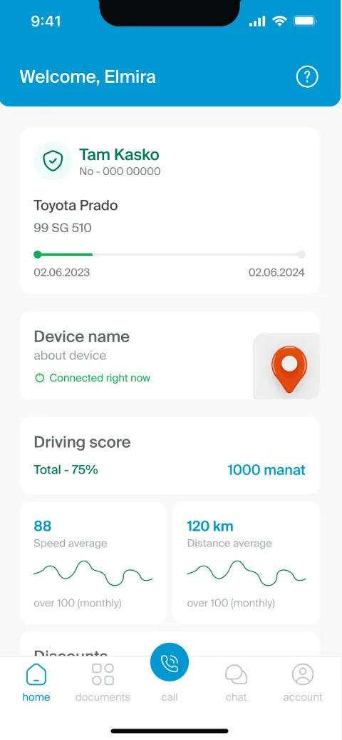
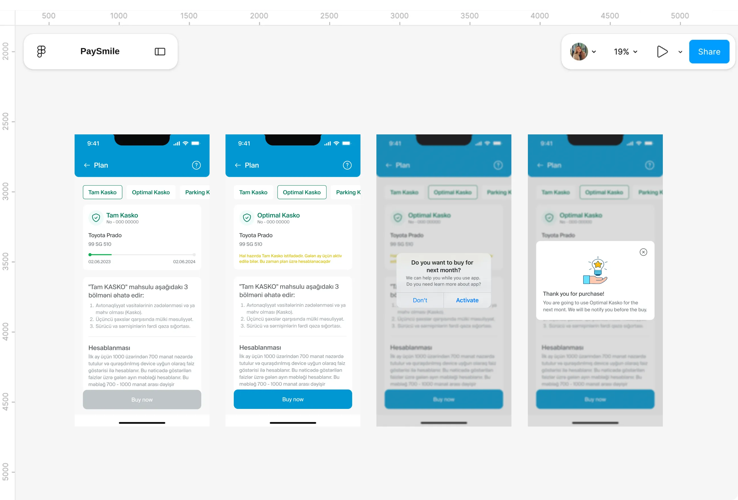
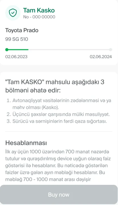
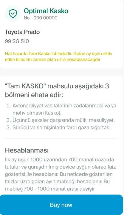
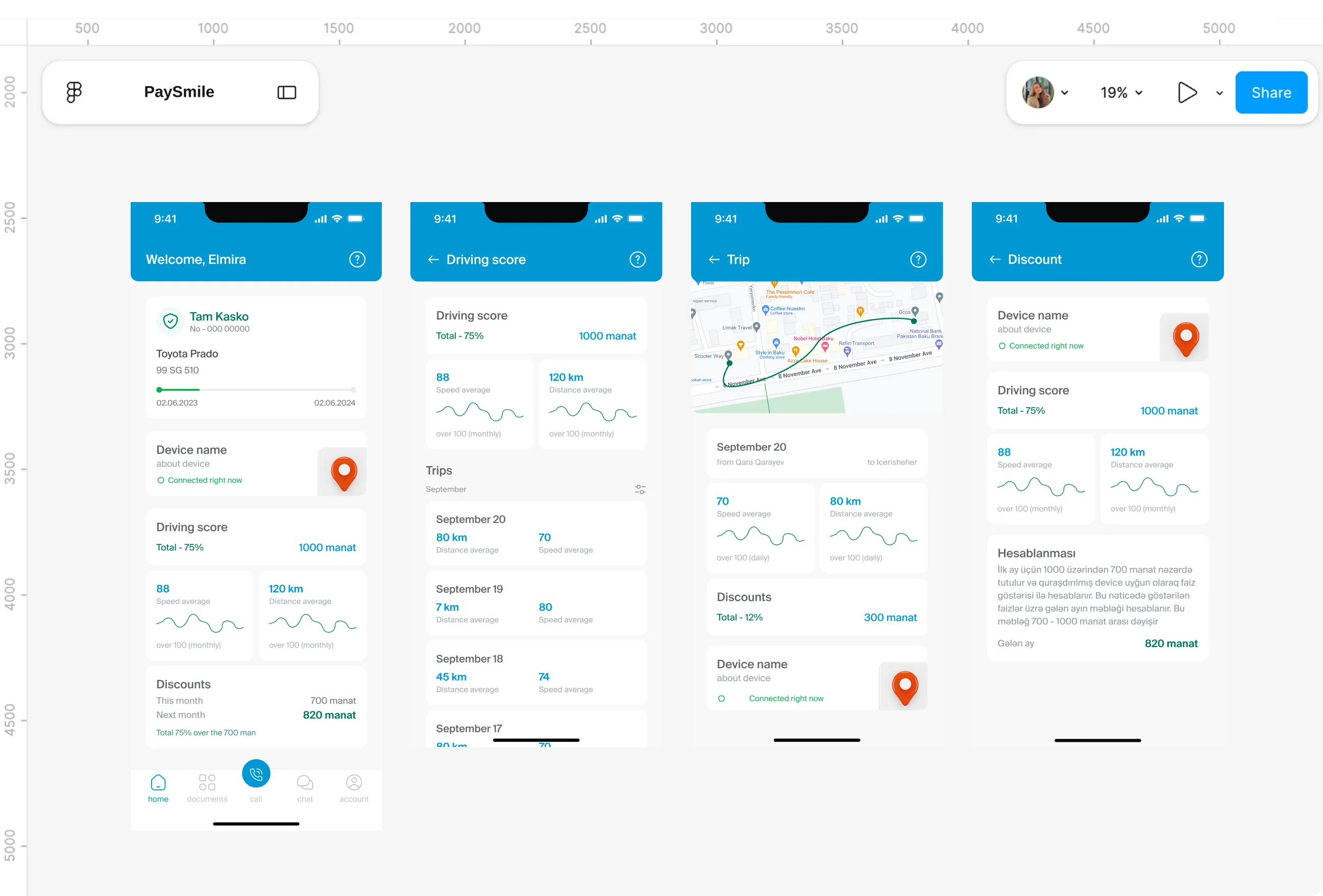
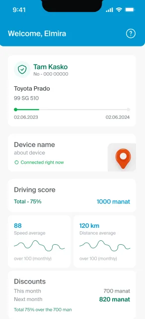
- Price now follows how people actually drive. The first month is 700 out of a possible 1000 manat, and later months move between those two figures depending on the driving score, so a careful week turns into real money.
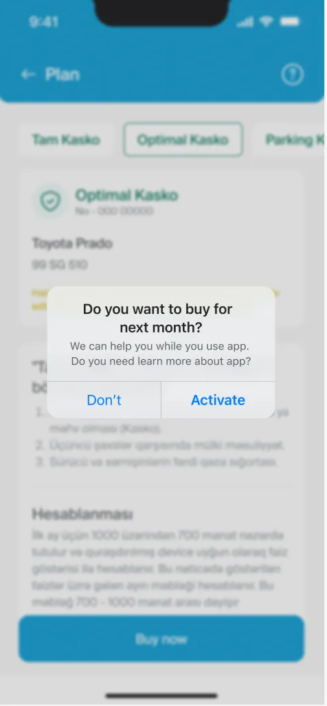
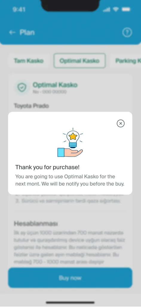
- Home shows this month's discount next to an estimate for next month, which gives drivers a target rather than a bill. Three tiers, Tam, Optimal and Parking Kasko, cover different needs, and switching takes effect from next month after a clear confirmation.
Trust in the price
Pain Points
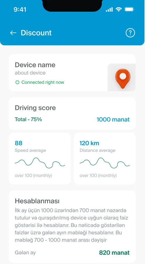
- A price that changes every month only works if people believe it. Three of the four interviewees called risk-based pricing fair, but that trust depends on seeing how the number is reached, not just being told it.
- Car data raised its own concern. Nearly half the survey respondents said they don't read notifications, and some saw alerts about their car as a form of tracking, so pushing scores at them would have damaged trust rather than built it.
What I Changed
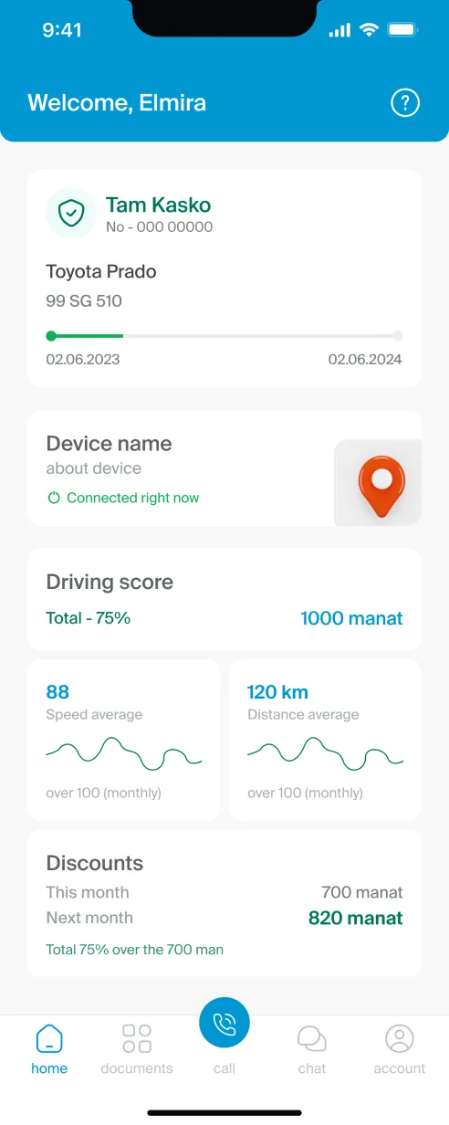
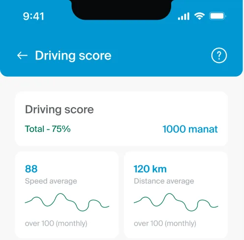
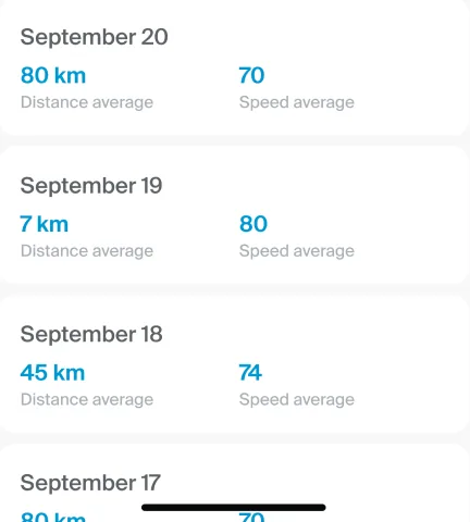
- The score lives inside the app, where drivers choose to look, instead of chasing them through push alerts. Each month breaks down into trips by date, and every trip opens to a route map, average speed, distance and the discount it earned.
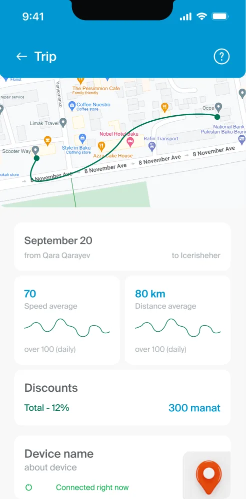
- A dedicated screen walks through how the monthly amount is calculated, step by step. Privacy settings sit in the account, which keeps control over the data in the driver's hands rather than hidden somewhere they'd never find it.
App awareness
Pain Points
- Almost three quarters of survey respondents didn't know their insurer had an app, and none of the four interviewees used one, relying on the website or the call centre instead. For most drivers, opening Paysmile would mean using an insurance app for the very first time.
- That first minute carries a lot of weight. Faced with an unfamiliar idea like usage-based pricing and then a long registration form, a new user would likely close the app and pick up the phone, just as they always had.
What I Changed
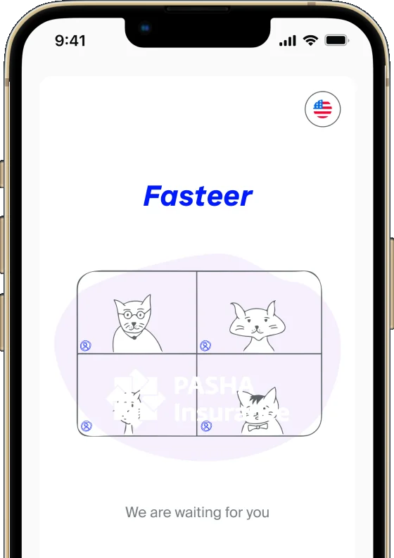
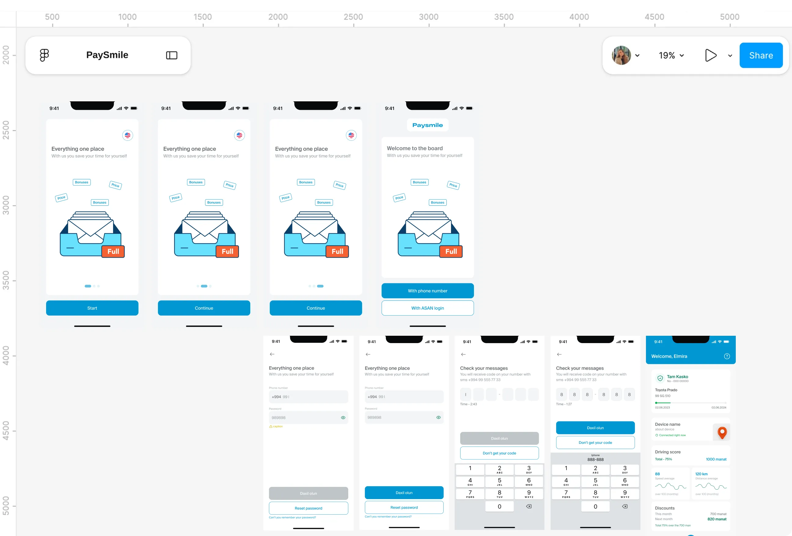
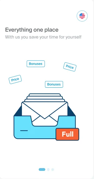
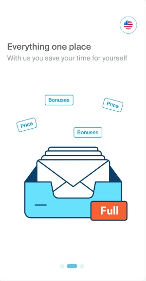
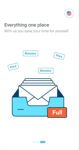
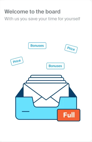
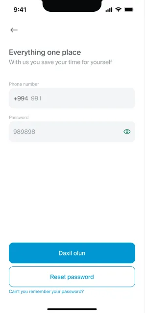
- Three onboarding screens introduce the app through one simple message, everything in one place, with a promise of saving time before any form appears. Progress dots show how far along people are, so the introduction never feels open-ended.
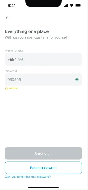
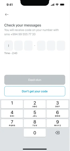
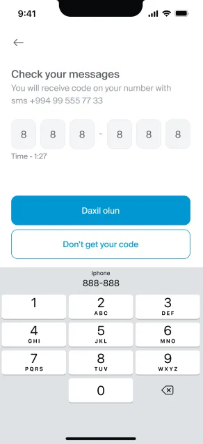
- Sign in then comes down to a single choice, phone number or ASAN login, followed by an OTP. There's no sign up, since the app builds on an existing PASHA profile, and tips on Home guide first time users once they're inside.
Car history
Pain Points
- A car's service record usually lives in scattered receipts and memory. When something goes wrong, proving how well it was looked after is almost impossible, and honest owners get no credit for their care.
- Two interviewees raised this independently, both asking for a shared, Carfax style record where services and repairs are logged with the owner's consent. The journey map pointed the same way, showing how much time was lost verifying documents after an incident.
What I Changed
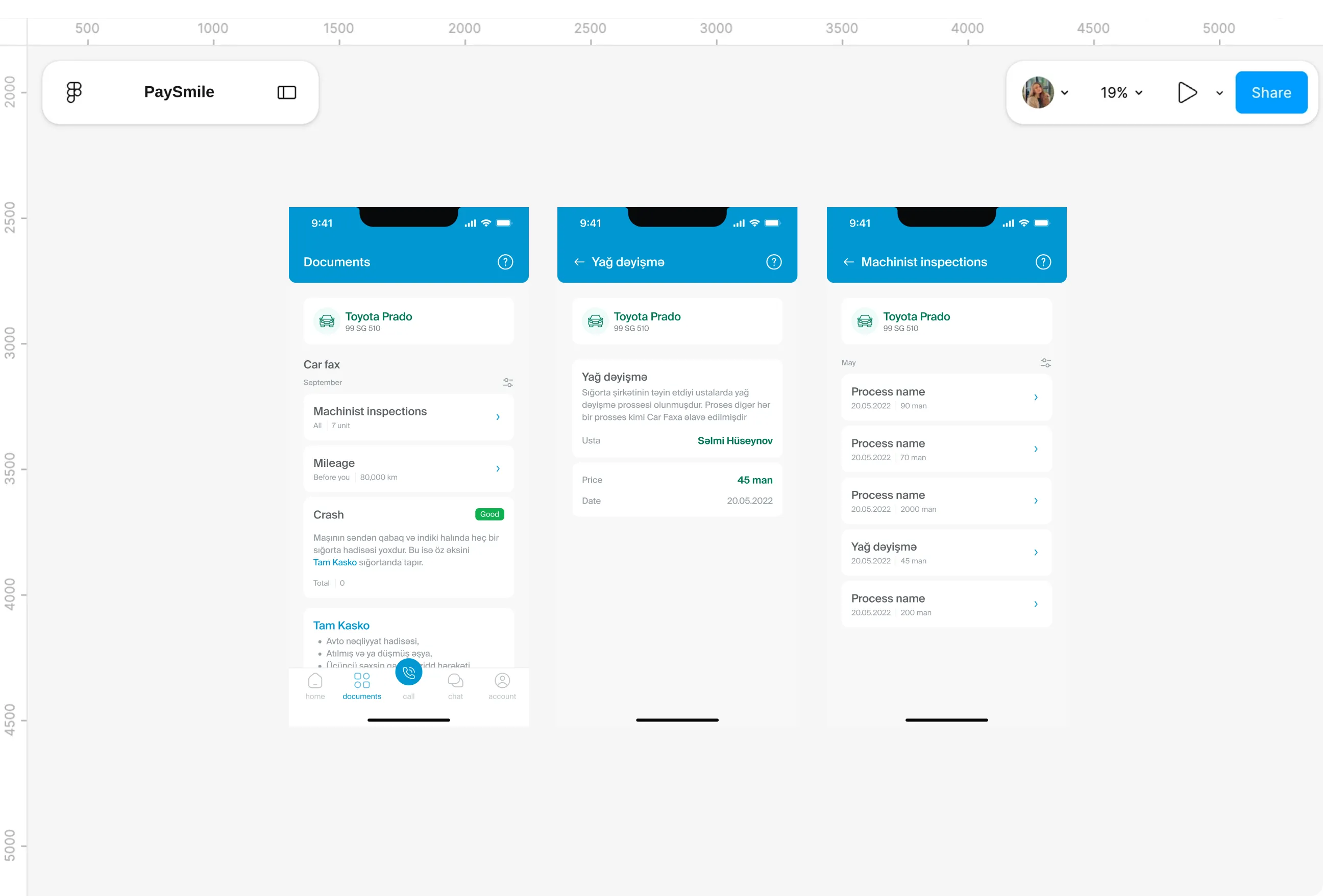
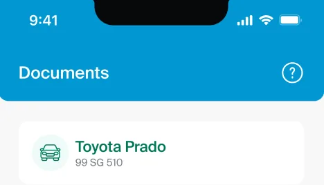
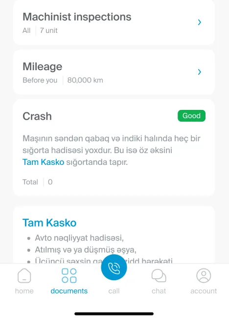
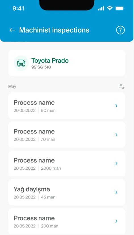
- A Car fax section inside Documents gathers that history in one place: inspections with dates and prices, mileage, and crash records, all filterable by month.
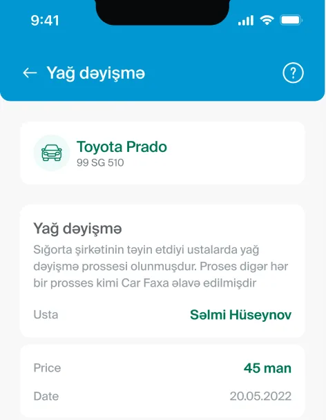
- Visits to insurer approved mechanics, like an oil change, are added automatically, so the record builds itself over time. A clean history becomes something the driver can show, not just something they claim.
Getting help
Pain Points
- Too little help was available digitally, so questions ended up on the phone, and calls dragged on. Interviewees described being passed between numbers on a hotline, and wishing for help that was faster and asked for fewer documents.
- Better customer service ranked among the top things survey respondents wanted from an insurer. The gap wasn't willingness to help, it was the channel.
What I Changed
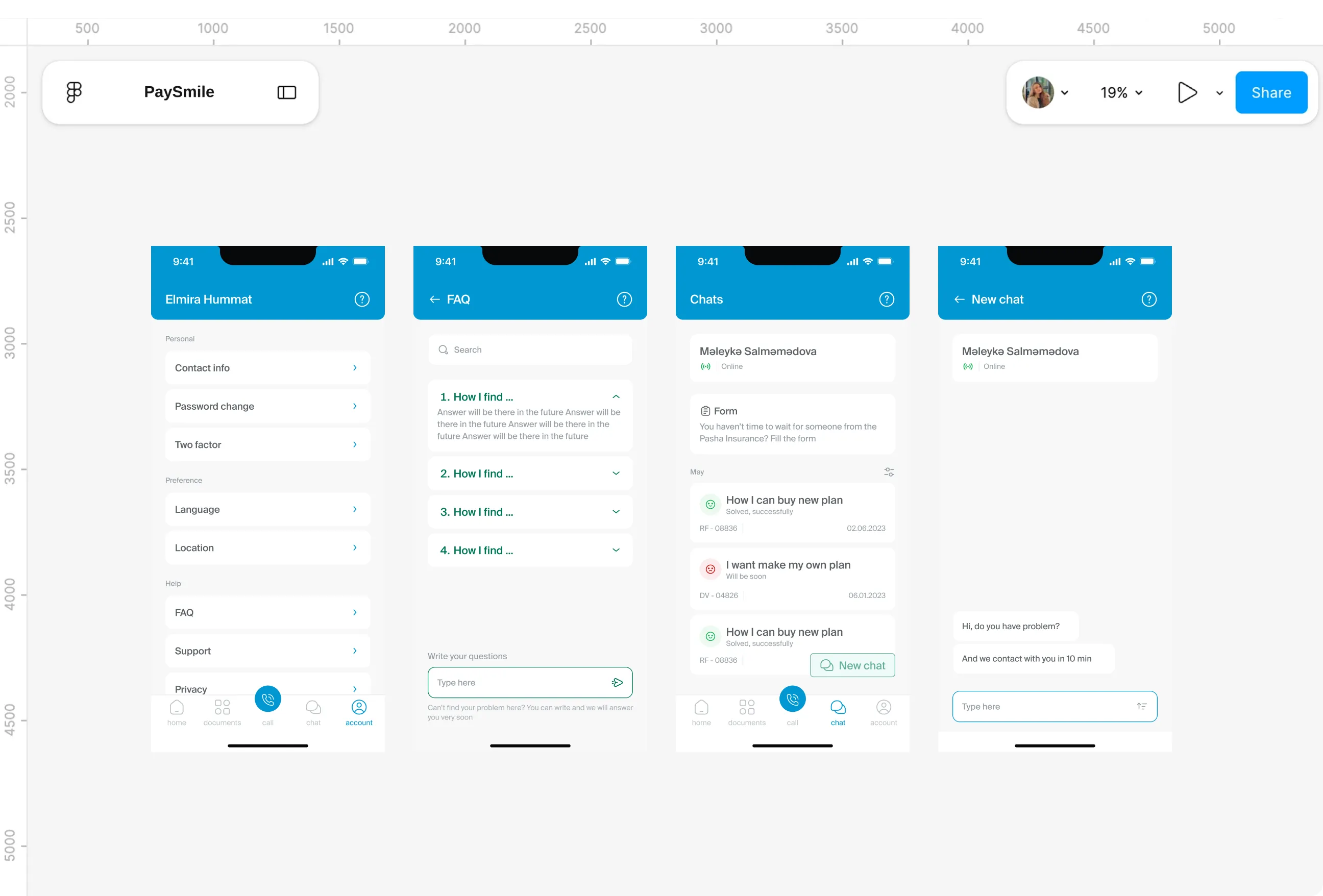
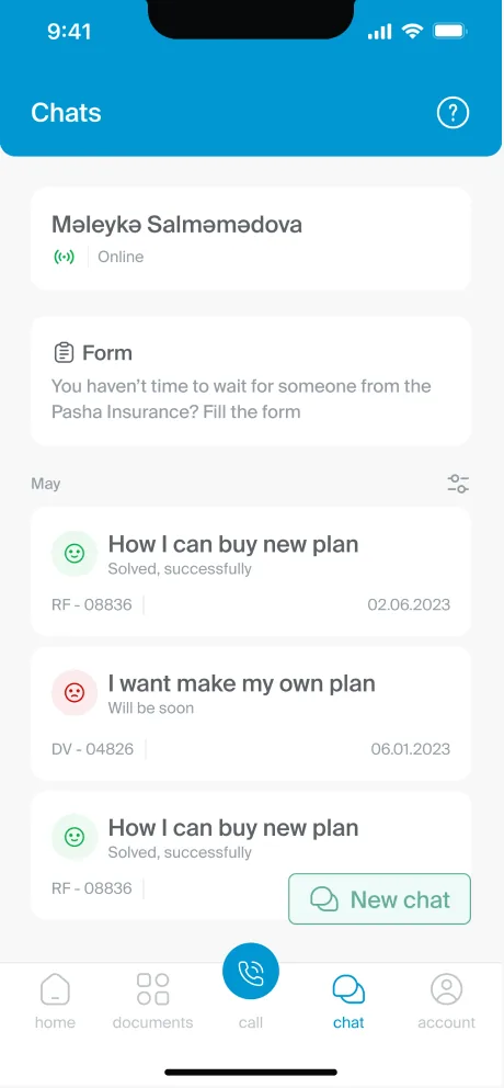
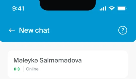
- Chat becomes the first stop, with an online agent and a promise of contact within ten minutes. For drivers who can't wait at all, a form lets them leave the details and get on with their day.
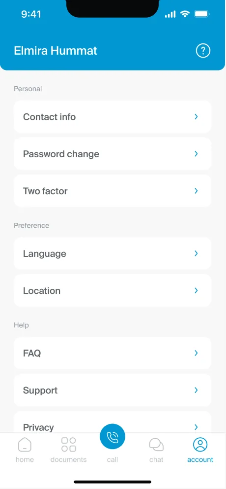
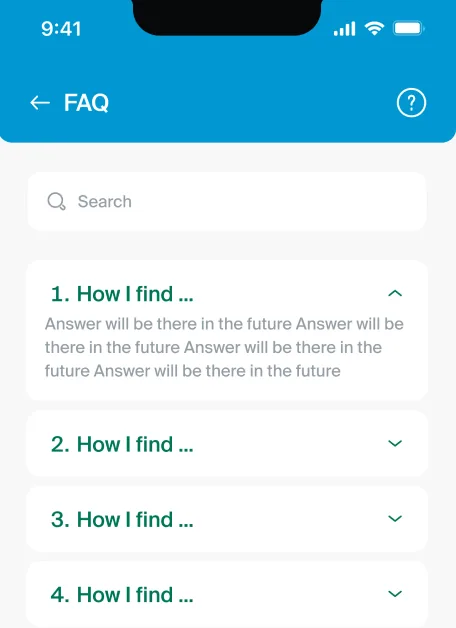
- Past requests carry status tags and reference numbers, so nobody has to explain the same problem twice. A searchable FAQ answers the common questions, and new ones can be sent from the same screen.
IA
Pain Points
- The research left a long list of features: plans, scores, trips, car history, chat, documents, settings and an emergency call. All of it had to fit onto a phone without turning into a maze.
- The emergency call mattered most, and it was also the easiest thing to lose inside a menu. In a stressful moment, nobody should have to hunt for it.
What I Changed
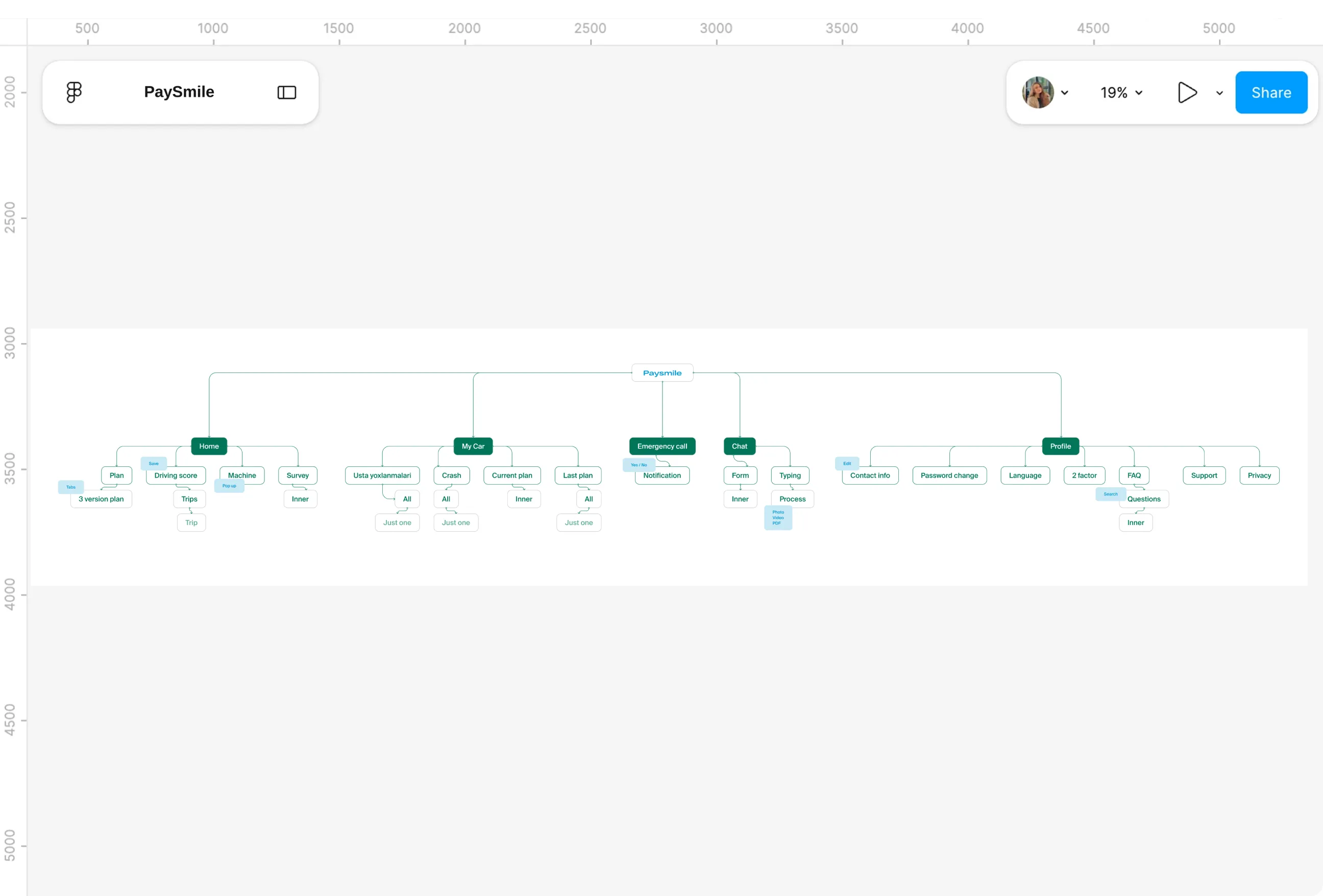
- Everything is grouped into five sections: Home, My Car, Emergency call, Chat and Profile. The emergency call sits in the centre of the bottom navigation, raised above the rest, so it's always one tap away.
- Everyday items like plans and driving score stay on Home, where people look first. Settings, FAQ and support sit quietly in Profile, available when needed but out of the way.
User flows
Pain Points
- Before any screen existed, the key tasks had to hold together as complete journeys. A missing step at this stage becomes an expensive fix once screens are drawn.
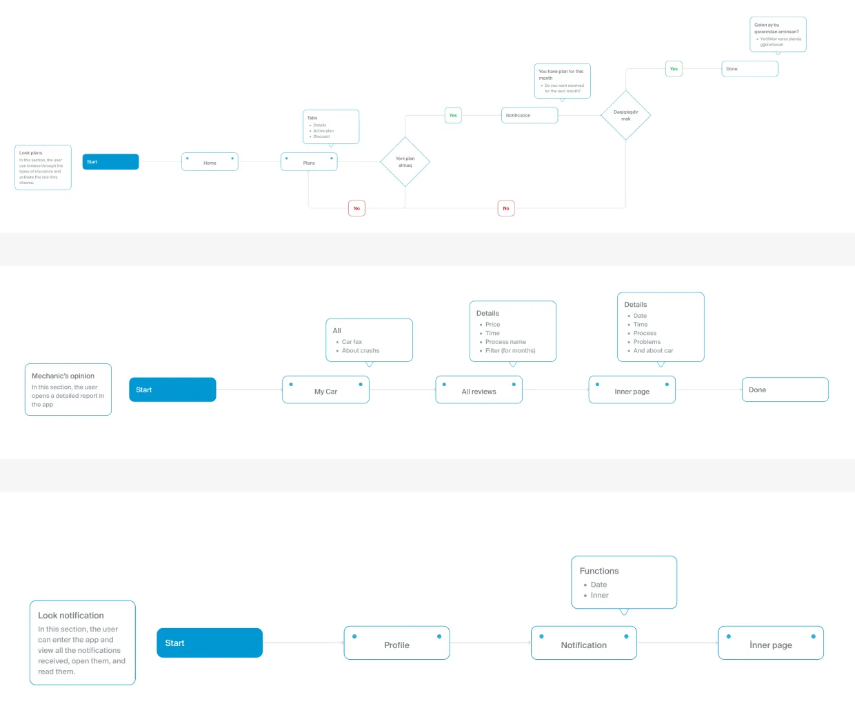
- Plans were the trickiest case. Because a plan is always active for the current month, changing it couldn't simply mean buying a new one, and returning users, OTP codes and permissions each needed their own branch too.
What I Changed
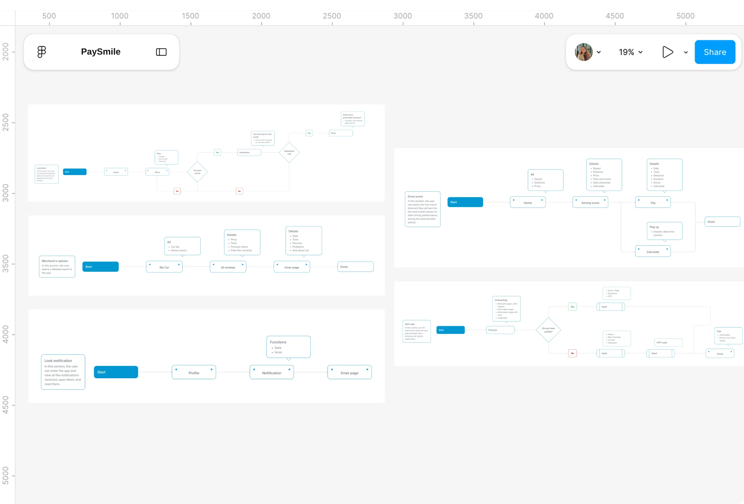
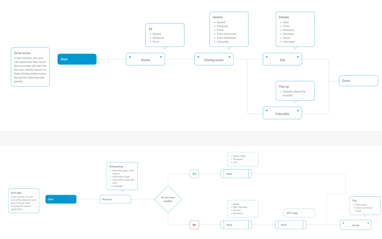
- Five flows mapped the core journeys: starting the app, checking the driving score, viewing plans, reviewing car history and reading notifications. A shared legend of starts, decisions, inputs and pages kept each one readable at a glance.
- The plan flow handles its tricky case directly. A new plan is saved for next month, and a confirmation asks whether the driver is sure before anything changes.
Wireframes
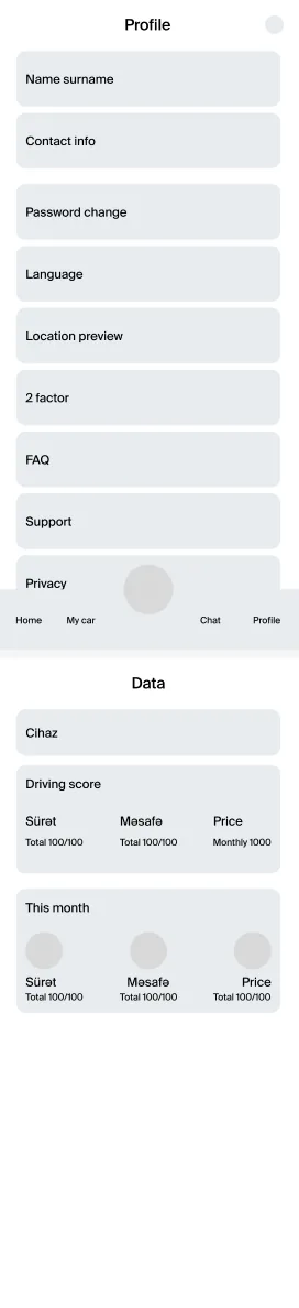
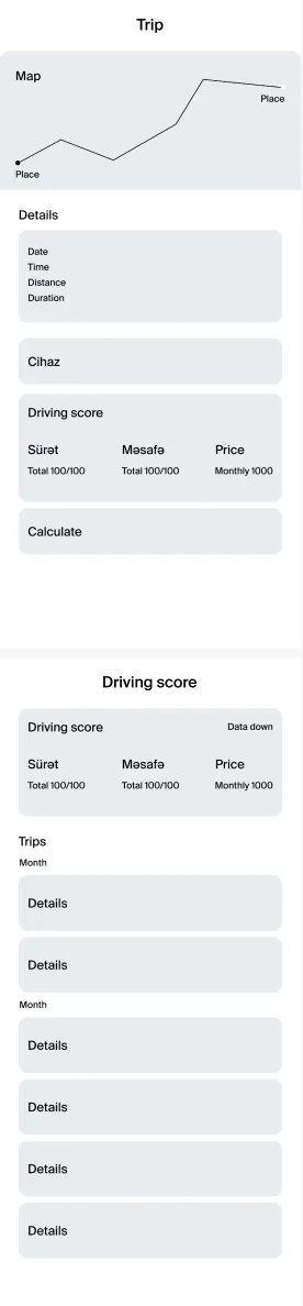
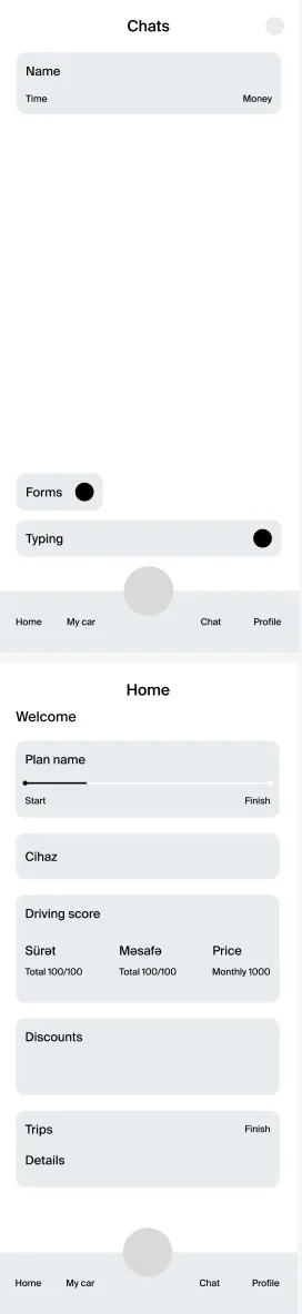
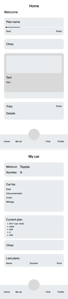
Pain Points
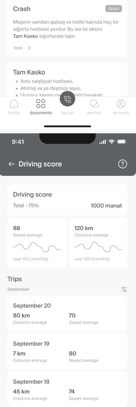
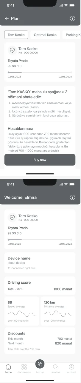
- With a week in total, layout and hierarchy had to be settled fast, before colour or imagery could distract from the structure. Home alone had to carry the policy, the device, the score, discounts and trips.
- Get the order wrong, and the information people open the app for ends up buried under everything else.
What I Changed
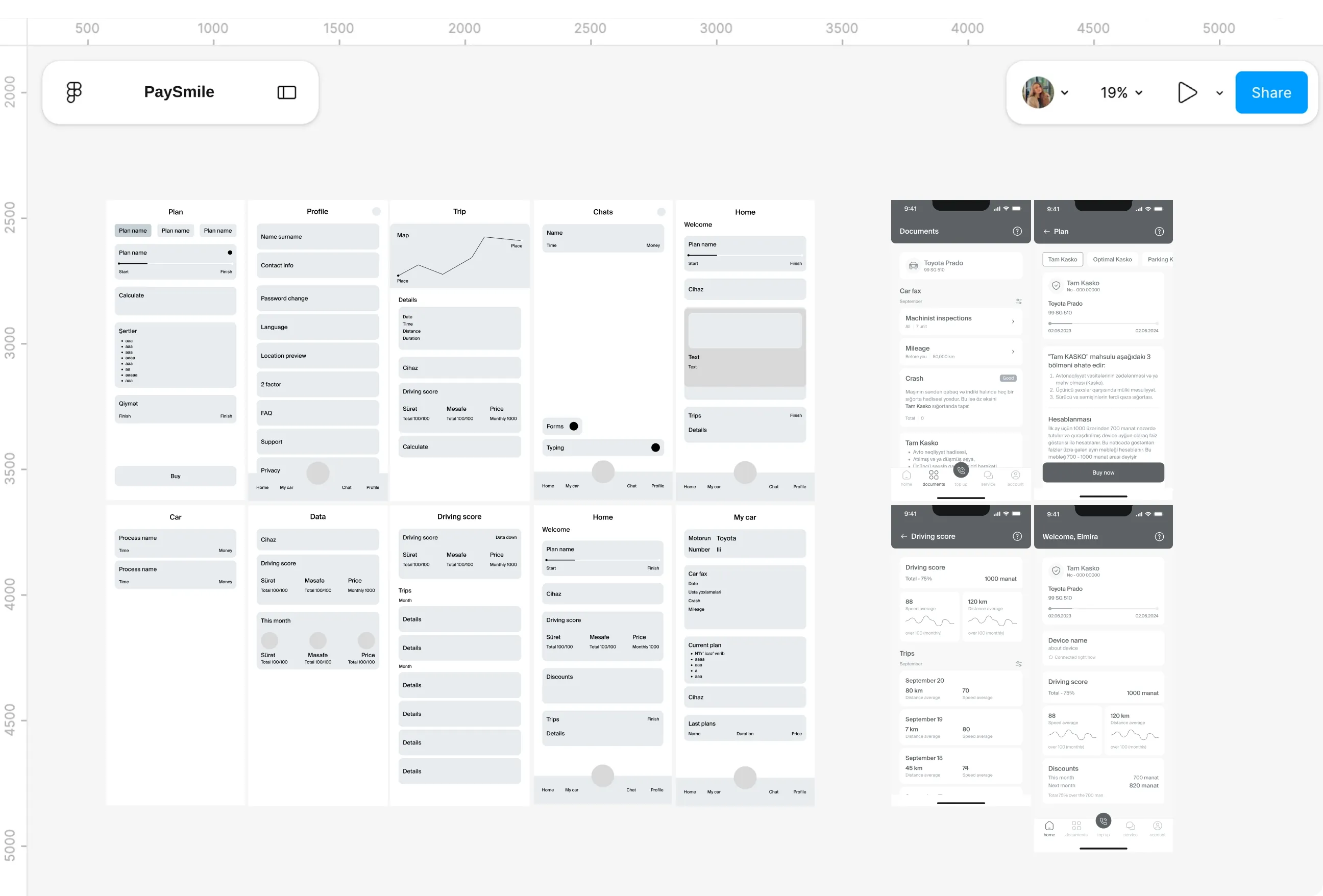
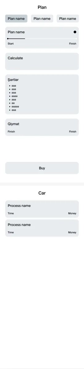
- Ten low fidelity screens came first, built from boxes and placeholder text at 390 by 844. They showed early on that Home, My Car, Chats and Profile could share one bottom navigation with a raised centre button.
- About 30 high fidelity frames followed, adding the states around each screen. Password errors, plan change alerts and thank you confirmations were designed properly rather than left as afterthoughts.
Wireflow
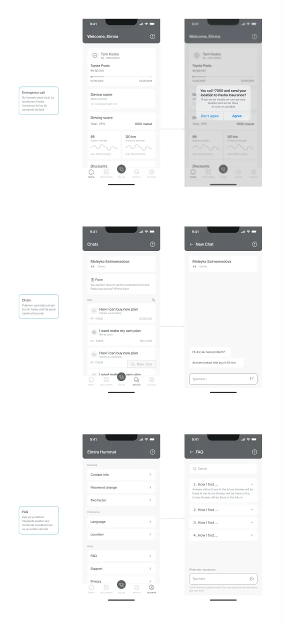
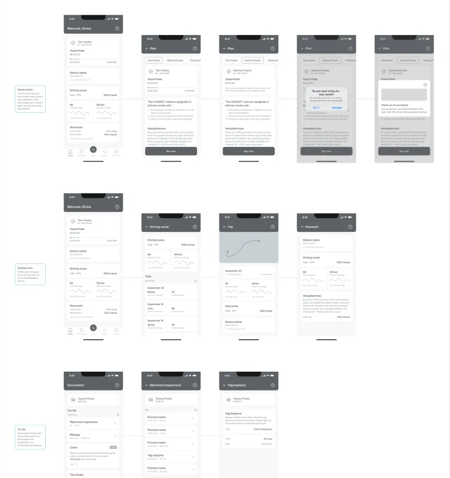
Pain Points
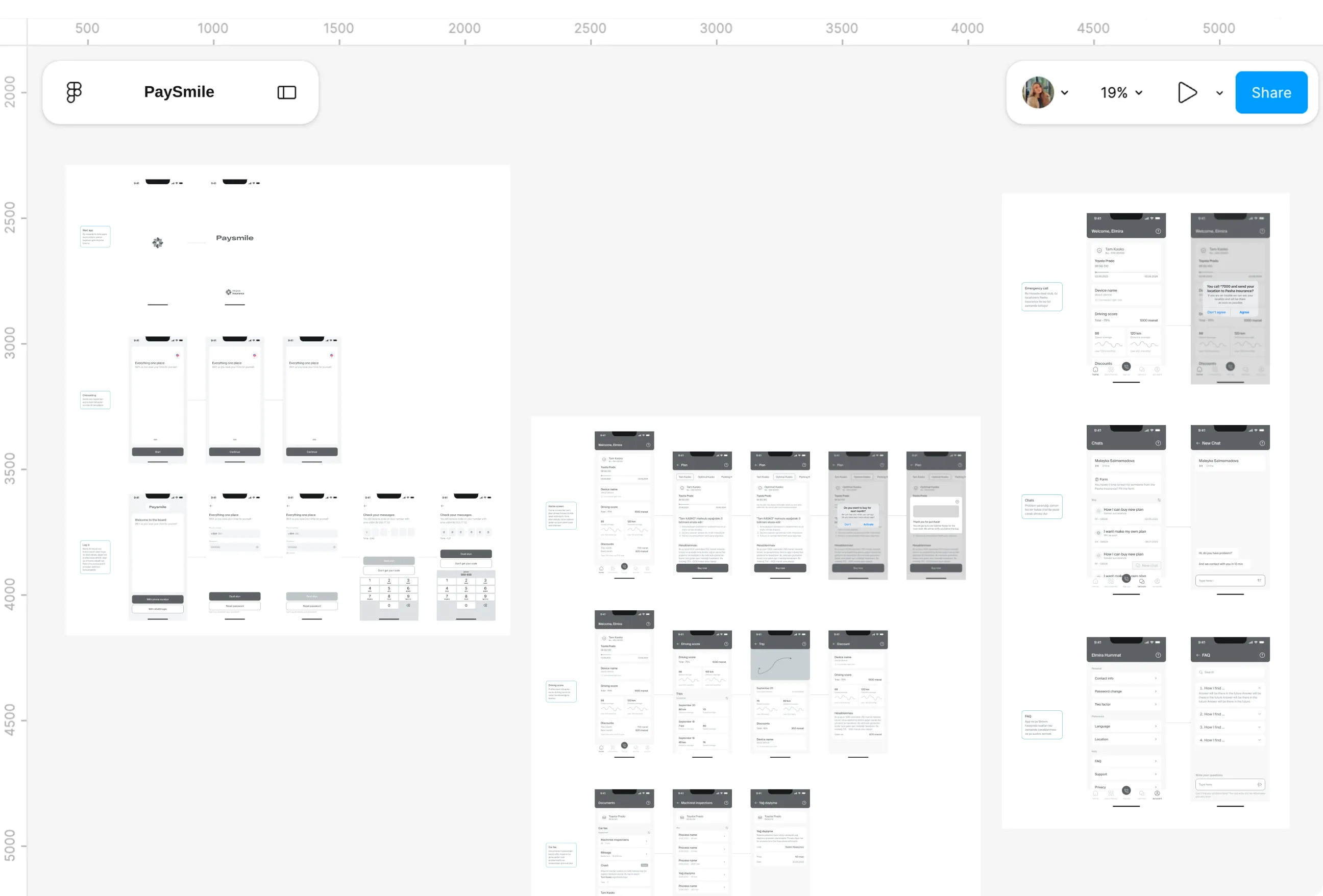
- Screens on their own don't prove that a journey works. A flow can look fine frame by frame and still break in the gap between two of them.
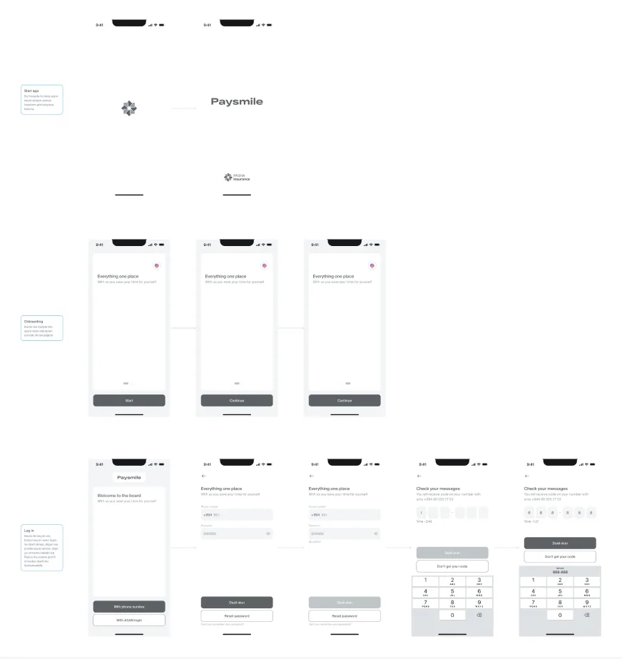
- This was also the point to test the assumptions behind entry, from the very first logo to signing in, before calling the design finished.
What I Changed
- Every high fidelity screen was linked into one wireflow, with a short scenario beside each row describing what the user is trying to do. Nine scenarios ran from the opening logo through onboarding, driving score, Car fax, emergency call, chat and FAQ.
- Walking it end to end confirmed that sign up wasn't needed, since the app only works with an existing PASHA profile. ASAN login or a phone number was enough, which kept the path into the app as short as possible.
Design System
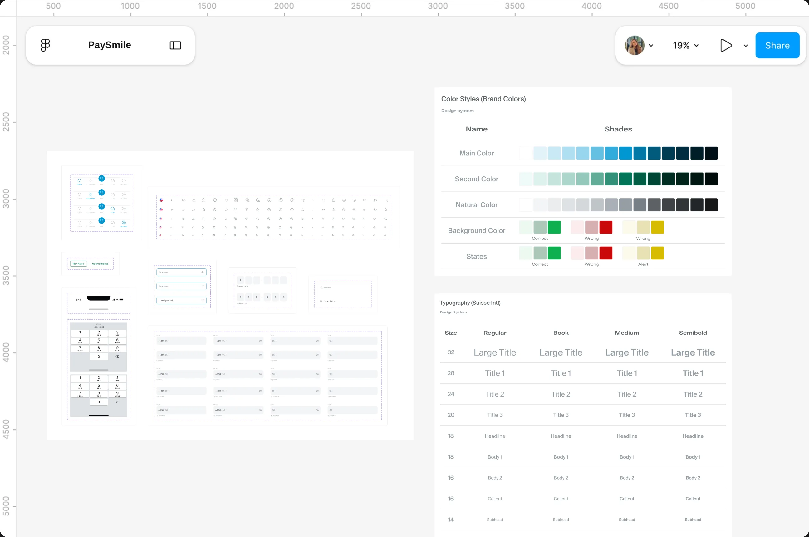
The design system keeps the app consistent and close to the PASHA Insurance brand. Colours, typography and reusable components were defined early, so every screen shares the same look and new screens are quicker to build.
Role and Working Context
I designed Paysmile alone in about a week, as the take-home task in PASHA Insurance's application process. I covered everything myself, from naming and research to the final UI and design system.

-
Discover
I started by listening to drivers. A survey of 11 drivers and four one to one interviews showed how people choose an insurer and what goes wrong after an accident. I also mapped 27 stakeholder groups to see who a usage-based product would affect.
I listened to drivers first: a survey of 11 and four interviews showed how people choose an insurer and what goes wrong after an accident, plus 27 stakeholder groups mapped.
-
Define
The findings came together in two personas and an accident journey map. From these, three problems stood out: Kasko felt unfair on price, help after an accident was slow, and most drivers didn't know their insurer had an app.
The findings became two personas and an accident journey map, pointing to three problems: unfair pricing, slow help after an accident, and low app awareness.
-
Design
I grouped the features into five sections, with the emergency call at the centre of the navigation. Five user flows came next, then ten low fidelity screens and about 30 high fidelity frames, all linked into a wireflow to check that every journey held together.
Five feature sections with the emergency call at the centre, five user flows, ten low-fidelity screens and about 30 high-fidelity frames, linked into one wireflow.
-
Deliver
The final UI brought everything onto the PASHA brand, supported by a design system of colours, typography and reusable components. I presented the whole project as an 18 slide Figma deck, covering both the UX and UI sides of the brief.
The final UI landed on the PASHA brand with a full design system, presented as an 18-slide deck covering both UX and UI.