Pasha Insurance OJSC
Mobile App Design
Overview
As the sole product designer on PASHA Insurance's mobile app (297,000+ customers), I redesigned sign-in, buying, claims and doctor booking. Sign-up dropped from about ten steps to one or two, and more customers completed purchases and renewals.
Context
PASHA Insurance's app had grown to cover four insurance lines but was hard to navigate and hard to trust: long flows, unclear coverage, and simple questions that ended up as phone calls.
Design Approach
I started by mapping the riskiest journeys, including every path and failure point, and kept the familiar structure so existing customers wouldn't be disoriented. I then built a shared design system so every screen stayed consistent.
Project Snapshots
These are the key results of the redesign, showing how the app became simpler, faster and easier to trust. Each figure reflects a real change in how customers use the product.Make coverage and claims clear, so customers can see what they get quickly, without a phone call.
Managing motor, property, travel and health cover in one regulated app
297K + active users
Less friction meant more customers finishing, with measurable revenue growth for the company.
Sign-up cut from ten steps to one or two. One tap with myGOVAZ, with the same path for citizens and foreign residents.
Remove friction from sign-in and buying. Fewer steps and fewer repeated checks, so fewer customers drop off.
7→3 fewer steps
Make coverage and claims clear
Let customers see what is covered and get help quickly, without picking up the phone.
More purchases, renewals and doctor bookings
50K+ monthly transactions
Make the app easy to navigate
Separate what customers already own from what they can buy, without disorienting people who knew the old layout.
-
297K +
active users
Managing motor, property, travel and health cover in one place.
-
7→3
fewer steps
Remove friction from signing in and buying.
-
50K+
monthly transactions
More purchases, renewals and doctor bookings.
Detailed Work
These are the main areas I redesigned to make the app simpler, clearer and easier to use. Each task tackled a real customer pain point and was built on one consistent design system.
Home
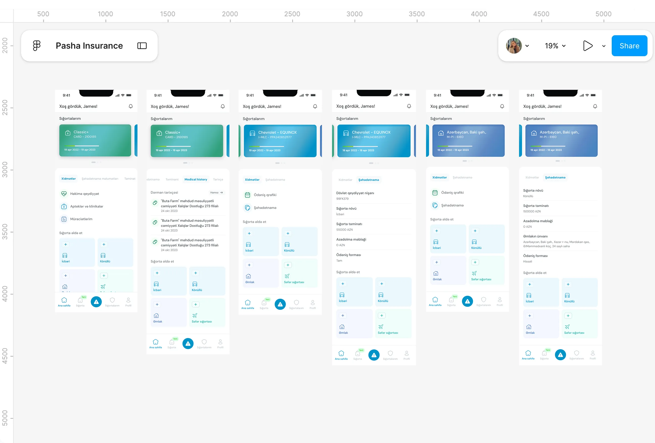
Pain Points
- The home screen conflated two different jobs, showing customers what they owned and what they could buy, on the same surface with no distinction between them.
- Certificate, coverage, history and claims were each tucked away separately, so there was no single place to get an overview. I was curious why, with four insurance verticals live, nobody had asked the more basic question: what does a customer actually come here to do?
- The added constraint was the existing user base. Many customers were older and comfortable with the current layout, which meant the fix had to feel like clarity, not disruption.
What I Changed
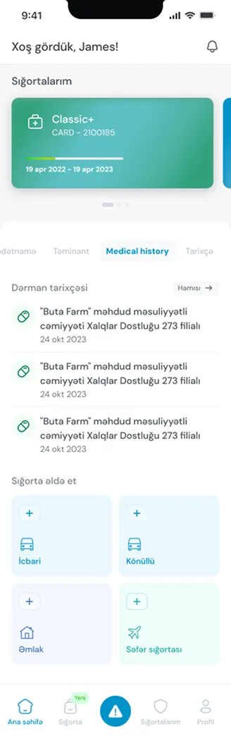
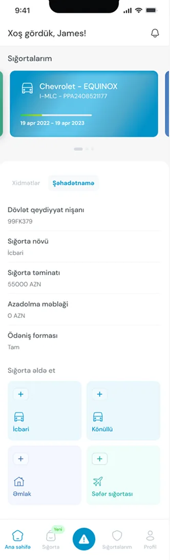
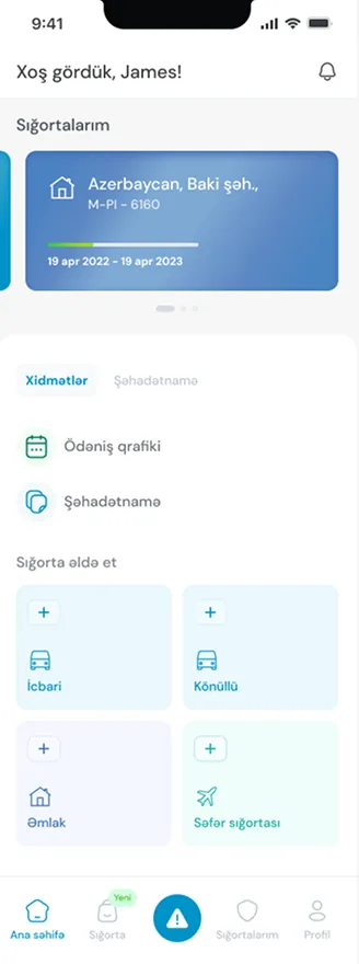
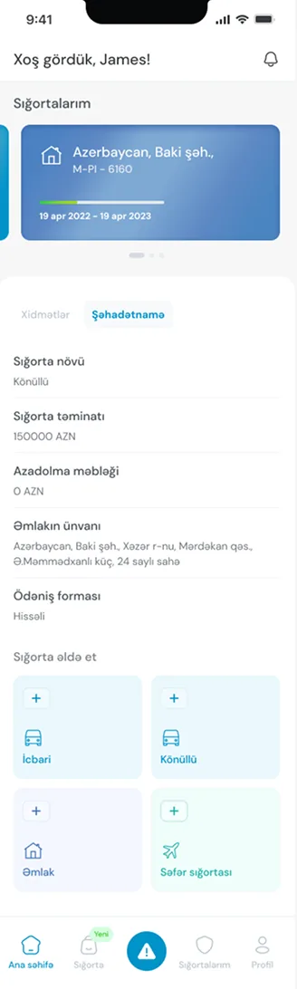
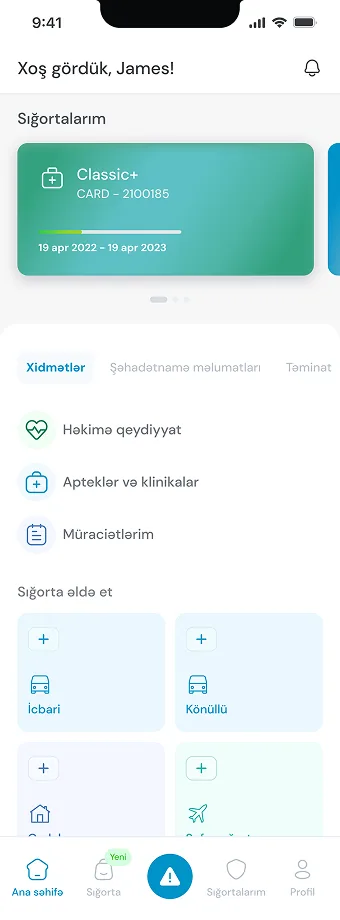
- I gave "Your Insurance" and "Get Insurance" their own spaces, with a dedicated entry point into package cards, so owning cover and browsing for more never sat on the same surface again.
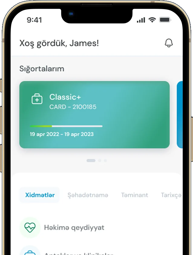
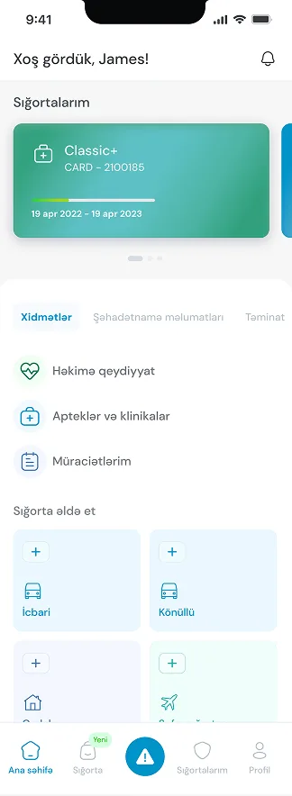
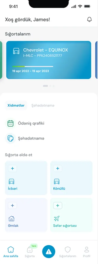
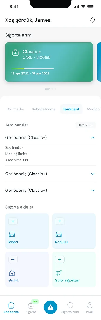
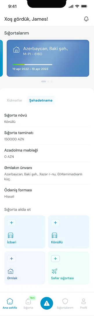
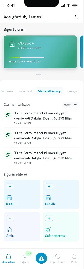
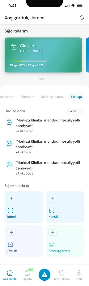
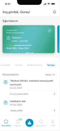
- For customers with more than one policy, I added a card carousel, one card per policy, with four tabs underneath, Services, Certificate, Coverage and History, so everything scattered across the app finally gathered around the policy it belonged to.
- The harder constraint was the same one from the pain point: an older customer base comfortable with the existing layout. So I kept the structure intact and put the effort into hierarchy instead, clearer headers, better grouping, a screen calm enough that nobody had to relearn where anything lived.
Certificates and coverage
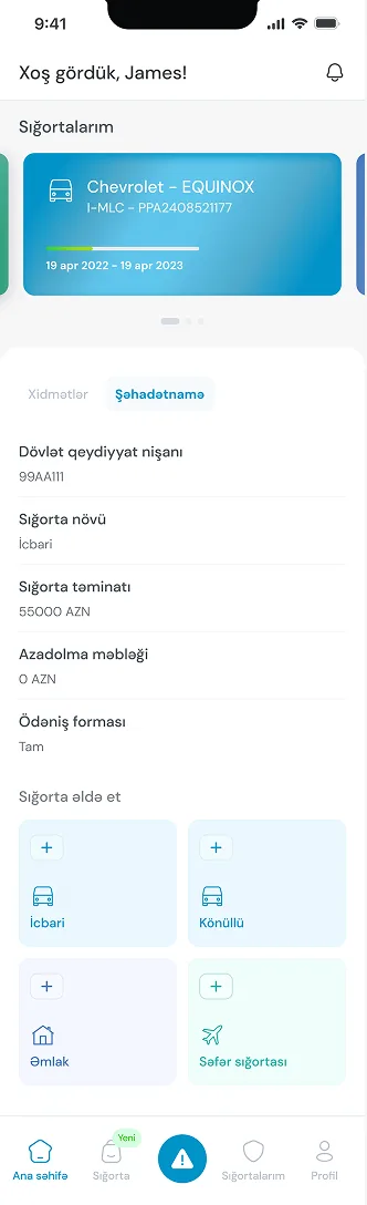
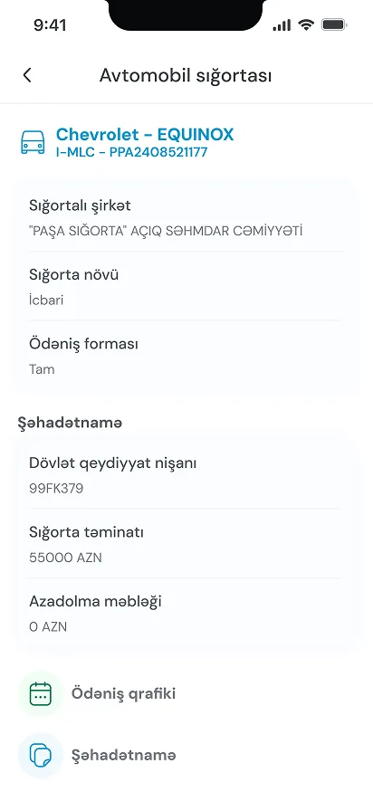
Pain Points
- I remember pulling up a customer's medical policy during a walkthrough and realizing I genuinely couldn't tell how much of their coverage they had left. The screen showed what the plan covered in general terms, but nothing about usage. If I couldn't answer that as the person who designed the screen, a customer definitely couldn't either.
- That's really what this whole problem came down to. Coverage existed as a static fact, covered or not covered, instead of something that moved as a person actually used their plan. Someone on a medical package had no way to see their balance the way you'd check a bank account, so the only real option left was calling and asking someone else to check it for them.
What I Changed
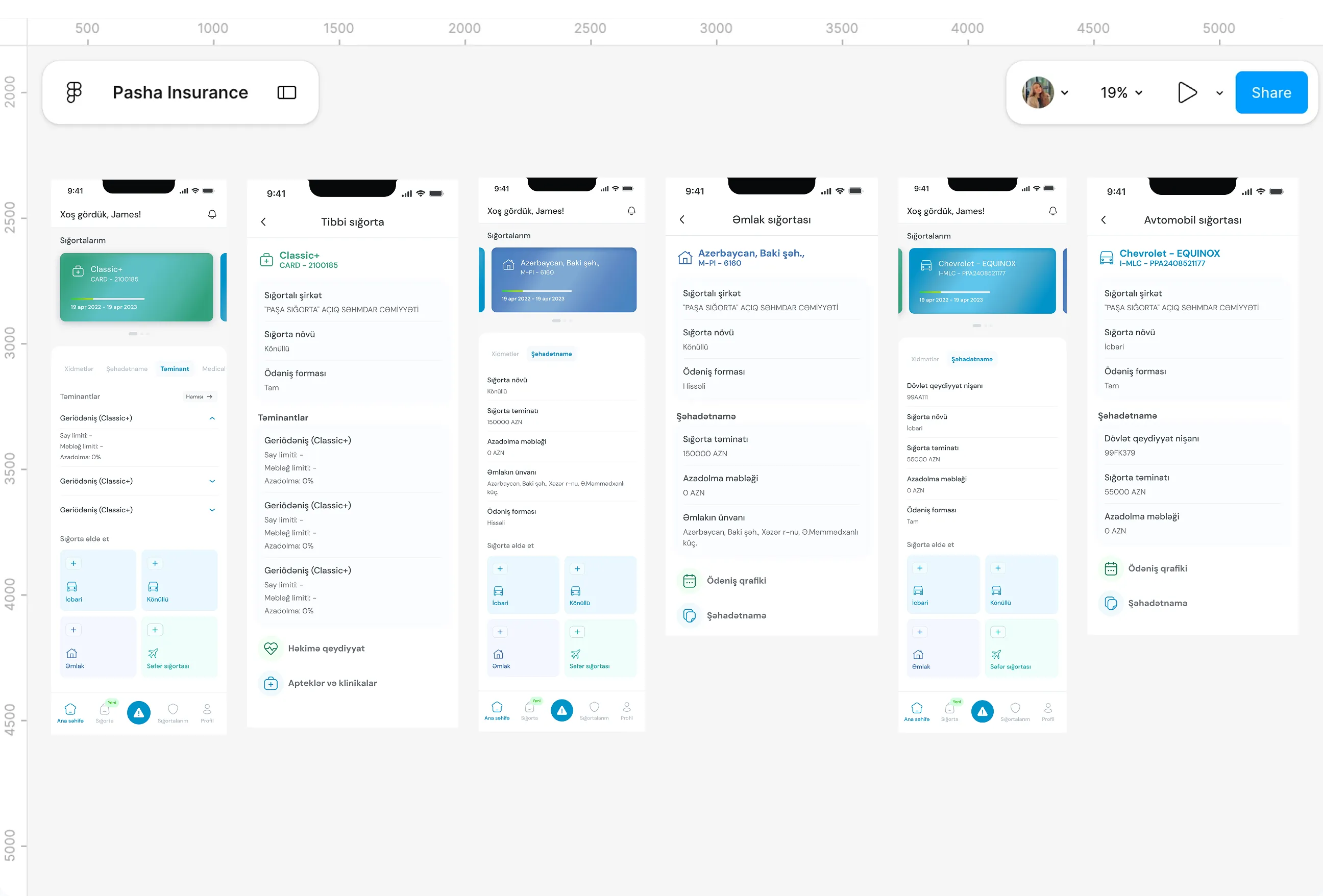
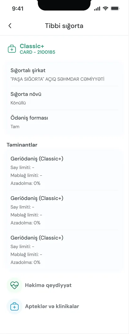
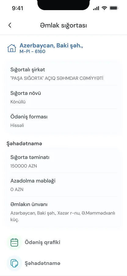
- The idea started with a simple question I kept asking myself. Why does a customer have to leave the home page just to understand their own coverage? So I brought it there directly, under two tabs I called Şəhadətnamə for the certificate and Tariflər for coverage, right where someone's already looking when they open a policy.
- Then came the part I actually cared most about, showing usage, not just terms. For someone on a medical plan, I added a history view with the total coverage, what they had already used, and what was left, laid out the same way I'd want to see my own account balance. It turned coverage from a document into something a customer could actually check on their own.
Medical and claims history
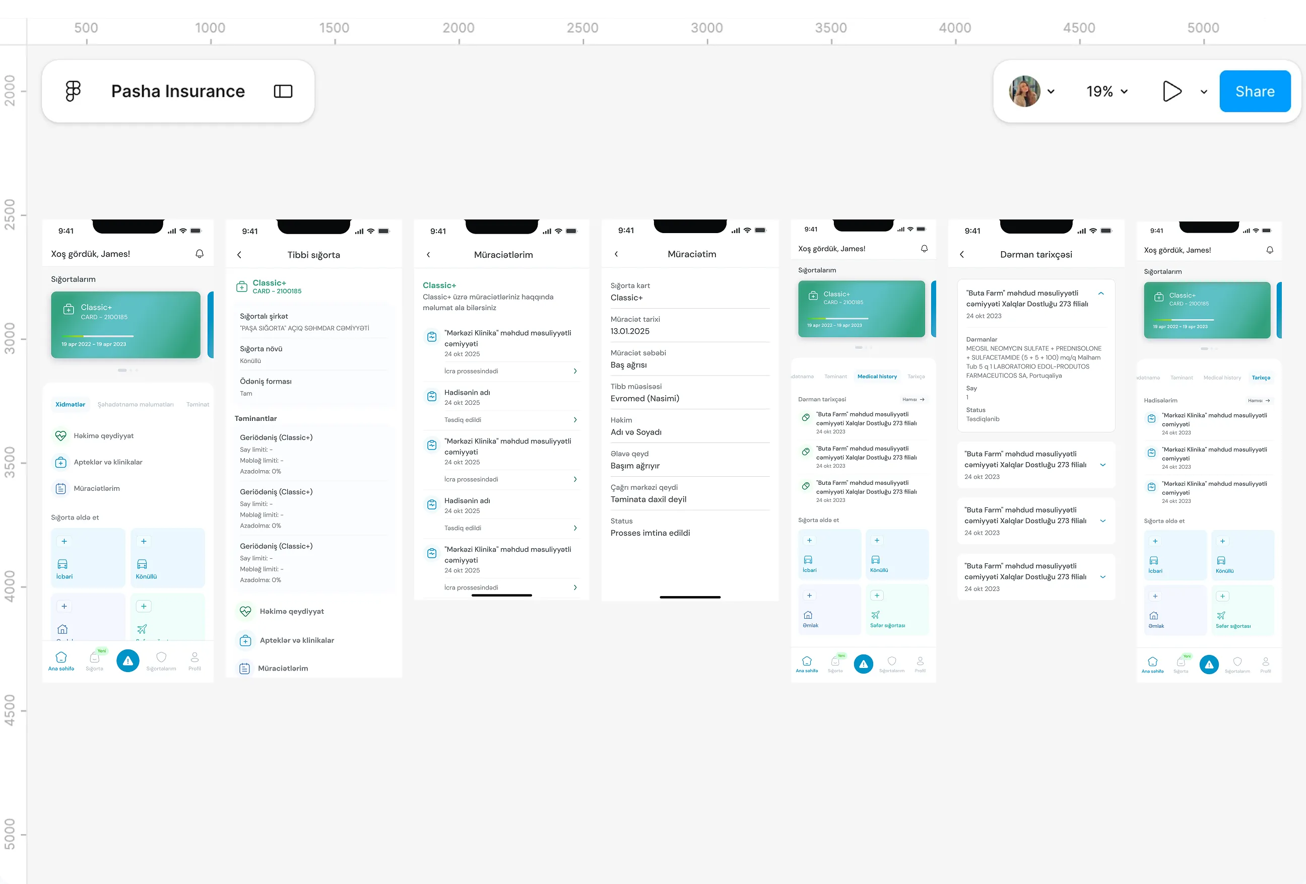
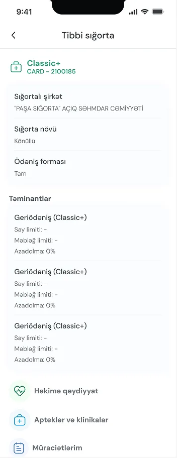
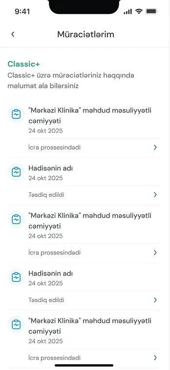
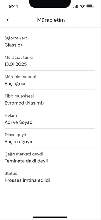
Pain Points
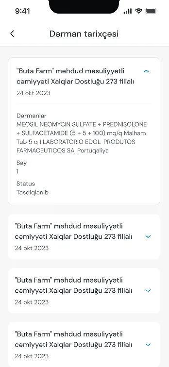
- I kept hearing the same kind of story when I talked to people about the app. Someone would go to a doctor, want to check whether the visit had actually been approved, and end up calling support just to get a yes or no.
- Same thing with past claims, if someone wanted to look back at what they'd submitted before, there was no way to just open the app and see it. It had to go through a person.
- That felt backwards to me. This is exactly the kind of information that should live quietly in an app, something you check in ten seconds without needing to explain yourself to anyone. Instead it was locked behind a phone call, which meant every routine question turned into a small piece of work for both the customer and whoever picked up on the other end.
What I Changed
- I wanted customers to be able to answer their own question without waiting on someone else to answer it for them, whether that was checking a claim from months ago or something as recent as yesterday's appointment.
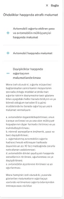
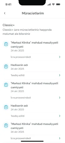
- So I built cards for both claims and medical history, cards a customer could tap into and see the full picture, what was submitted, what happened to it, when.
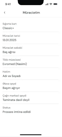
- The part that mattered most to me was the appointment status. If someone visits a doctor through their medical cover, they can now see directly in the app whether that visit was approved or cancelled, no calling, no guessing. It moved something that used to depend entirely on another person into something a customer could just check for themselves, whenever they wanted.
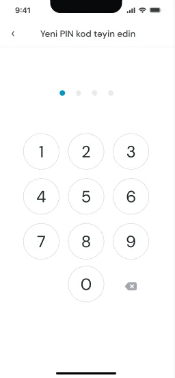
Login and sign up


Pain Points
- One conversation stuck with me early on, a colleague, working here, with health insurance through his employer, who had never once opened the app. But a single story isn't evidence, so I went looking for whether this was actually a pattern or just one frustrated person.
- Given how PASHA sits within a much larger group of companies, I had access to a wider pool than just our own customers, so I asked around across some of the other companies under the same umbrella. Foreign employees, people with insurance through their employer, people who technically had access to the product and had simply never used it. And I kept getting the same answer.
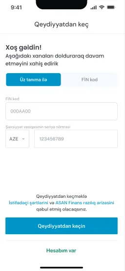
- Sign-up took roughly ten steps as it was, and if you weren't a local citizen, you were routed into a separate, longer branch asking for immigration details on top of everything else. Every single person I spoke to had either given up partway through or never attempted it at all. That was the moment this stopped being an anecdote and became a real problem worth solving properly.
What I Changed
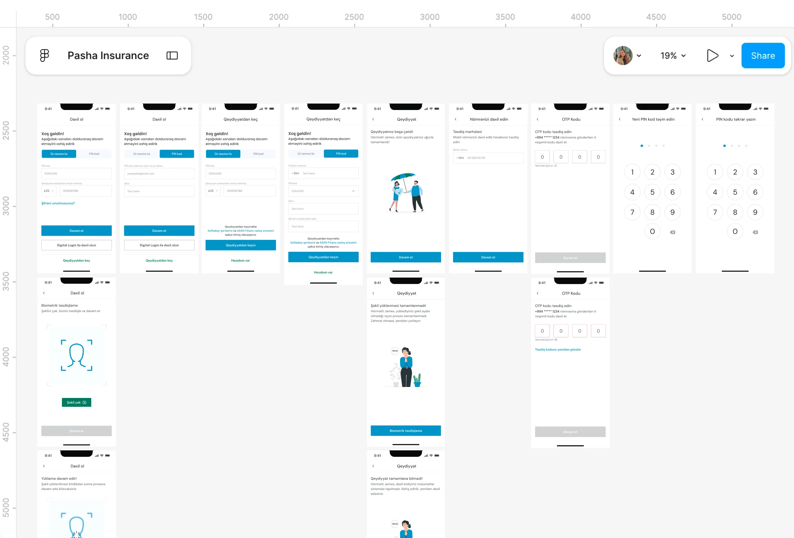
- Once I had enough of a pattern to trust it, the direction became obvious to me. This couldn't be fixed by trimming a step or two off an already long form, that would have just made a broken thing slightly less broken. I wanted to remove the form itself, and rethink what sign-up was even for.
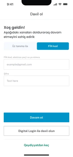
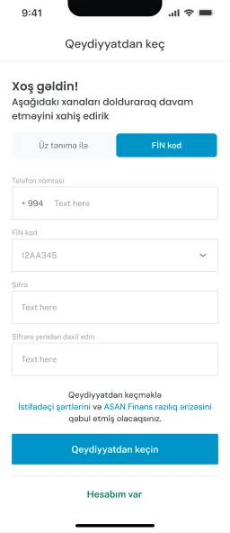
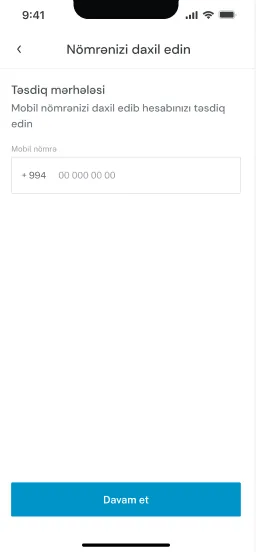
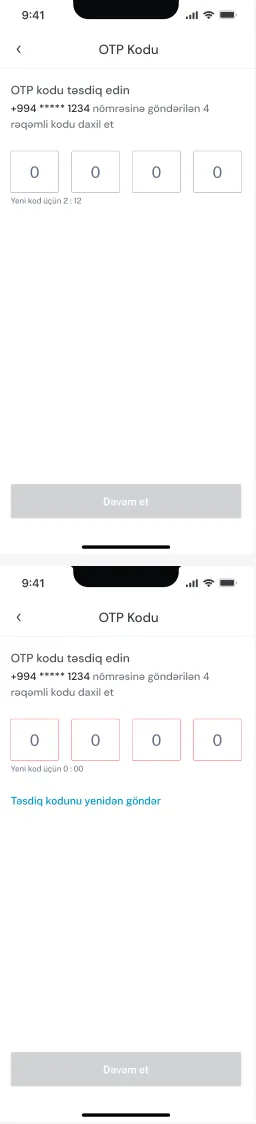
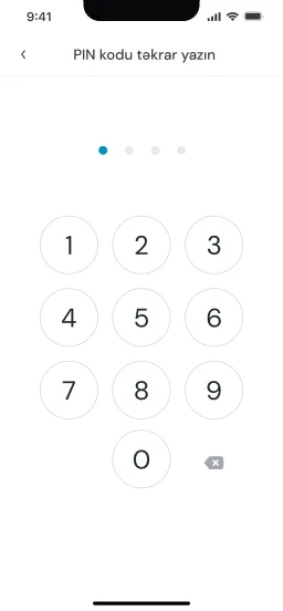
- So I rebuilt sign-in around myGOVAZ, the national digital ID already used across the country. One tap, a face or biometric check, and the profile fills itself in from there. No password, no separate branch for anyone based on citizenship, the same one or two steps for every single person going through it.
- What had been roughly ten steps, worse for an entire group of people who'd been quietly excluded by design, came down to one or two, identical for everyone. I kept the old login available for people who preferred it, but the real shift was structural. Nobody should be sorted into a harder path just because of where they're from, and this was the fix that actually held up once I checked it against more than one person's experience.
CASCO purchase

Pain Points
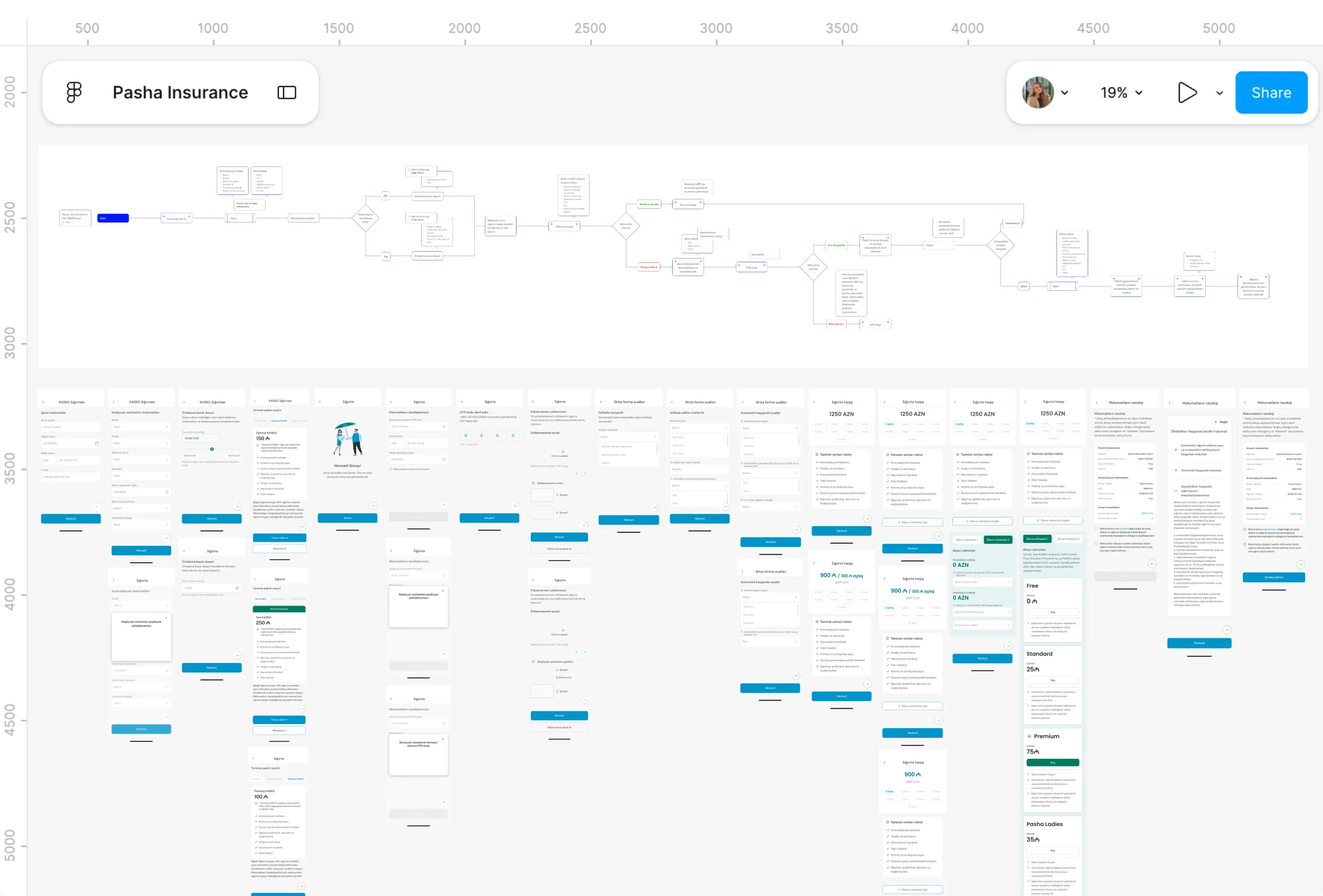
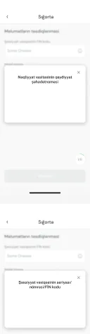
- CASCO was the one that intimidated me a little when I first got into it, and I say that honestly. There was no shortcut around learning the domain properly, terms like the car passport, driving history questions, accident records, all of it new to me, none of it something I could design my way around without actually understanding it first.
- But once I understood the flow well enough, the problem became obvious. Customers had to enter every detail about their car by hand, driving habits, accident history, page after page of it. And the part that genuinely surprised me was where most of the quote errors were actually coming from, not from the system, but from customers pricing their own car incorrectly, because they were the ones typing in details they weren't always sure about.
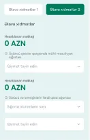
- On top of that, there were three coverage tiers to choose from, and comparing them properly meant holding a lot of information in your head at once. I kept asking myself, if I struggled to compare these tiers clearly and I'd been looking at this for weeks, what chance does someone checking this for the first time actually have.
What I Changed
- The car details problem had an answer sitting right there once I looked for it. The registration document already had the information, so instead of asking customers to retype it and risk getting it wrong, I built auto-fill straight from the car passport, editable if anything needed correcting, with an estimated market value the customer could override rather than calculate themselves.
- The tiers took more thinking. I wanted someone to be able to actually compare all three at once, not toggle back and forth trying to remember what the last one said, so I put them side by side, with an expanding view in the app and an optional upsell once a tier was chosen.
- The other piece came from a practical, almost obvious observation, people often have more than one car. So I made it possible to add several and pay for every policy in a single transaction, instead of repeating the entire process car by car. None of these were dramatic changes individually, but together they turned something that had genuinely intimidated me into something I felt was finally straightforward for the person actually using it.
Digital claims
Pain Points
- Once a claim existed, actually getting paid was its own separate ordeal. The old process meant physically going to a branch, you couldn't get paid without showing up in person, or calling and, at best, being sent a link.
- Even that link wasn't really a shortcut. You still had to type everything in manually, your name, your details, information the company already had if you were logged into the app, but because you'd arrived through an anonymous link, none of that carried over. You'd go through identity verification again, codes, confirmations, an entire process just to prove who you already were.
- There was also no real distinction between the different situations someone might be in. Whether you were claiming for yourself, claiming for someone else, or dealing with a repair instead of a payout, it all funneled through the same rigid, document-heavy process, with no path built around what you actually needed.
What I Changed
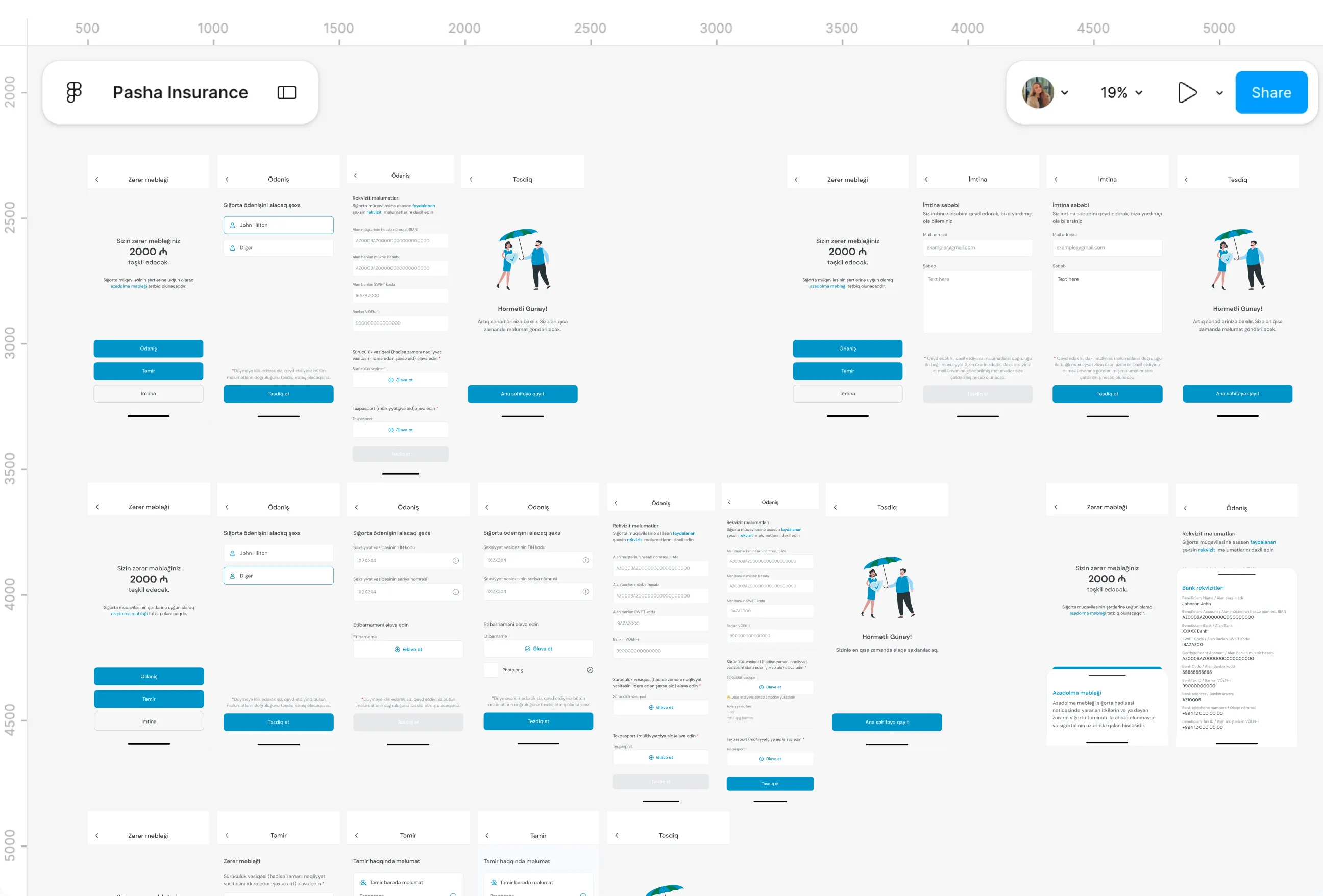
- I designed the claim amount screen as the starting point once someone opens a specific claim, and split it into three clear paths instead of one generic form: Payment, Refusal, and Repair, each built around what the customer actually needed to do next.
- For the Payment path itself, since the person is already inside the app, I only asked for what genuinely couldn't be skipped, IBAN, correspondent account, the receiving bank's SWIFT code, and the bank name, plus a driving licence and passport for confirmation. No re-entering identity details that already lived in their profile.
- Where it gets more interesting is paying on behalf of someone else, a second car, another person entirely. I built that as its own flow, so the customer isn't forced through their own identity again just because the payout applies to someone else.
Doctor appointments

Pain Points
- This one came up more than once in the health team meetings, and it always followed the same shape. A customer books an appointment, hospital, time, appointment type, and only finds out afterward whether their insurance actually covered it. By then it's too late to do anything but be frustrated.
- The other half of the problem was harder to solve on paper. People here expect to choose their own doctor and see a real, specific schedule, not just get slotted into whatever's available. But hospitals genuinely couldn't guarantee that. Walk-ins, emergencies, last-minute changes, a doctor's day can shift entirely in an hour, so asking them to commit to a fixed schedule weeks out was asking for something that didn't reflect how hospitals actually operate.
- I remember sitting with that tension for a while. Customers wanted certainty, hospitals couldn't offer it, and somewhere in between was a version of this that respected both realities instead of pretending one of them didn't exist.
What I Changed
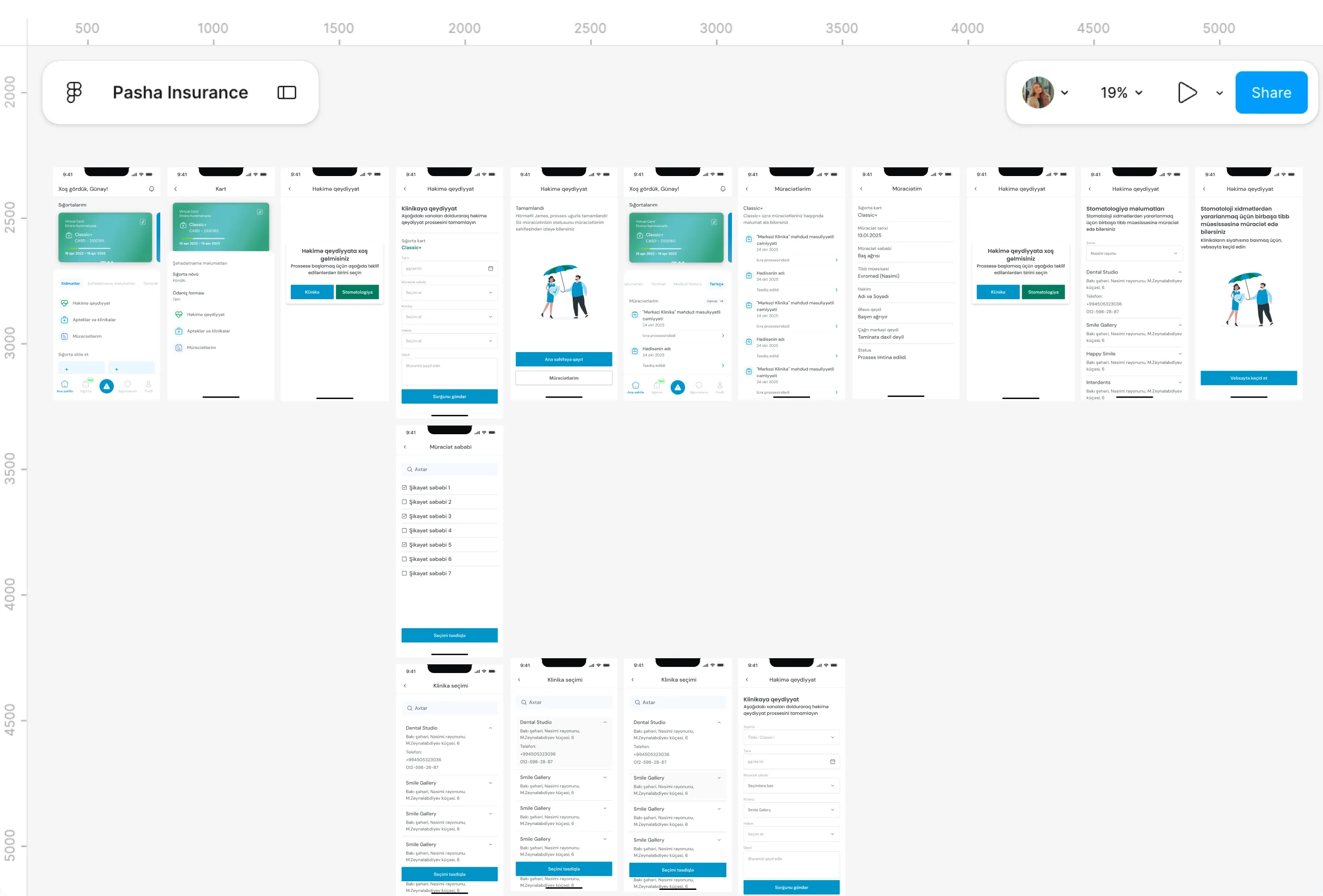
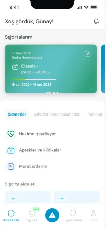
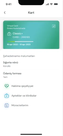
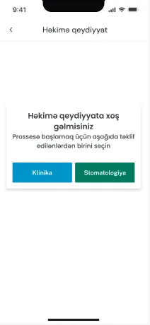
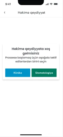
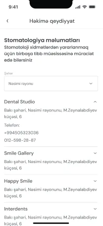
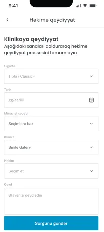
- The coverage question had a clean answer once I actually looked at how people were describing their issue. Instead of a free-text box, where nobody could tell what was covered until a human read it, I built a guided selector where the customer chooses the type of issue, and the app tells them right there whether it's covered before they ever finish booking.
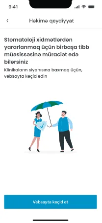
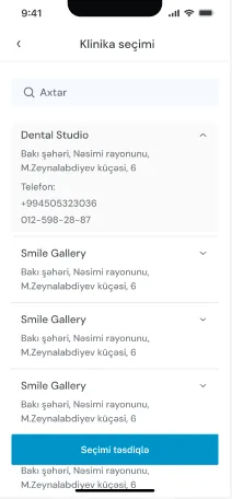
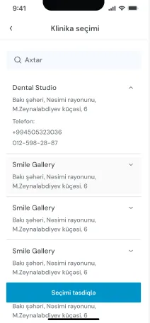
- The scheduling side took longer to get right. I didn't want to promise customers a fixed doctor and time that hospitals couldn't reliably deliver, so instead I let the customer choose a hospital, see which doctors were available there, and pick one. That gave them the choice that mattered most to them.
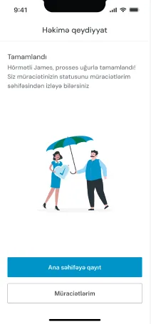
- The last piece was building in the honesty that hospitals actually needed. Once the customer picked a doctor and a time, hospital staff would confirm the final slot on their end, matching an open appointment with what was requested. It wasn't a perfect promise of exactly what you asked for, but it was true, and getting to that point meant sitting down directly with the health team and hospital partners until the data behind it actually held up.
Retention
Pain Points
- This one came from thinking about the business side of the problem, not a specific complaint from a single customer. PASHA is one of the largest insurers in the market, but it's still a competitive one, and a customer with just one policy, say, only motor insurance, had no real reason to think about adding anything else. Nothing in the app nudged them toward it, and nothing rewarded them for sticking around either.
- I kept thinking about how easy it is for a customer like that to just drift, not because they're unhappy, but because there's no reason for them to stay engaged beyond the one thing they originally signed up for. And a customer who's disengaged is a customer a competitor can eventually win over.
- It's a quieter kind of pain point than something like an accident flow, but it mattered just as much, maybe more, because the cost of it doesn't show up as a complaint. It shows up months later as a lost customer.
What I Changed
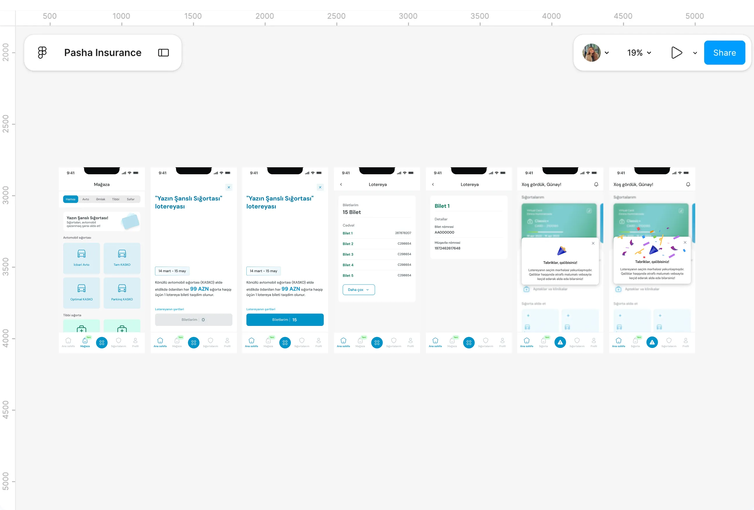
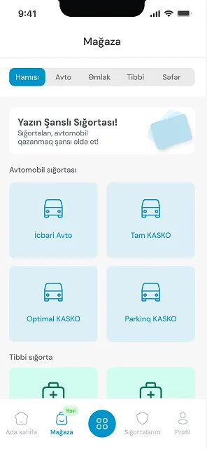
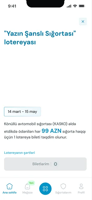
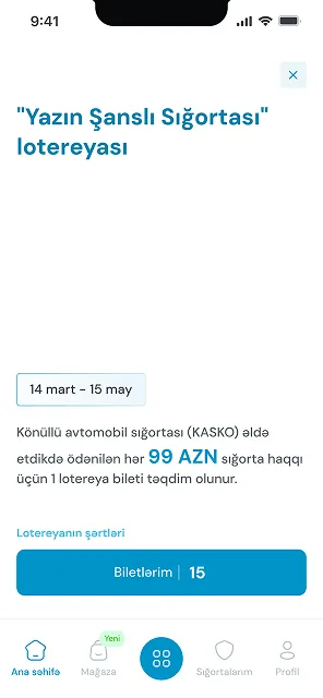
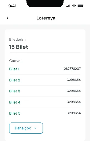
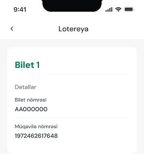
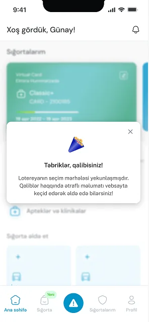
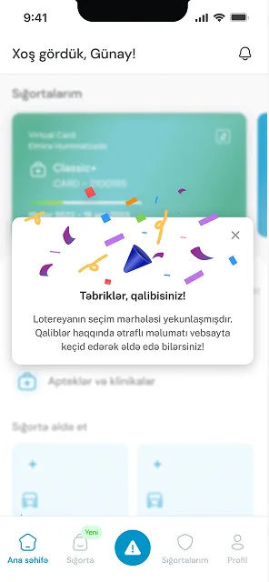
- I wanted to give people an actual reason to stay active with their insurance beyond just renewing when they had to. So I designed a gamified loyalty mechanic, where customers earn points every time they buy or renew a package, building toward a monthly prize draw.
- To make it visible, I added a gift-box style entry point right on the home screen, something that caught the eye and explained itself when tapped, rather than burying the whole idea in a settings page somewhere.
- The last piece was the leaderboard, showing each customer's ranking based on their activity. It gave the whole thing a bit of momentum, something to check back on, not just a one-off reward. I worked on this with developers, a business analyst and a copywriter, over about two to three sprints, and it became one of the pieces of the app that was designed less to fix a broken moment and more to give people a reason to keep coming back.
Design System
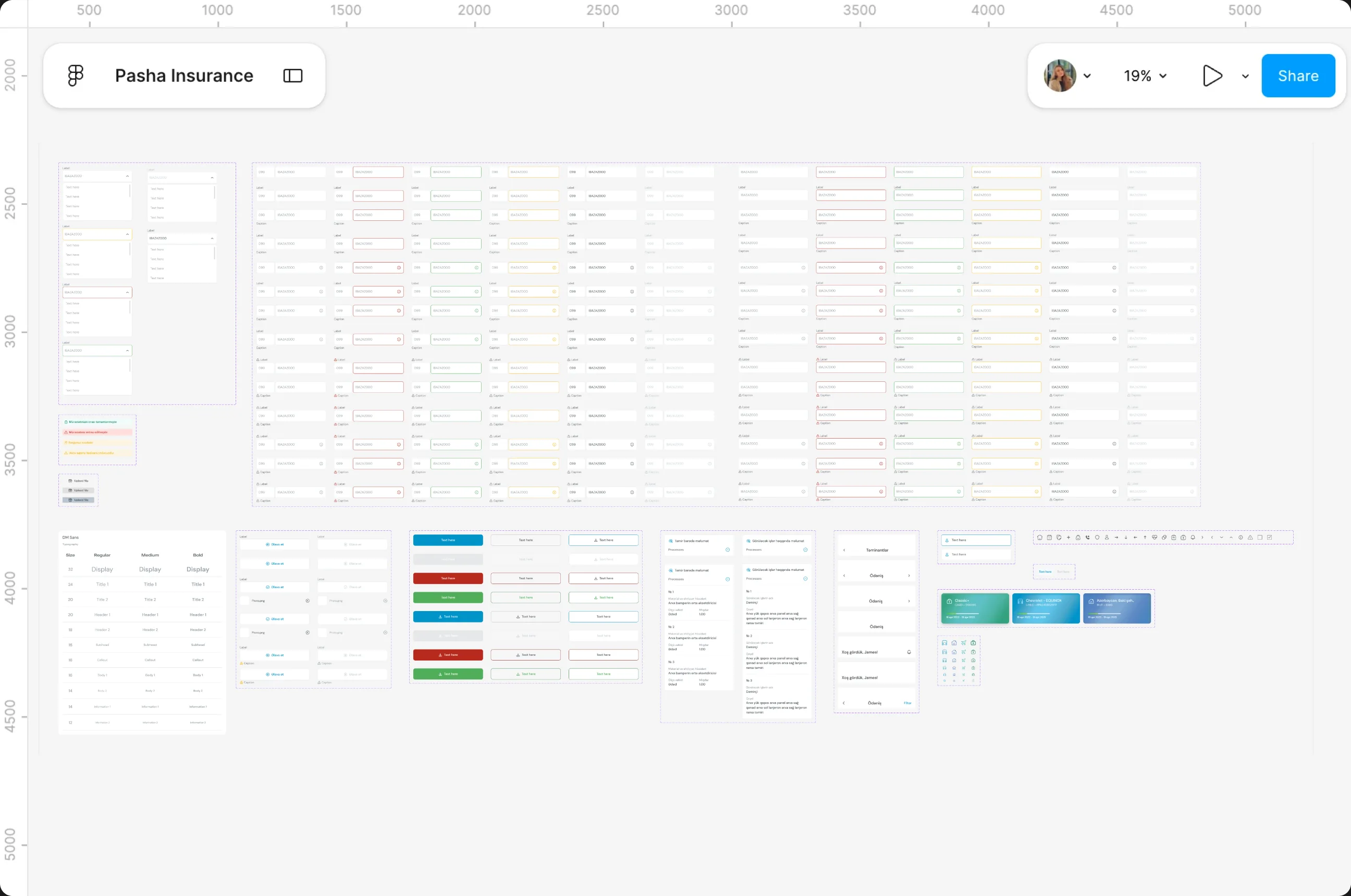
One shared language behind every screen, built once and reused everywhere. What began as tidying up individual components turned into the foundation every later screen was designed on.
Role and Working Context
I owned design end to end across the app, website and customer cabinet, working in Agile sprints alongside developers, marketing, product teams and hospital partners.

-
Discover
With no prior insurance background, learning each product came first, through repeated meetings and calls with the motor, property, travel and health teams. Moderated user research and focus groups, with real customers and colleagues from across the wider PASHA group, sat alongside call centre logs and in-app feedback. For health, working directly with the health team and hospital partners, on both the B2C and B2B sides, showed how scheduling and coverage worked in practice.
I owned everything on the app, website and cabinet, working in Agile sprints alongside developers, marketing and hospital partners.
-
Define
The research pointed to one insight: customers weren't confused by the interface, they were unsure whether their actions would work. The highest-risk journeys, CASCO and claims, were mapped as full decision trees, and priorities were agreed with the product manager, compliance and ops. After each round of focus groups, the team decided what to fix straight away and what to schedule for later.
The research pointed to one insight: hesitation, not confusion. The riskiest journeys were mapped as decision trees and prioritised with the team.
-
Design
Flows, screens and a shared design system were built across all three platforms, keeping the familiar structure for older customers while improving the hierarchy. Marketing shaped the copy and graphics, a marketing copywriter joined on larger features, and an external graphics agency produced icons and imagery, with design direction coordinated in Russian. UI and UX stayed with me throughout.
Flows, screens and a shared design system built across all three platforms, keeping the familiar structure while improving the hierarchy.
-
Deliver
Work ran in Agile sprints tracked in Jira, shipped in sprint-sized pieces: a notification redesign in two weeks, a design system in about a sprint, and a loyalty programme over two to three. Delivery was shared with the engineering squad and a business analyst, alongside compliance, ops and the call centre. Focus groups after major milestones fed back into the next sprint.
Work ran in Agile sprints, shipped in sprint-sized pieces, with focus groups after each milestone feeding into what came next.