Pasha Insurance OJSC
Website Design
Overview
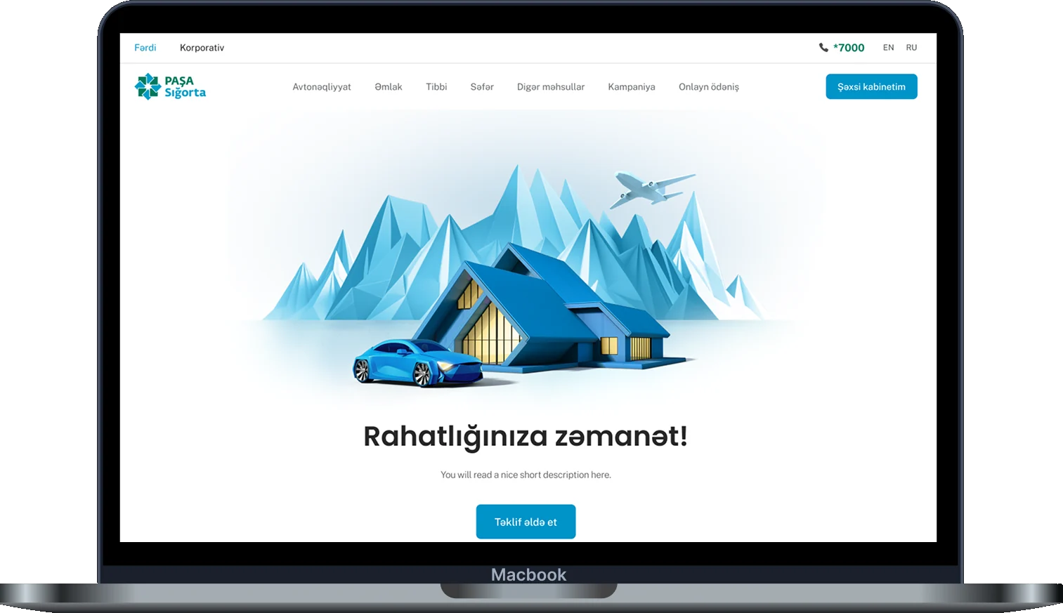
As the sole product designer on PASHA Insurance's public website, I led the end-to-end redesign for both individual and corporate customers. The site had to work as fast self-service for one person and as credible, detailed support for corporate decisions.
Research and Evidence
Moderated sessions and focus groups surfaced the same pattern: not confusion about the site, but hesitation about what they'd just read. Call centre data told the same story, most queries were basic questions the site should already answer.
Design Approach
The website presented information without helping anyone act on it. Individual and corporate audiences needed genuinely different depth and pacing, not the same page, and treating them the same quietly worked against both.
Project Snapshots
These are the key results of the redesign, showing how the site became clearer for individuals and more credible for corporate decisions. Each figure reflects a real change in how the site works.These are the key results of the redesign, showing how the site became clearer for individuals and more credible for corporate decisions.
4 verticals property, health, travel and motor
Fast self-service for individuals, and detailed support for corporate decisions.
2 distinct experiences on one site
Turn browsing into a decision, not just information. Help people compare options confidently and know what to do next, instead of just reading and leaving.
While keeping a human option for those who want it
Fully Digital Casco
Fewer basic questions reaching the call centre
The discount complaint pattern was resolved
Advance notice before a promotion goes live replaced a broken countdown timer and the refund requests it caused.
Payment routes built: individual, business and bank.
-
4 verticals
property, health, travel and motor
One shared site now covers every line of cover.
-
2
distinct experiences on one site
Fast self-service for individuals, and detailed support for corporate decisions.
Detailed Work
A closer look at each part of the site, from fast individual purchases to detailed corporate decisions, with the problem, the design and the reasoning behind each one.
Full site redesign
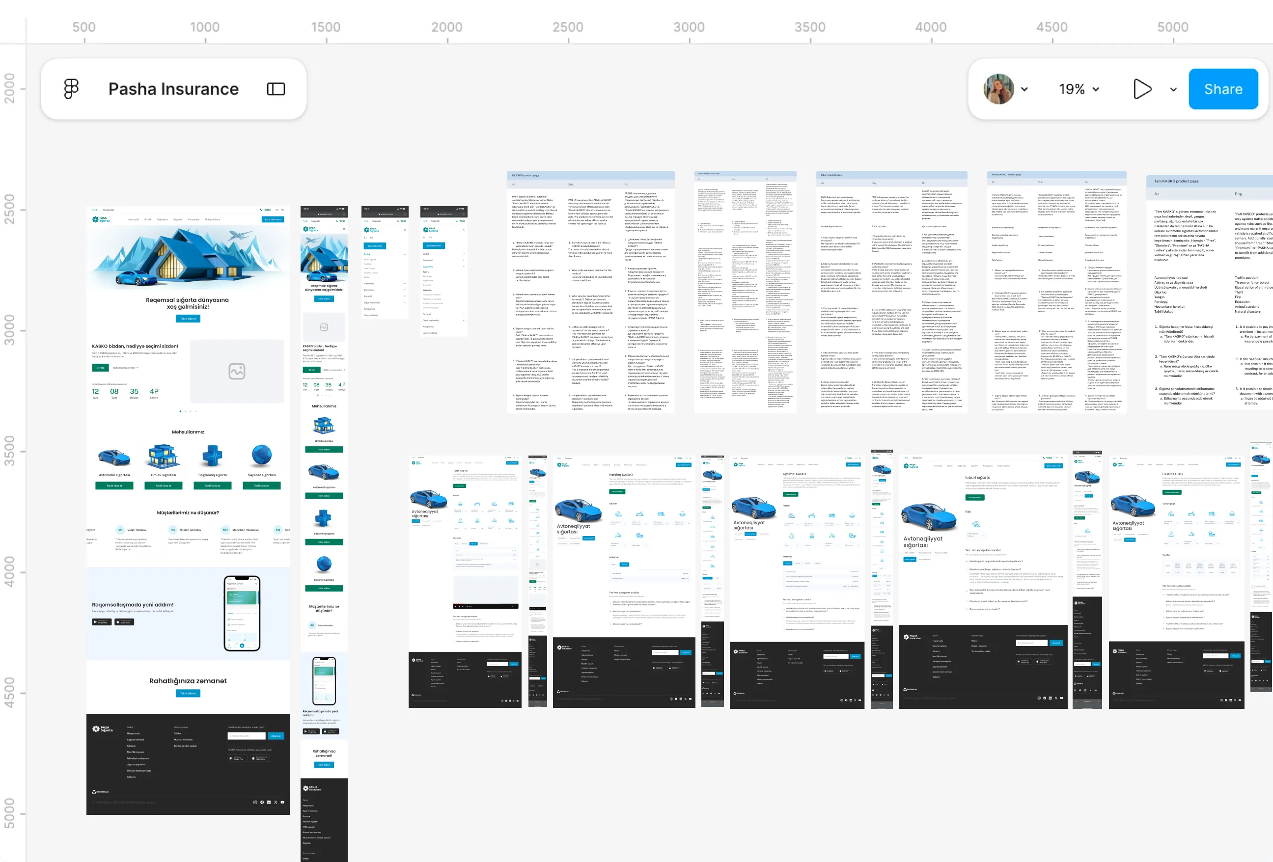

Pain Points
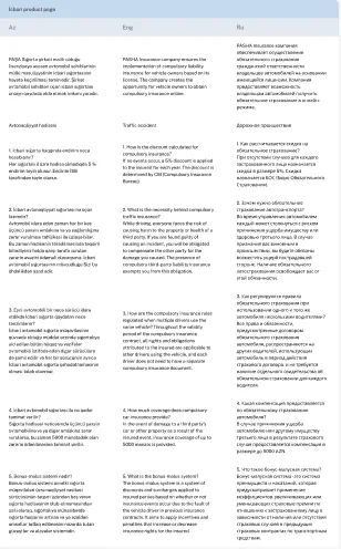
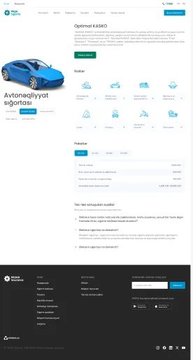
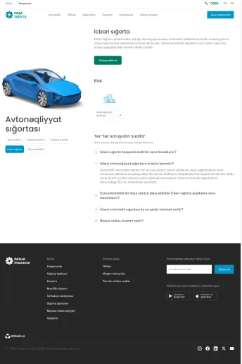
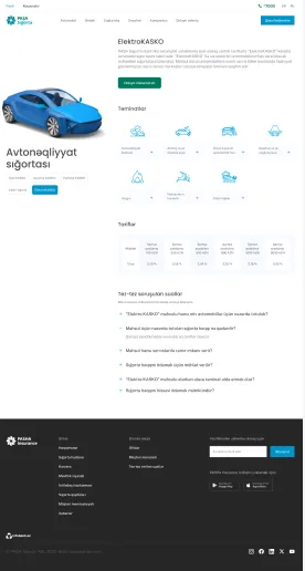
- Early on, mapping the site meant clicking through page after page trying to find a shared structure that didn't exist. Property had grown one way, motor had grown another, and personal and business content sat next to each other with no real logic tying them together, just years of pages added whenever something needed to go live.
- A conversation with someone from marketing summed it up. Asked to find a specific motor package's terms, even she had to check three different pages, despite working there every day. If she couldn't navigate it quickly, a first-time visitor stood no real chance.
- That wasn't really a content problem, it was an architecture problem hiding behind years of accumulated pages. Every new insurance vertical had been bolted onto whatever existed before it, and nobody had gone back to ask whether the whole thing still made sense as a system.
What I Changed
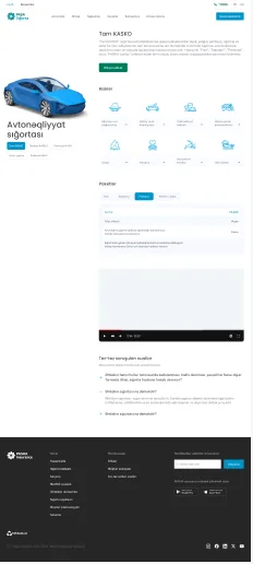
- Fixing years of accumulated structure meant starting somewhere unglamorous, mapping the entire site as it actually existed, every page, every section, before touching a single design decision. That gave a real picture of the mess rather than a guess at it.
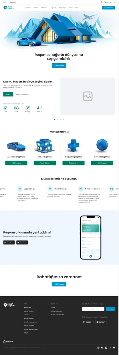
- From there, the site was rebuilt page by page, home, packages, testimonials, footer, with a shared structure underneath instead of each vertical inventing its own. An external agency handled icons and imagery, so the internal flows, the part that actually mattered, stayed the focus.
- The result wasn't a visual refresh sitting on top of the same problems. It was the same content, finally organized in a way that matched how people actually looked for it, motor next to motor, personal separated from business, instead of scattered wherever a page happened to fit years ago.
Health insurance
Pain Points
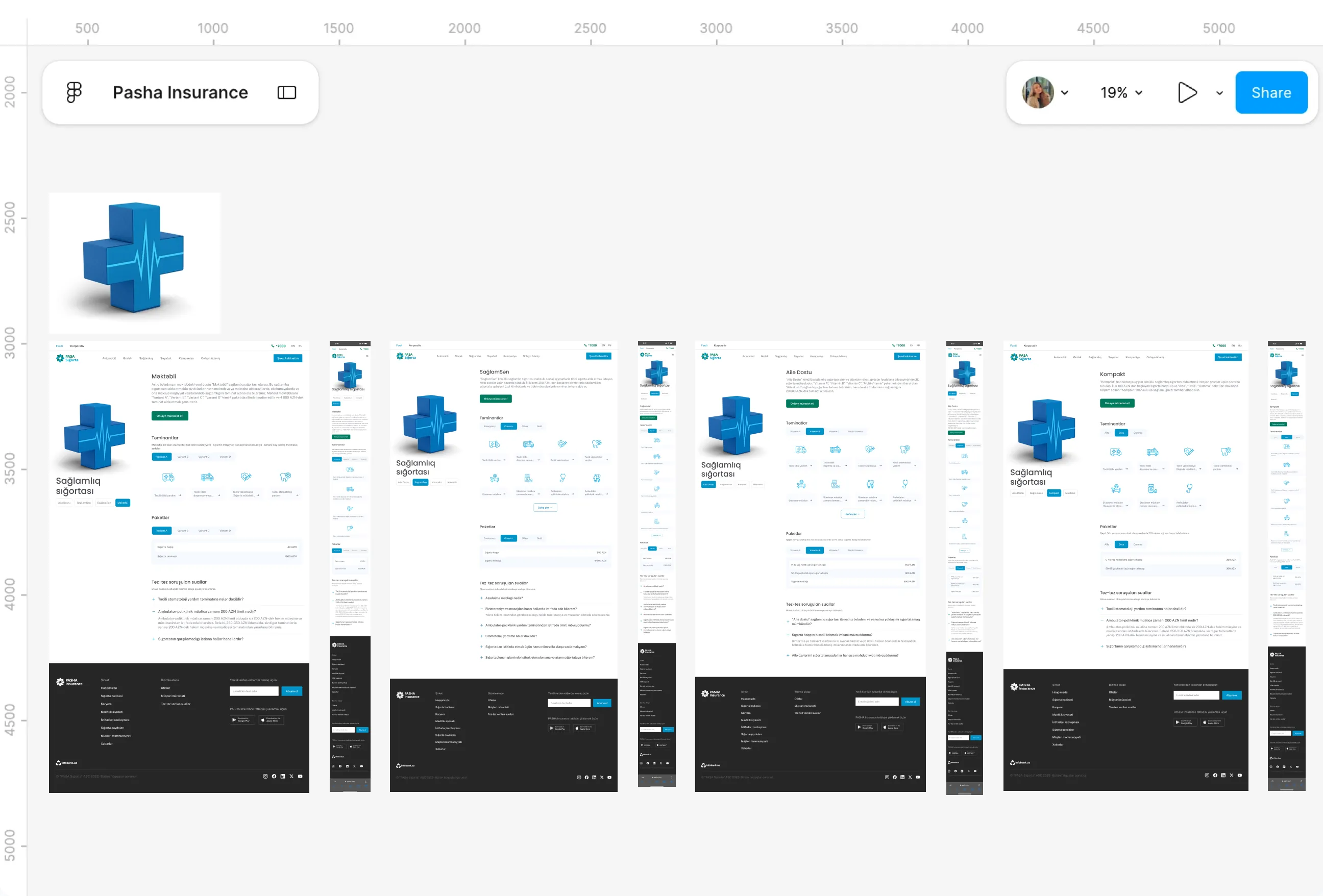
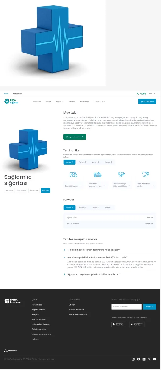
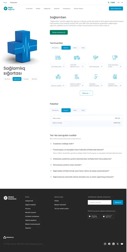
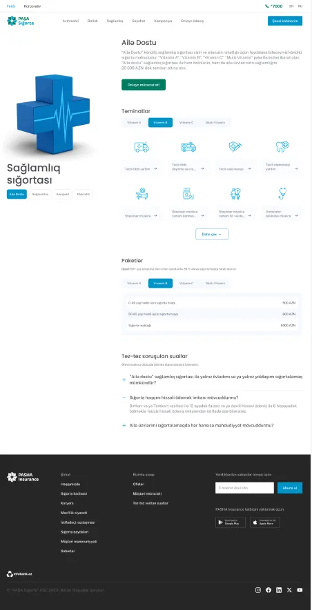
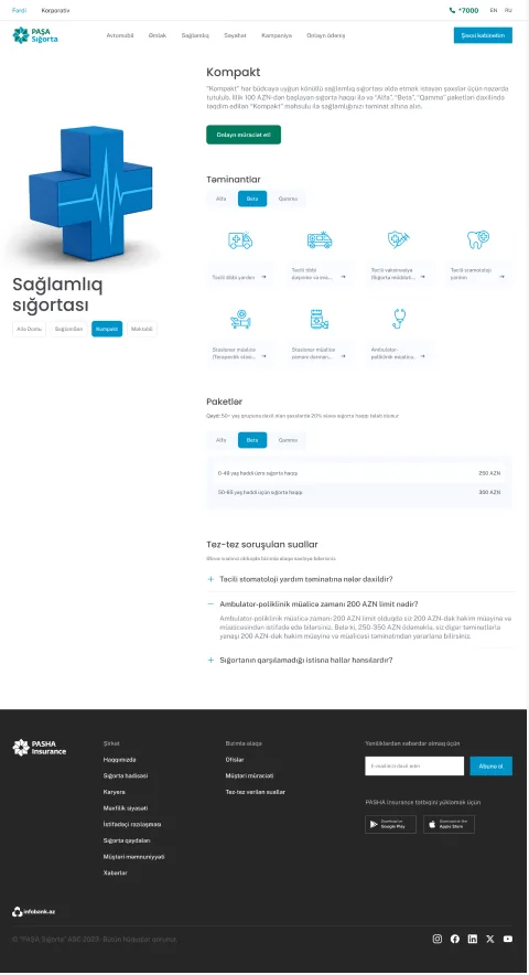
- A customer trying to compare health packs used to land on a wall of text, paragraph after paragraph explaining coverage in language that read more like policy documentation than something meant to help someone decide. Getting through even one pack took real effort, let alone comparing two or three.
- The health team mentioned something that stuck with me. Unlike other verticals, there was no pricing calculator here, so every price question still went through a call, even for someone who'd already read everything on the page.
- Put together, that meant the hardest vertical to understand was also the one offering the least help getting through it. Dense content and no pricing tool left customers doing all the comparison work themselves, with nowhere to check their thinking before picking up the phone.
What I Changed
- Restructuring the browsing experience came first. Customers now see all the health packs together, then get full detail only once they select one, so nobody has to read everything just to find the one option that might apply to them.
- Filters followed naturally from that, letting customers narrow packs down by whatever mattered most to them, rather than scanning every option manually to spot the difference themselves.
- The pricing gap couldn't be solved with a calculator the way other verticals had one, health pricing simply didn't work that way. So instead, customers can compare up to three or four packs side by side before submitting anything, then a call centre call confirms the actual price, which meant the call still happened, but only after someone had already narrowed things down with real information in front of them.
Property insurance

Pain Points
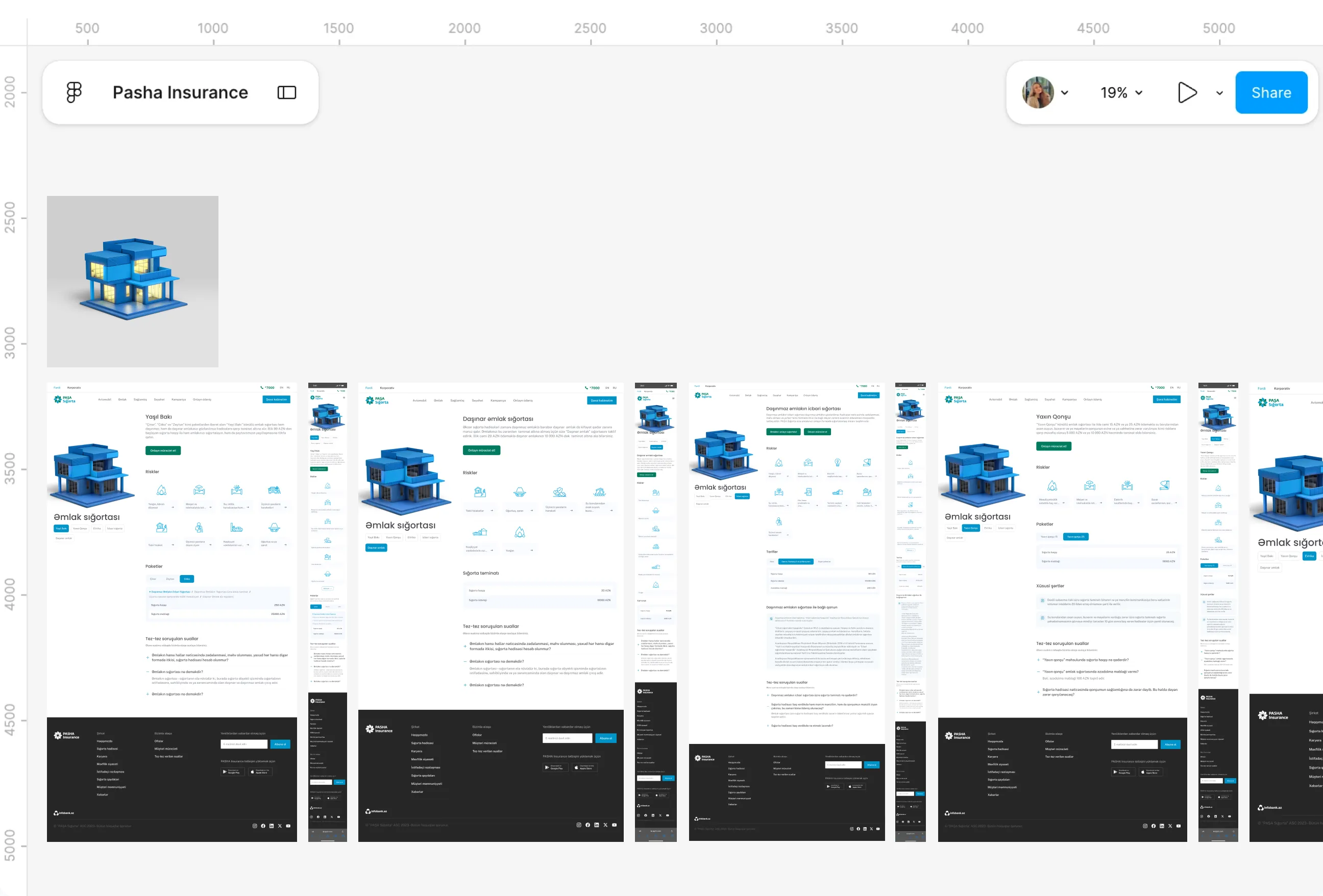
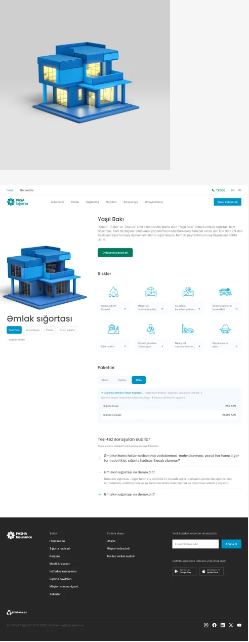
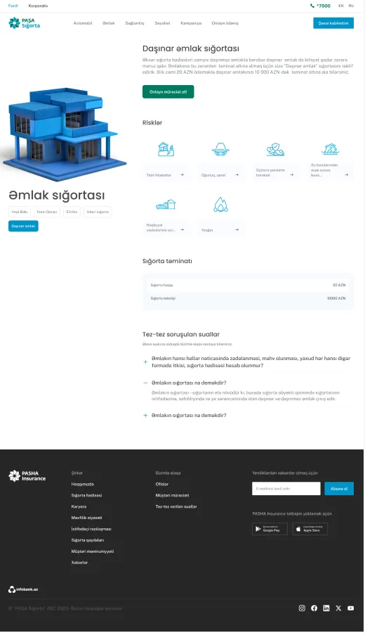
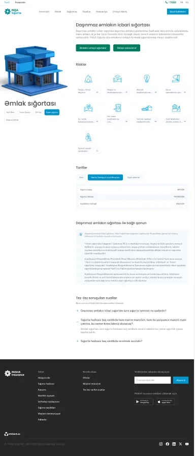
- A property manager we spoke with during requirements meetings put it plainly. Customers would ask which packs actually covered earthquake damage or flood risk, and there was no way to answer that from the page itself, someone always had to call and ask a person directly.
- Unlike motor or travel, property couldn't move to a fully self-serve purchase, and that wasn't a design oversight. Insuring a property genuinely requires manual verification, confirming ownership, confirming the building, work that has to happen offline no matter how good the page is.
- So the real gap wasn't the offline step itself, it was everything around it. Customers had no way to compare which specific risks each pack actually covered before reaching out, which meant the call that was always going to happen started from zero instead of from an informed question.
What I Changed
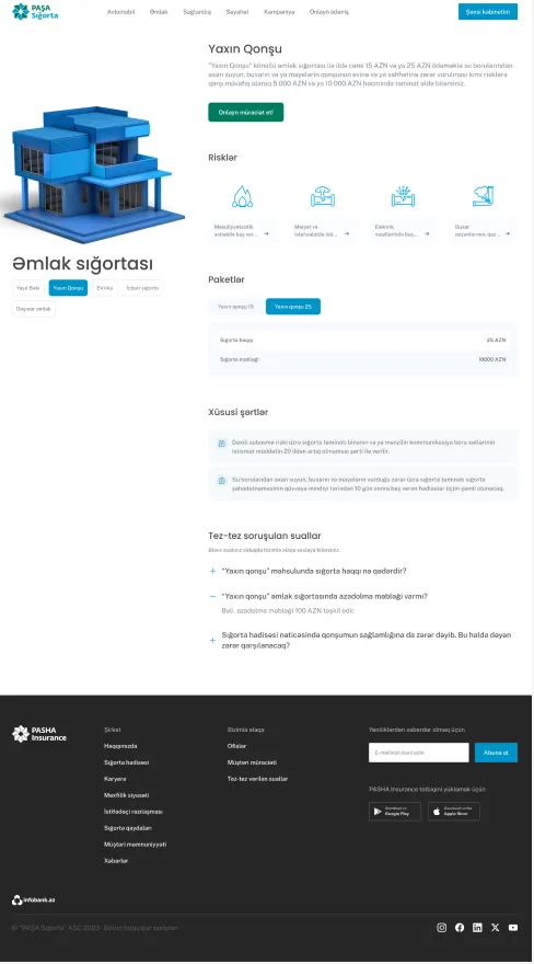
- Since purchase had to stay offline, the page's job became making sure people arrived at that call already informed. Clear information and browsing pages came first, giving customers something real to read before they ever needed to pick up the phone.
- The bigger addition was a calculating element showing exactly which packs covered which specific risks, earthquake, flood, and what a customer would actually receive if that risk occurred. That's the exact question the property manager mentioned, now answered on the page instead of only over the phone.
- A contact pathway sits right alongside it, so once someone's compared their risks and found the right pack, reaching out is the next natural step rather than a separate hurdle. The call still happens, but it starts with someone who already knows what they're asking for.
Travel insurance
Pain Points
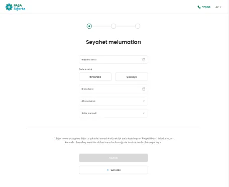
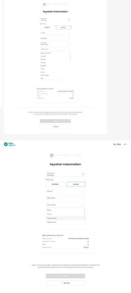
- Travel didn't fit the same mold as the other verticals from the start. There were no fixed packs to browse the way motor or property had, just two very different journeys, domestic and international, that had ended up sharing pages without much thought given to how differently people actually needed to complete them.
- A customer buying international cover, someone who already had a passport number ready and just wanted to pay and go, was stuck following the same completion path as someone booking a domestic trip who genuinely needed to speak to the call centre first. Neither group was well served by a shared process built for neither of them.
- That mismatch showed up as friction in both directions, international customers stuck waiting through steps they didn't need, and domestic customers pushed toward a self-serve path that never quite worked for what their trip required.
What I Changed
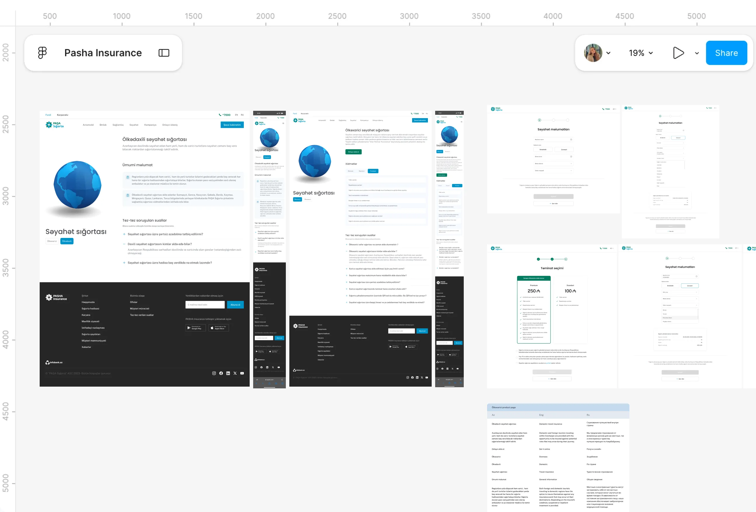
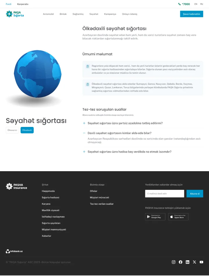
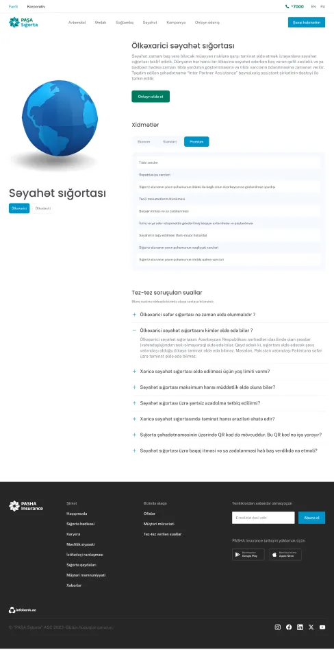
- Splitting the flow by type was the first real fix, information and coverage pages built around how each type of trip actually differs, rather than forcing both through one generic structure.
- From there, domestic and international took genuinely separate completion paths. Domestic still routes to a call centre after a quote, since that's what the trip actually needs. International became fully self-serve, since the customer already provides a passport number as part of the flow, which meant identity verification and purchase could both happen immediately, no call required.
- The underlying calculation stayed shared between both, dates, duration, destination, still feed one system regardless of type. What changed was what happened after the price appeared, each customer finally following the path that matched their actual trip instead of one built for someone else's.
CASCO purchase
Pain Points
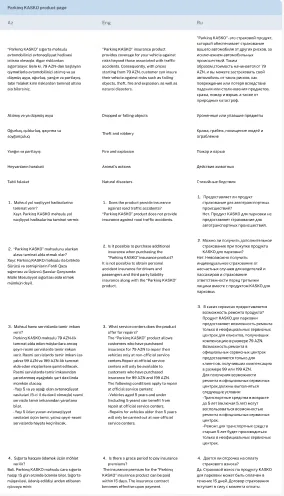
- CASCO was the highest value motor journey on the entire site, and it still ended the same way every time, an office visit or a call centre step just to finish what should have been a simple purchase. Everything up to that point could happen online, and then it couldn't.
- A colleague on the sales side mentioned something during one of our syncs that stuck with me. Customers would go through the whole comparison, decide on a tier, get genuinely close to buying, and then drop off the moment they realized finishing meant leaving the browser entirely. The most committed customers were hitting the same wall as everyone else.
- That made the offline step feel less like a technical limitation and more like an inherited habit, something nobody had gone back to question since the process was first built, even as everything around it moved further online.
What I Changed
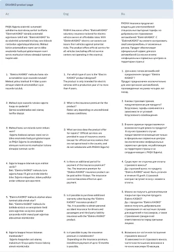
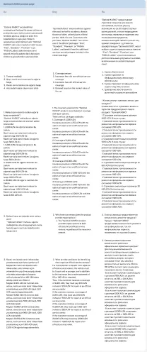
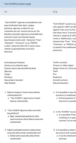
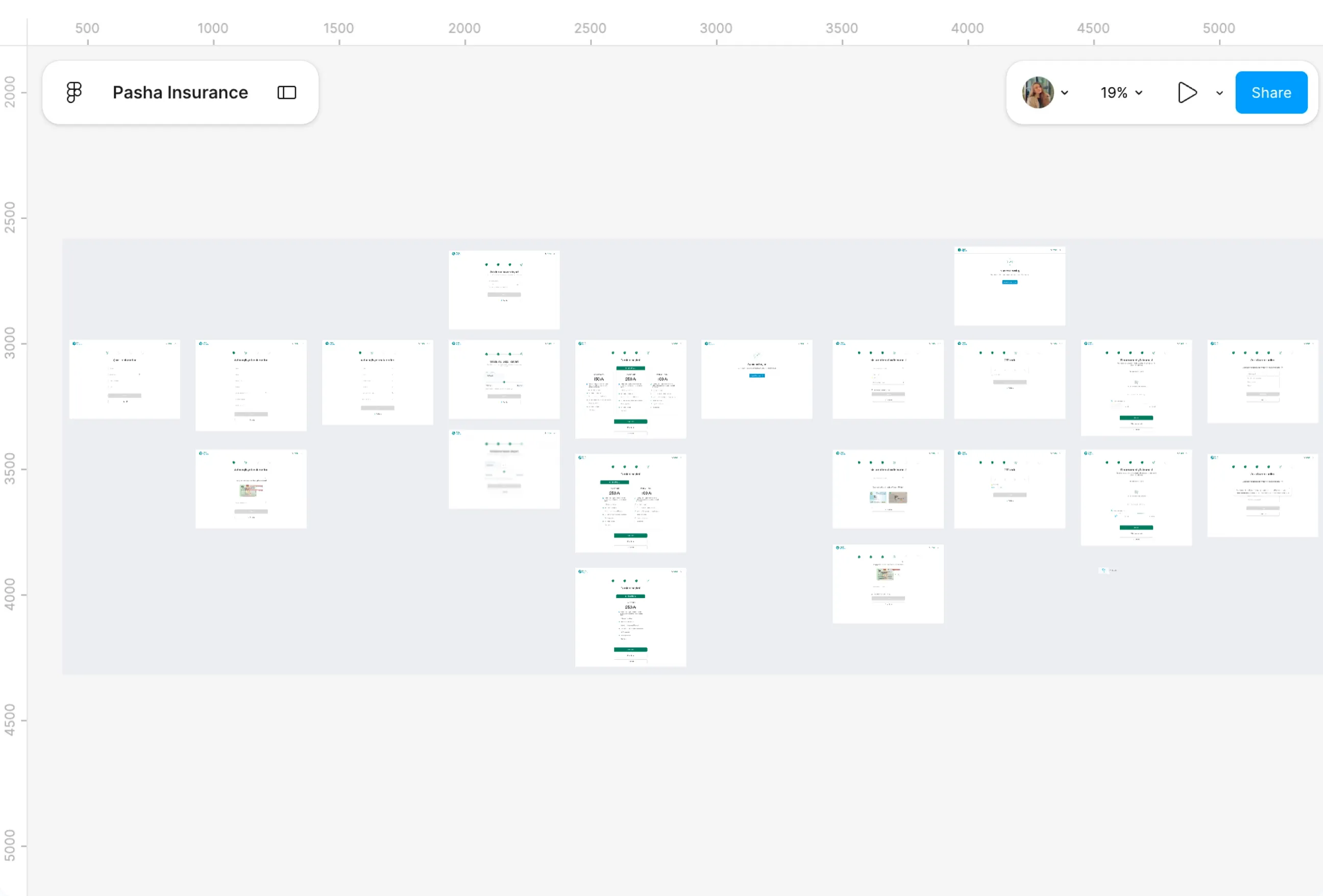
- Rebuilding CASCO as a fully digital journey meant removing that final wall entirely, not just shortening the steps leading up to it. Multi car support came first, letting a customer complete more than one policy in a single transaction instead of repeating the whole process per car.
- Auto fill from the car passport replaced manual entry next, so customers weren't retyping information the document already held. The three tiers now show side by side, genuinely comparable rather than something you had to hold in your head across separate pages.
- Identity verification changed too, a confirmation notification instead of an unreliable OTP, which mattered more here than it sounds, since a failed OTP at the final step was exactly the kind of thing that used to push people back offline. Two completion paths remained afterward, save the quote and call the call centre, or pay directly online, but for the first time, paying online all the way through was actually possible.
International travel
Pain Points
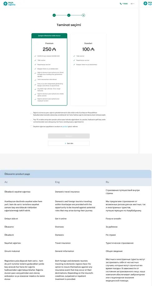
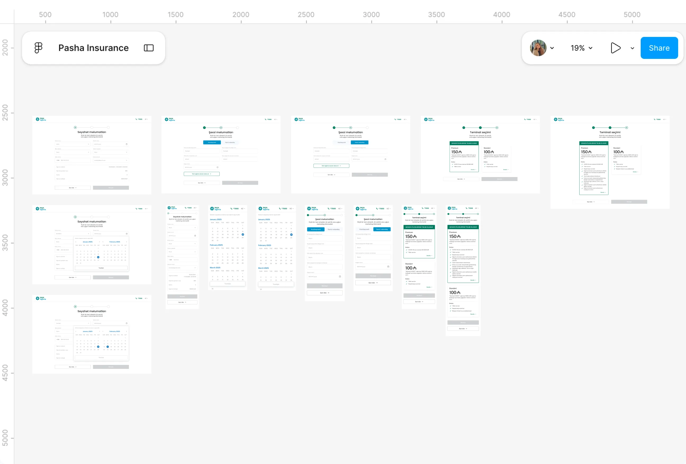
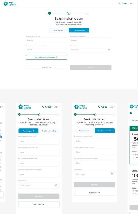
- International travel was the one part of the site where self-serve was actually supposed to work end to end, no call centre required, since the customer provides a passport number that lets the whole thing verify itself. But getting from that idea to a flow that actually held together for real cases took longer than expected.
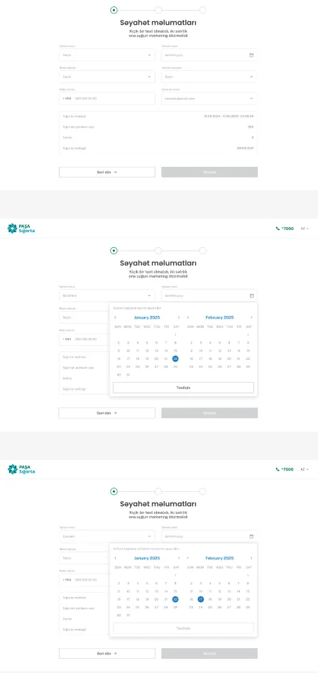
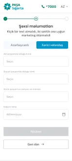
- Foreign citizens buying cover for a trip abroad needed a genuinely different set of fields than Azerbaijani citizens did, ID versus passport series, different verification data entirely, and someone traveling with family needed a way to add more than one insured person without restarting the whole form for each one. Neither of those cases fit comfortably into a single generic form.
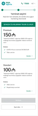
- There was also the destination question sitting underneath all of it. Coverage requirements change depending on where someone's actually going, Schengen countries carry their own mandatory minimums, and a customer comparing two packages needed to see exactly what each one covered before deciding, not just a price sitting next to a name.
What I Changed
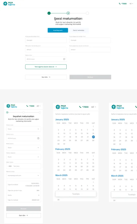
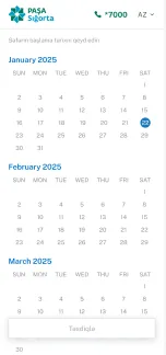
- Splitting citizenship into its own toggle came first, Azerbaijani or foreign citizen, each branch asking only for what that specific case actually needed rather than showing every possible field to everyone. Adding another insured person became its own repeatable step too, so a family booking together didn't mean starting over per traveler.
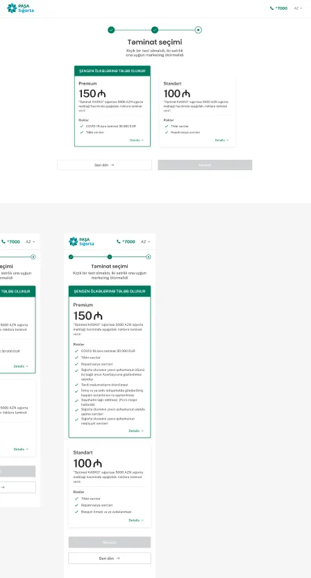
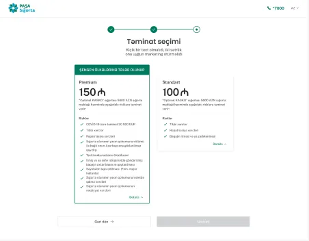
- The package comparison got built around what actually mattered for the destination. When Şengen coverage applied, that requirement showed clearly at the top of the card, and each tier, Premium against Standart, listed its actual risks side by side, so a customer could expand either one and compare coverage directly instead of guessing what the price difference bought them.
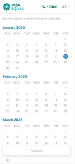
- The whole flow was built responsive from the start, desktop and mobile carrying the same steps without the mobile version feeling like an afterthought, since someone finalizing a trip is just as likely to be doing it from their phone as from a laptop. That mattered here specifically, because this was meant to be the one flow where nobody had to stop and call anyone.
Accident reporting
Pain Points
- An accident doesn't mean just one thing. Sometimes it's a person hurt, sometimes property damaged, sometimes it's purely about the car, and each of those situations genuinely needs different information from the person reporting it.
- Asking everyone the same set of questions regardless of what happened would have made the form longer and more confusing than it needed to be for any single case, and nobody reporting an accident wants to wade through fields that don't apply to them.
- There was also a legal reality sitting underneath all of it. Depending on the situation, the incident might need to be reported to the relevant state authority, and the flow had to account for that without turning into a bureaucratic maze at the exact moment someone was least equipped to deal with one.
What I Changed
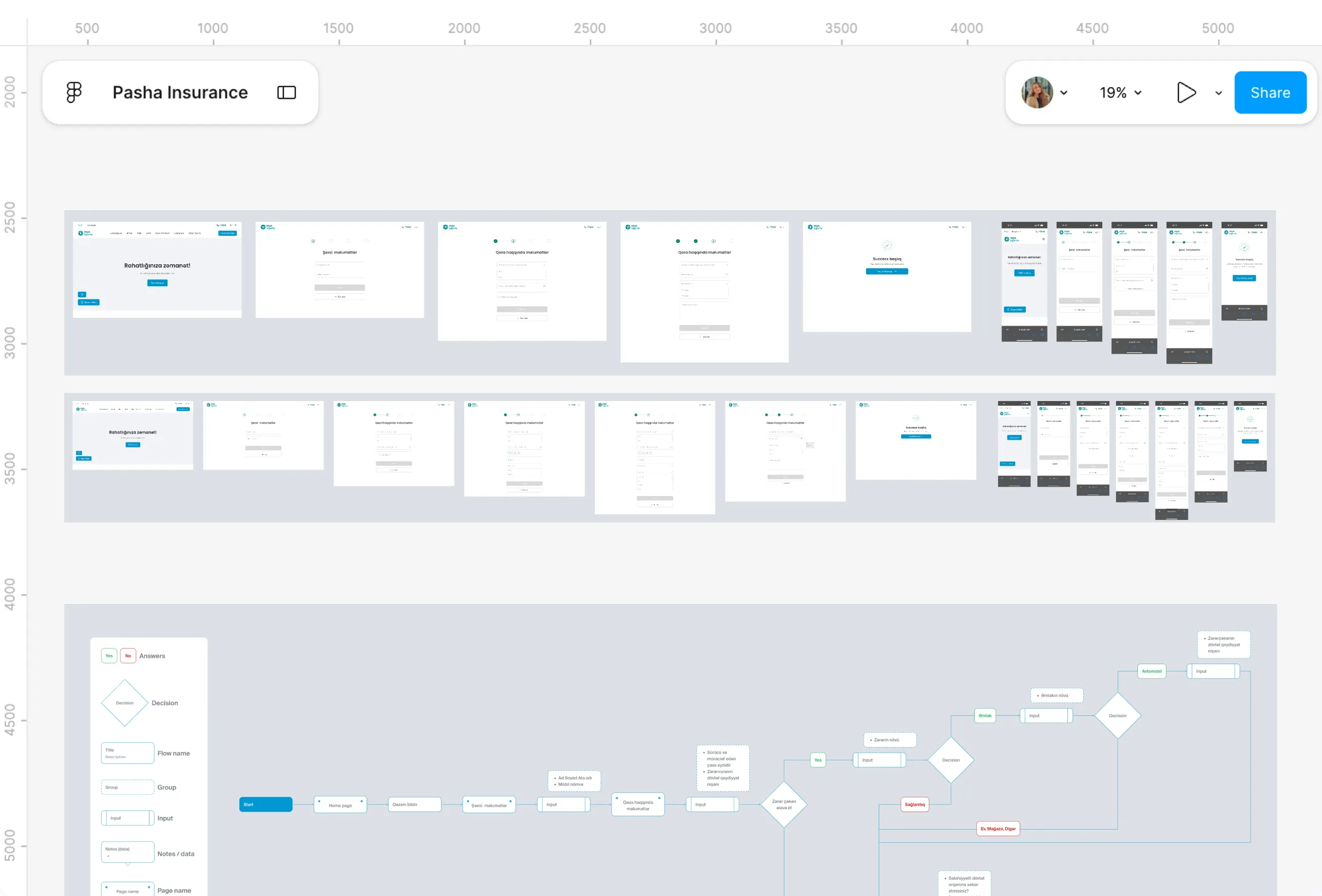
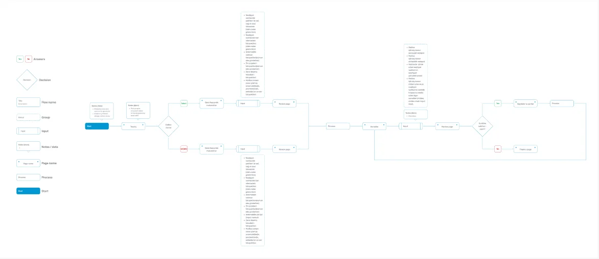
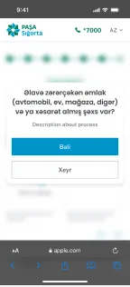
- One tap on Qəzanı bildir opens a short flow, starting with personal details so the person is identified before anything else is asked of them.
- From there, the accident information splits by what actually happened, health, property, or vehicle, and each branch only asks for what that case needs, a plate number for a car, a property type for a house or shop, a type of harm for health.
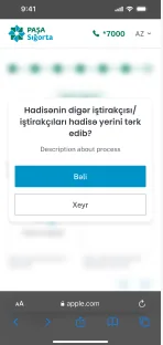
- The state notification question sits later in the flow, alongside the date, location and a short description, rather than as an intimidating checkpoint at the start, and multiple injured or damaged parties can be added one after another, so one accident involving more than one thing doesn't mean starting the report over.
Damage evidence upload

Pain Points
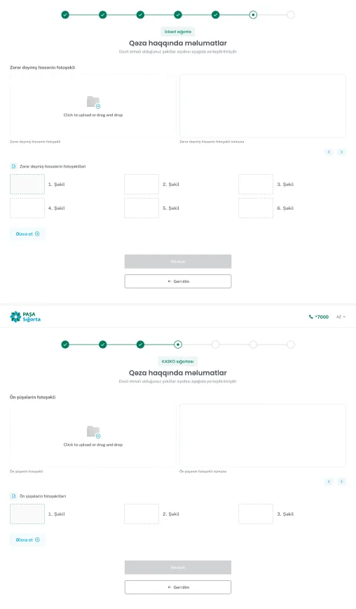
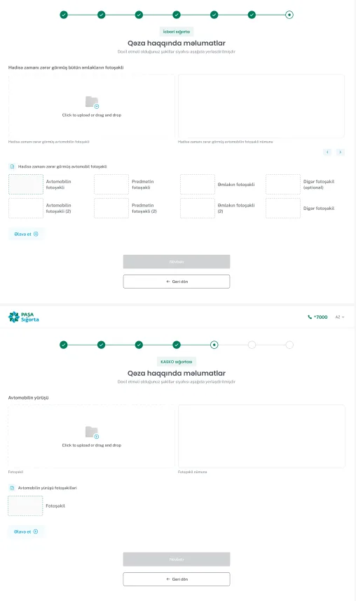
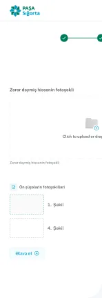
- Once someone reached the point of actually documenting damage, the risk shifted from confusion about what happened to whether the evidence they submitted would even be usable. A single blurry photo of the wrong angle could stall a claim later, and nobody standing at the scene of an accident is thinking clearly about which four angles of their car actually matter to an assessor.
- The requirements also weren't the same for every case. A compulsory policy claim and a KASKO claim needed different supporting documents, and KASKO specifically required something as granular as the car's current mileage, entered manually, information that has nothing to do with the accident itself but everything to do with how the claim gets evaluated.
- On top of the vehicle evidence, there was a separate category entirely, proving who was actually involved. Identity documents, driver's licence, vehicle registration, and in some cases confirmation that the person submitting even had the right to act on the vehicle owner's behalf. Treating all of that as one big undifferentiated upload step would have made an already stressful moment feel like an interrogation.
What I Changed
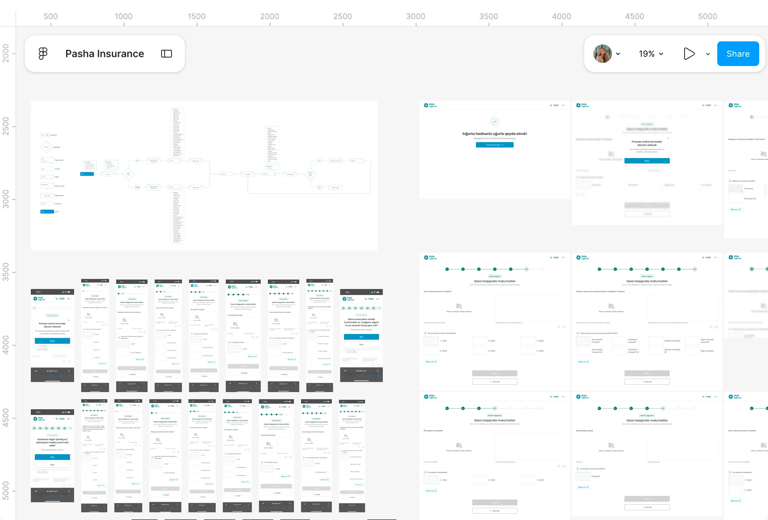
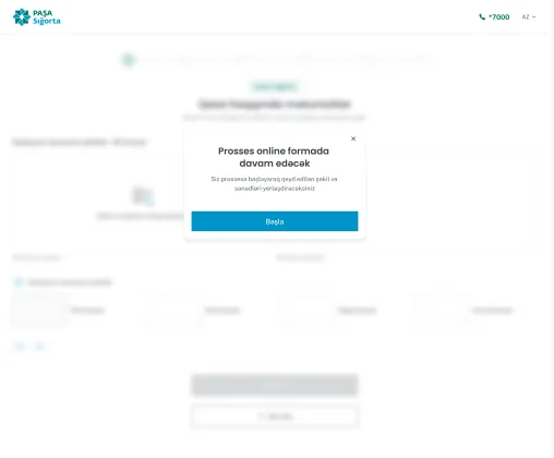
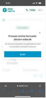
- I split the requirement itself into an explicit checklist rather than a blank upload field, front-left, front-right, rear angles with visible examples, a close-up of the plate, the interior, the windshield, and the specific damaged area, so the person knows exactly what's expected before they even open their camera.
- Vehicle photos and participant documents got separated into their own distinct steps, since they're answering different questions, what happened to the car versus who's actually involved, and I added the authorization checkbox only where it was actually relevant, when someone other than the owner was submitting.
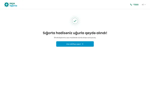
- Everything funnels into one shared review page before submission, regardless of whether the claim started as İcbari or KASKO, so despite the two policy types asking for slightly different things earlier in the flow, the person always ends with the same chance to check everything before confirming, followed by the terms acceptance and a clear final state, either a short guideline page or a straightforward thank-you, depending on what that specific case still needed.
B2B corporate
Pain Points
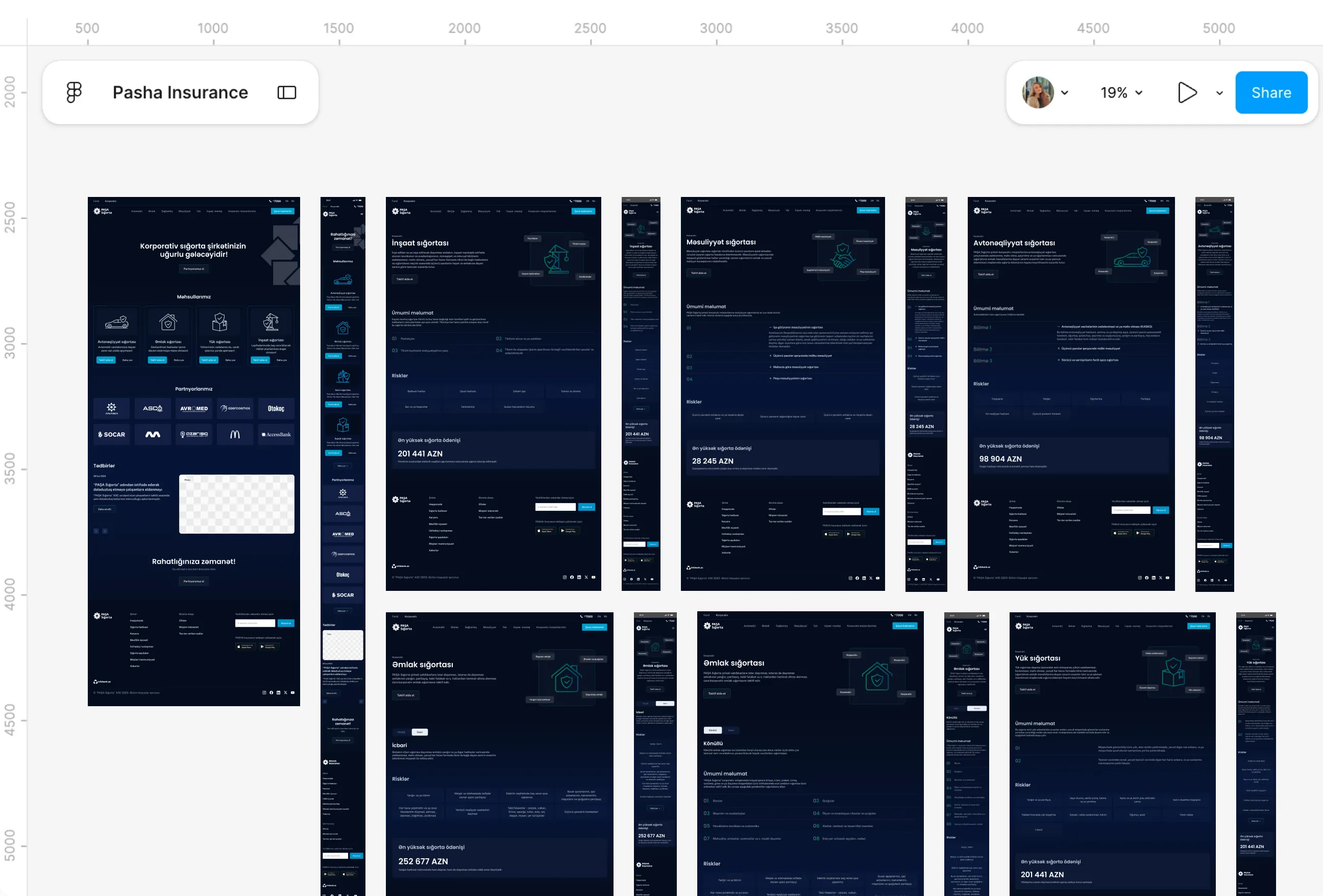
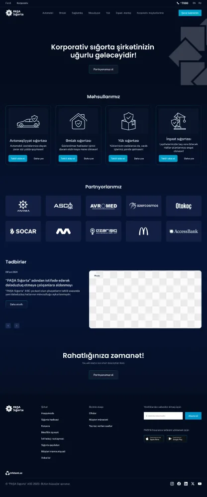
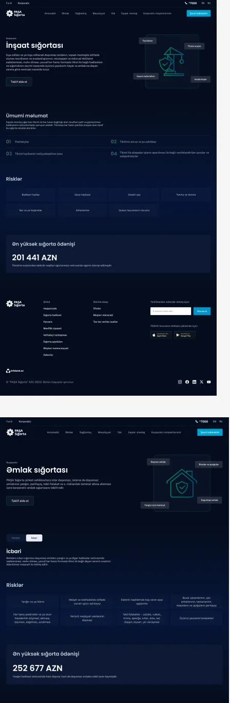
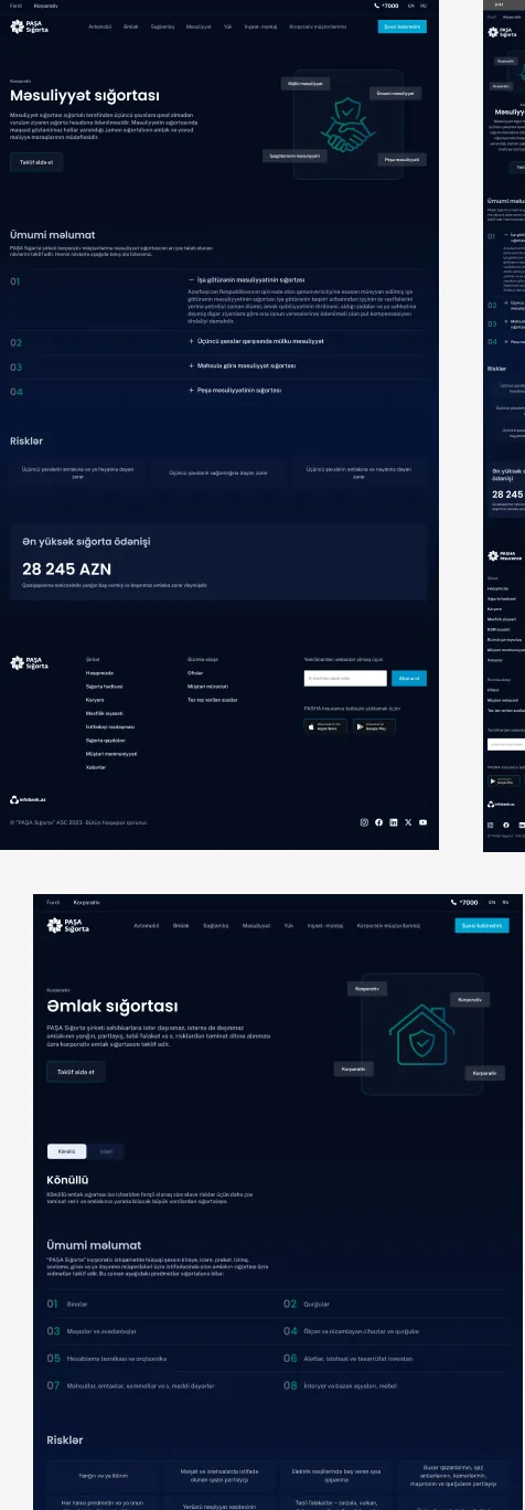
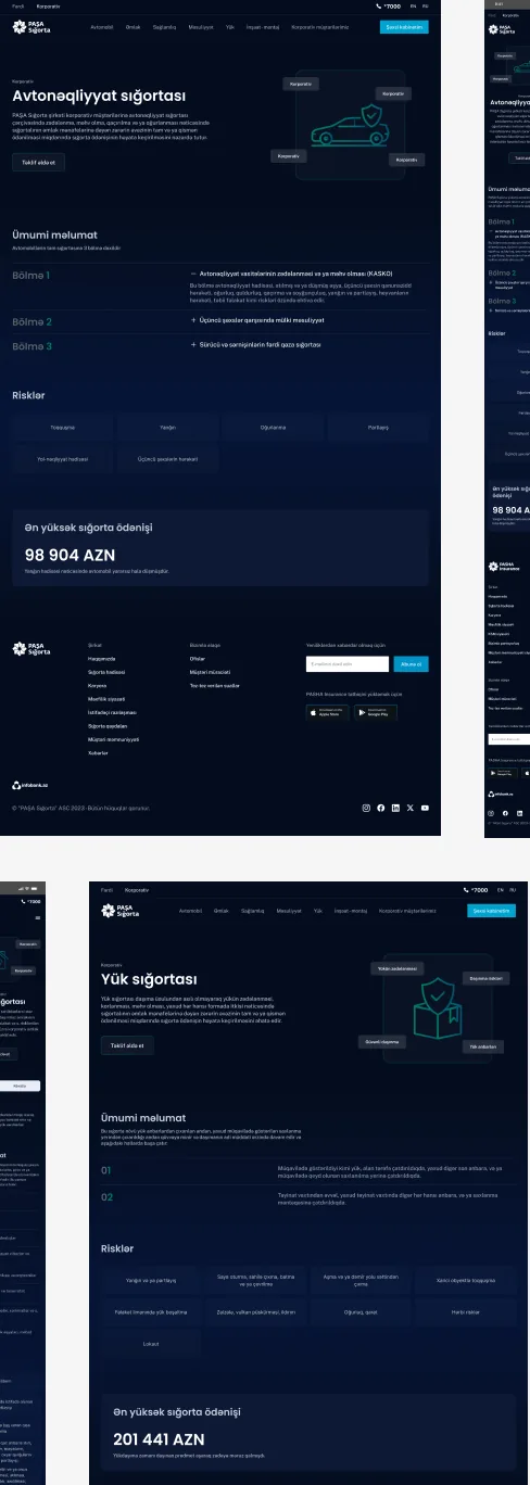
- Every corporate line carried the same tension, whether it was health, motor fleets, or property for a company rather than a person. Businesses wanted enough to gauge scale and fit before a conversation, but pricing couldn't be shown publicly, since a number risked misrepresenting a company's real size or need.
- That silence read differently depending on who hit it. Health customers had to pick a headcount tier before seeing anything about coverage, which meant several picked wrong simply because the comparison never came first. Motor fleets got a blank form with no reference point at all, which felt less like caution and more like the site was hiding something.
- Underneath both was the same structural gap, corporate decisions involve more than one person and more time than an individual purchase, yet the pages were built as if a business would move through them the same way a single customer would.
What I Changed
- The fix looked different per vertical, but the principle stayed the same, show enough to evaluate fit and scale, without ever stating a figure publicly. Health got tiers reordered side by side before commitment. Motor fleets got a reference price point instead of a blank form.
- A confirmation step followed wherever a company had to choose between options, so a representative could see exactly what they were selecting before moving forward, rather than discovering afterward whether it actually fit.
- Pricing itself stayed off every corporate page. Submitted details routed to the call centre in every case, where an actual conversation could cover what the page intentionally left out, but by that point, the company had already done enough evaluation on its own to know the conversation was worth having.
B2B Health Insurance
Pain Points
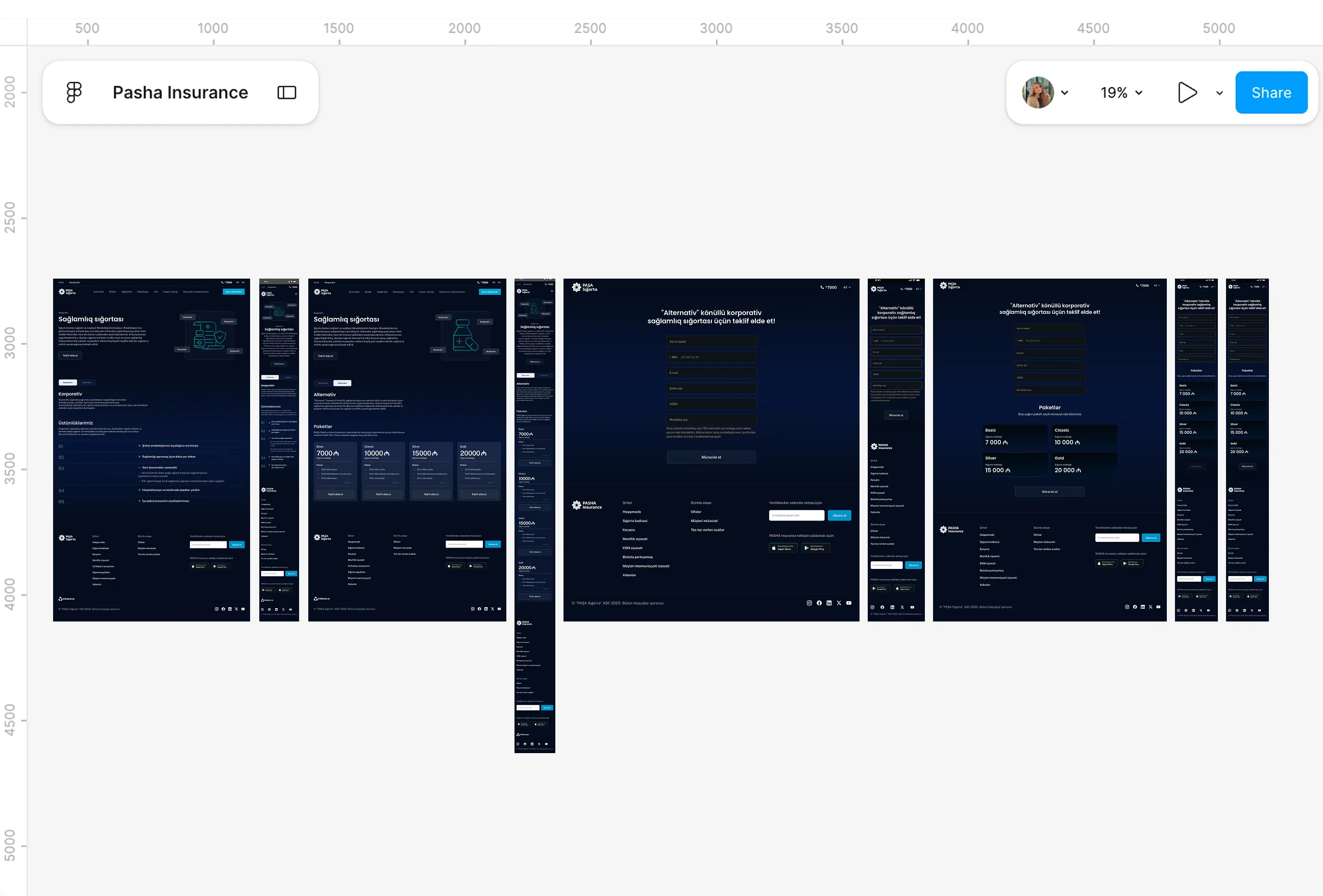
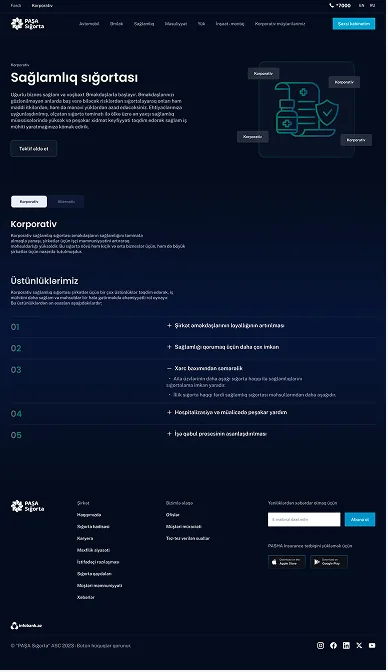
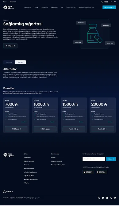
- A conversation with the B2B team surfaced this one clearly. Companies looking to insure their employees had to pick a headcount tier, under 50 or over 50, before they'd seen anything else about what either tier actually covered. Several had picked the wrong one simply because the choice came first and the comparison came never.
- That created a strange sequence for a decision this size. A company representative would commit to a tier based on a number, then only afterward find out whether it matched what their employees actually needed, sometimes discovering they'd over-selected coverage they didn't need to pay for.
- Layered on top of that was a constraint the individual side never had to deal with. Company-level figures were treated as sensitive, since showing exact pricing publicly risked misrepresenting a business's actual scale, so the flow also had to build enough trust to move forward without ever stating a number.
What I Changed
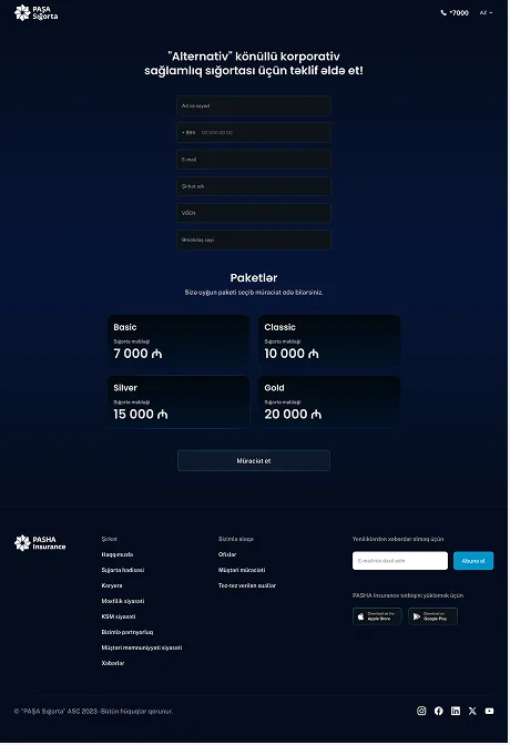
- Reordering the decision felt like the obvious fix once the pattern was clear. Both tiers, under 50 and over 50 employees, now show side by side first, coverage and differences laid out before anyone has to commit to a headcount.
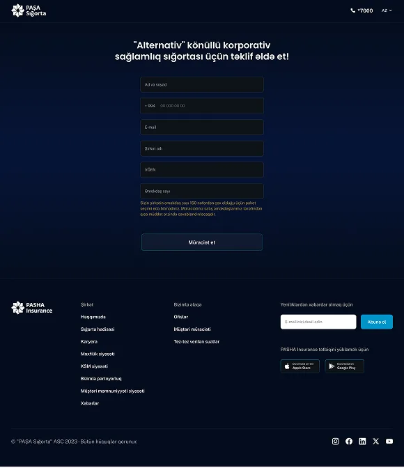
- A confirmation step follows once a tier is selected, so a company representative sees exactly what they're choosing, coverage, terms and all, before moving forward, rather than only finding out afterward whether the tier actually fit their employees.
- Pricing itself stayed off the public page entirely. Submitted details route to the call centre, where a company representative follows up by phone, keeping the sensitive part of the conversation exactly where it needed to stay private, while everything a company needed to decide which tier fit them was already visible before that call ever happened.
Online payment
Pain Points
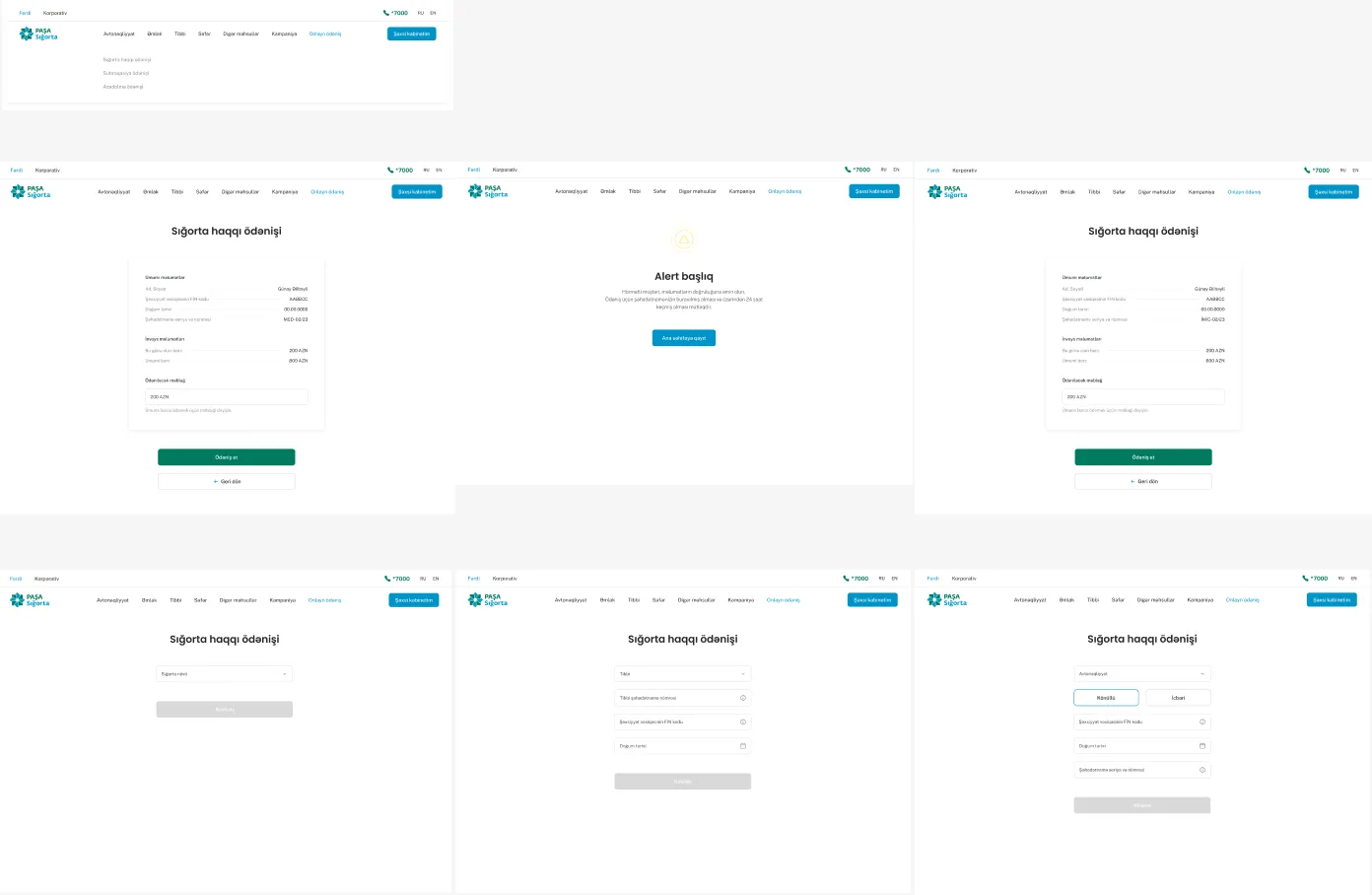
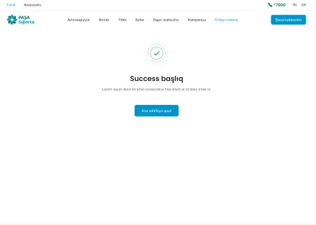
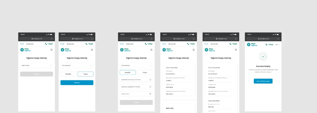
- Payment had grown the way things do when nobody designs it end to end, one method added when it was needed, then another, with no shared logic behind any of it. Business and individual customers landed on the same experience, even though what identified and verified them was completely different.
- Someone from the payments side mentioned this plainly during a review. Individuals had national ID and myGOVAZ available for verification, businesses didn't work that way at all, they needed something tied to the company itself, not a person. Forcing both through one generic flow meant neither was actually well served by it.
- That mismatch showed up as friction in a place friction is especially costly, the final step before money actually changes hands, exactly where someone is most likely to abandon if something feels unclear or misaligned with who they are.
What I Changed
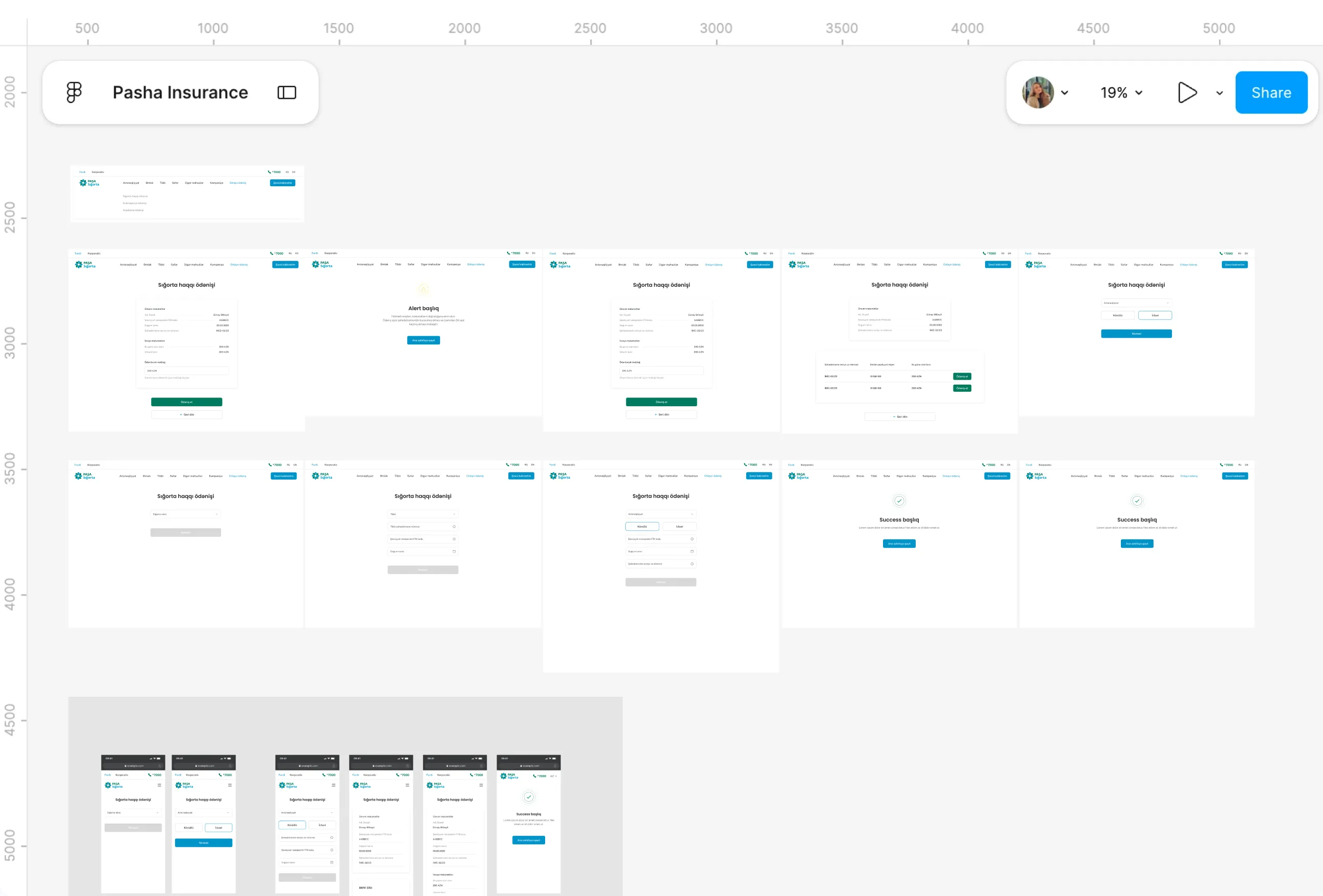
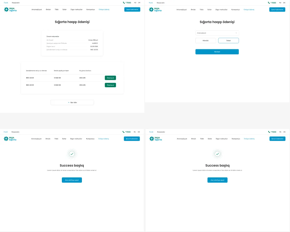
- Splitting payment by customer type was the starting point, rather than trying to make one flow flexible enough to cover everyone. Businesses got a unique code, issued exclusively to them, since a company needed something tied to their identity as an organization, not a personal ID number.
- Individuals got MilliÖn as the standard path, verified through national ID and myGOVAZ, the same verification method already familiar from other parts of the site. An ABB bank option sat alongside it, using that same national ID and myGOVAZ verification, giving individuals a second route without introducing a second kind of identity check.
- Three distinct routes came out of this instead of one generic one, each built around who was actually paying and what they had to verify with, so the final step before money changed hands finally matched who was standing in front of it.
Role and Working Context
Sole designer on the PASHA Insurance website from November 2023 to May 2025, covering the individual and business sides across property, health, travel and motor.

-
Discover
Understanding the site meant starting with what actually existed, not what anyone assumed existed, so mapping the full information architecture came before any design decision, backed by repeated meetings with each insurance vertical's team, moderated sessions and focus groups with individual and business customers, and call centre data showing which questions the site hadn't answered well enough on its own.
Understanding the site meant starting with what actually existed, not what anyone assumed existed, so mapping the full information architecture came before any design decision, backed by repeated meetings with each insurance vertical's team, moderated sessions and focus groups with individual and business customers, and call centre data showing which questions the site hadn't answered well enough on its own.
-
Define
The research kept surfacing the same pattern rather than a scattered list of complaints, hesitation about what to do with information already read, not confusion about how to use the site, which reframed the whole problem around one split, individuals needed speed and self-service, while corporate pages needed enough depth to support a slower, multi-stakeholder decision without ever showing pricing that could misrepresent a business's scale.
The research kept surfacing the same pattern rather than a scattered list of complaints, hesitation about what to do with information already read, not confusion about how to use the site, which reframed the whole problem around one split, individuals needed speed and self-service, while corporate pages needed enough depth to support a slower, multi-stakeholder decision without ever showing pricing that could misrepresent a business's scale.
-
Design
Every section got rebuilt page by page, home, packages, testimonials, footer, on the shared architecture from Discover, with CASCO, the B2B flows and the partner network map each treated as genuinely different problems rather than one template reapplied four times, and a dedicated design system built specifically for the website, kept separate from the app's own since the two products carried different constraints entirely.
Every section got rebuilt page by page, home, packages, testimonials, footer, on the shared architecture from Discover, with CASCO, the B2B flows and the partner network map each treated as genuinely different problems rather than one template reapplied four times, and a dedicated design system built specifically for the website, kept separate from the app's own since the two products carried different constraints entirely.
-
Deliver
Focus groups ran after each milestone, external sessions testing with real customers and internal sessions bringing in designers across the wider group, feeding findings into what shipped next, while delivery ran cross-functionally with sales, marketing, B2B stakeholders and an external agency, ending with CASCO online, the discount issue resolved, and corporate flows live with pricing kept private.
Focus groups ran after each milestone, external sessions testing with real customers and internal sessions bringing in designers across the wider group, feeding findings into what shipped next, while delivery ran cross-functionally with sales, marketing, B2B stakeholders and an external agency, ending with CASCO online, the discount issue resolved, and corporate flows live with pricing kept private.