Portfolio
Personal Website
Overview
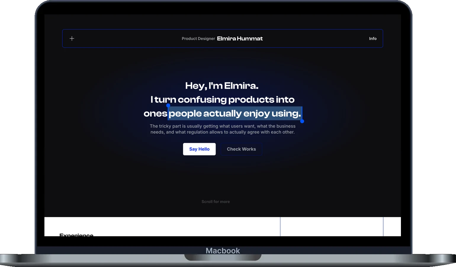
This site is my portfolio and my newest project. I designed every screen myself in Figma, then built and shipped it with Claude Code, my first time vibe coding, knowing little more about code than what an H1 is.
Context
Portfolios usually show finished work, not how a designer thinks. I wanted mine to behave like a product: calm to read, quick to open and a little playful, so the site itself becomes a case study of how I make decisions.
Design Approach
I kept one rule: motion has to mean something, or it goes. The AI could build almost anything, so my job was deciding what should exist, reviewing every change in the browser and cutting what felt busy, even when it was clever.
Project Snapshots
A snapshot of a seven day, self directed build, five days of design and two of building. These figures describe scope and performance, not user impact, since this is my own portfolio rather than a tested product.A snapshot of a seven day, self directed build. These figures describe scope and performance, not measured user impact.
5 + 2 days Designed, then built
Learning on the way
I'd never used Claude Code before. I learned it while building this site in two days, and I'm still learning something new with every change I make.
A real product, not a Figma file. Live on its own domain, tested on every change and deployed automatically, so a design decision reaches the site in minutes.
Designing with AI, not handing it over
The code came from Claude Code, but every layout, animation and cut was a design decision I made and could explain.
Motion with a job to do. Every animation had to explain something, bricks being laid, lines drawn as you read, cards pulled from a folder, or it was cut.
Fast, accessible and findable. Reduced motion, contrast checks and SEO were designed in, not added at the end.
0.27s
-
5 + 2 days
designed, then built
Five days designing every screen myself, then two days learning Claude Code while I built it.
-
3 sizes
one design system
Desktop, tablet and mobile designed separately, not squeezed down from desktop.
-
0.27s
until the page appears
Measured on the live site, after moving fonts and caching in house.
Detailed Work
A closer look at each part of the site, from the system underneath to the motion on top and the ideas I cut. Every screen shown is the live site, and the numbers come from measuring it.
Design system
Pain Points
- Before a single page existed, the risk was obvious: seven pages, three screen sizes and a lot of motion could easily turn into seven slightly different websites. I've seen that happen on real products, where every screen invents its own spacing and nobody notices until it's everywhere.
- Building it with AI made that risk bigger, not smaller. A tool that can produce anything will happily produce inconsistency too, unless something tells it what the rules are.
What I Changed
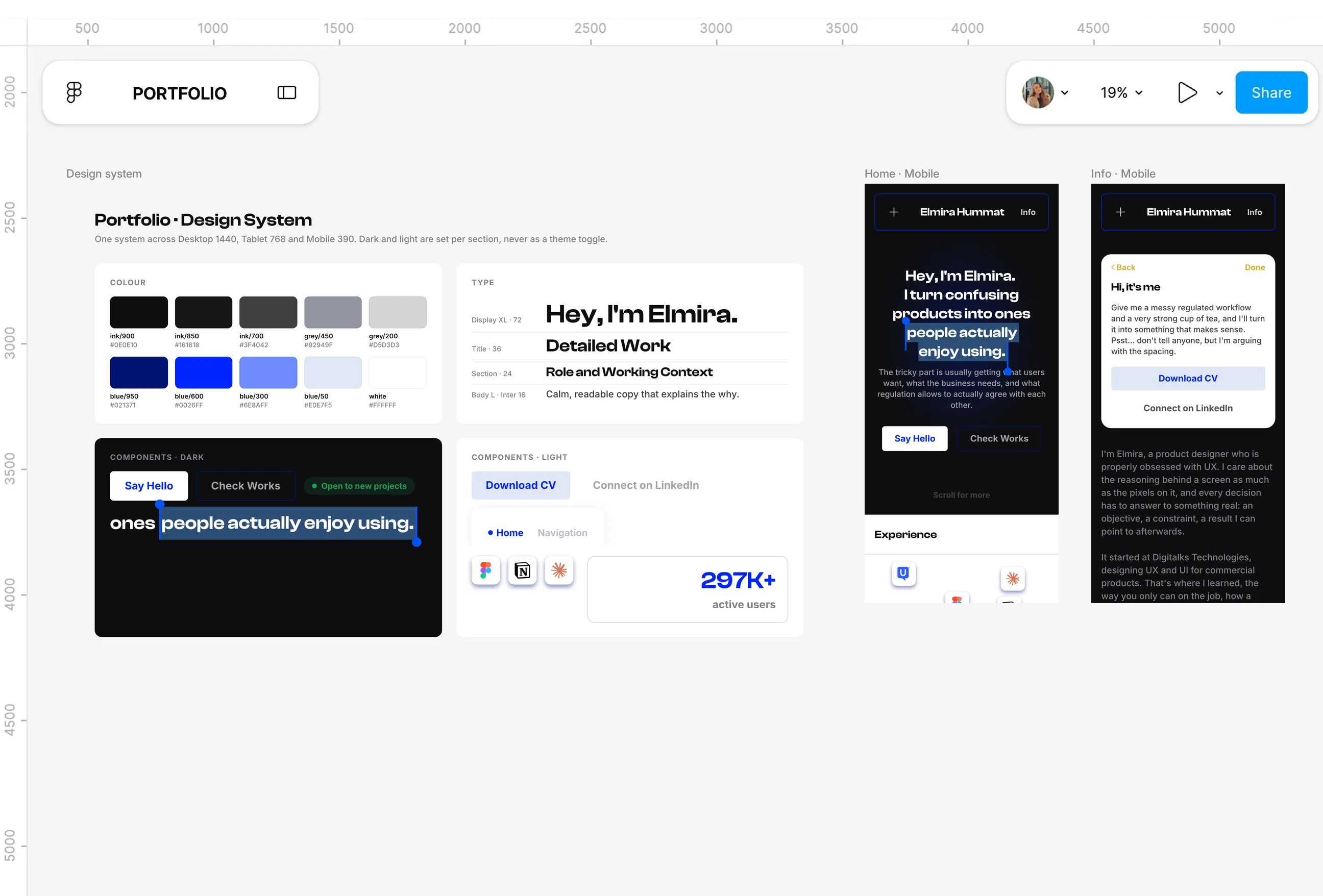
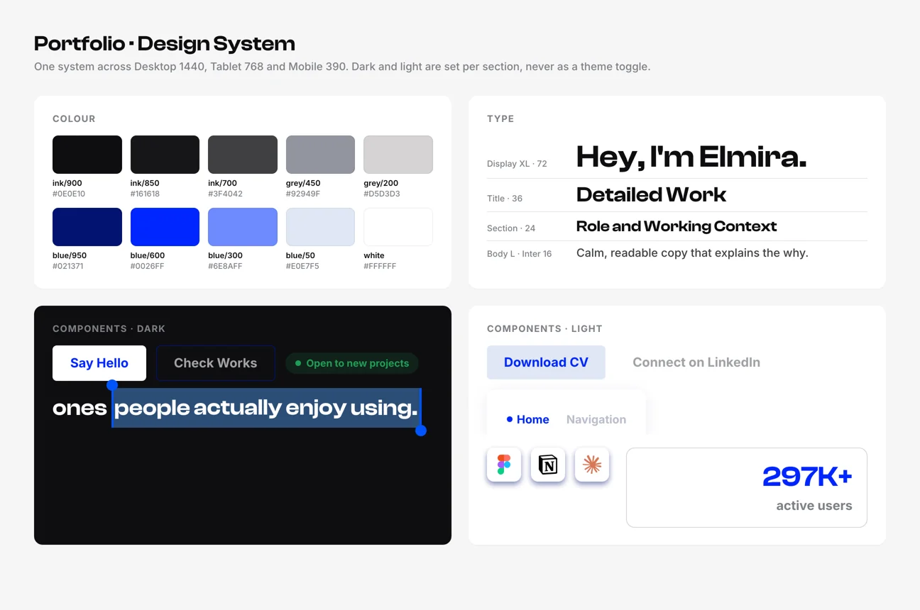
- I wrote the rules down first: a design system brief with colour, type, spacing and every component's behaviour, and a content document with every word on the site. Those two files became the handoff, the same way I'd hand work to an engineering team.
- Dark and light are set per section, never as a theme toggle, and every value lives in one set of tokens. When I later moved the whole site to a deeper black, it was one change, and every page followed.
Responsive layouts
Pain Points
- Most portfolios are designed on desktop and squeezed onto a phone at the end. Things that work at 1440 pixels, a folder stack that overlaps on purpose or a deck of cards, simply don't survive being shrunk.
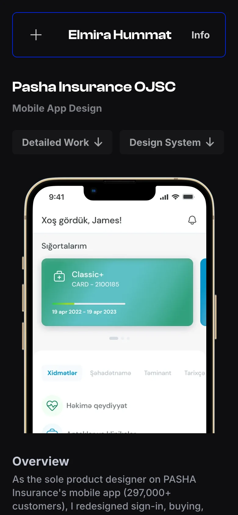
- The case study screens were the hardest part: desktop shows a whole Figma canvas, which becomes unreadable on a phone.
What I Changed
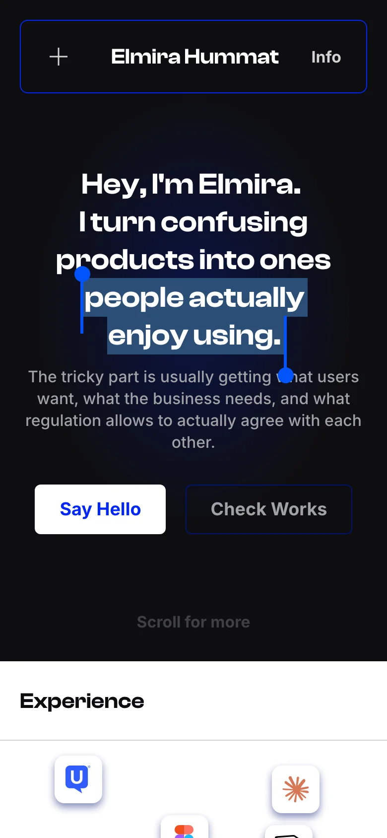
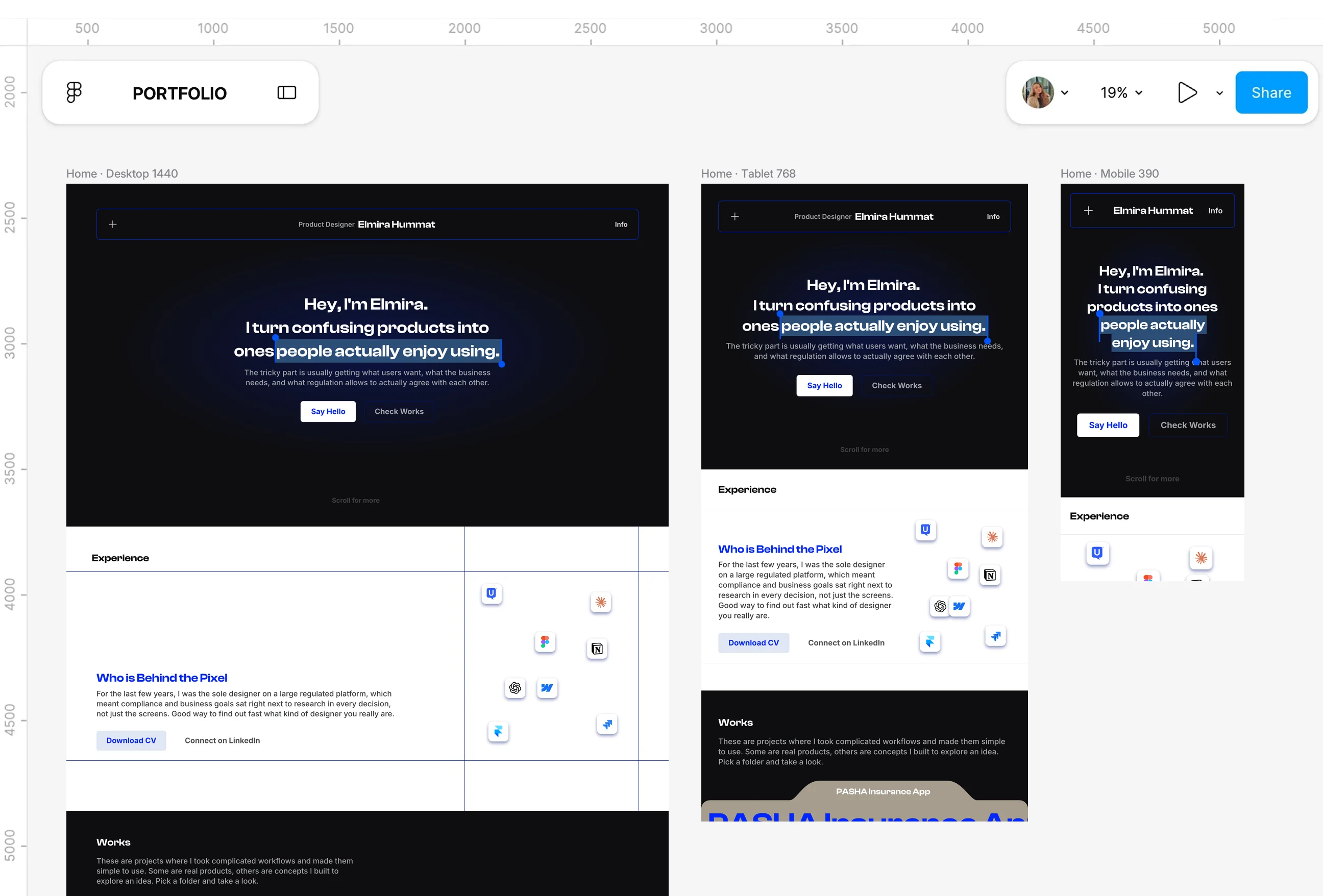
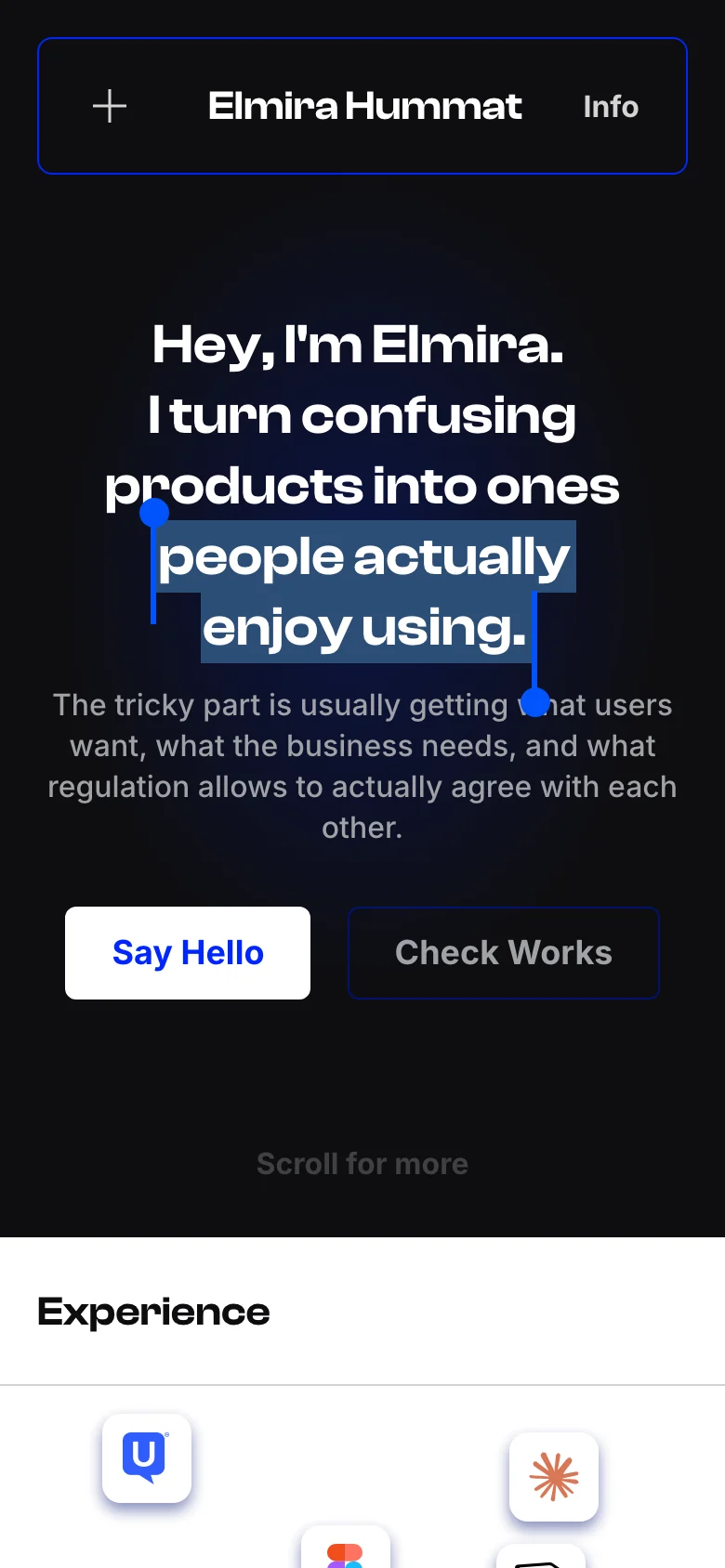
- Every page was designed three times, for 1440, 768 and 390, and the differences are intentional: process cards overlap on desktop, sit side by side on tablet and become a swipeable row on mobile.
- On tablet and mobile the screens sit on a light panel in tidy rows and open full size on tap, and long findings open with Read more, so a phone visitor gets the story without scrolling through walls of text.
Motion with meaning
Pain Points
- Motion is the easiest thing to overdo. With a tool that can animate anything in minutes, the temptation is to make everything move, and a portfolio that never stops moving is tiring to read.
- My first versions also played before anyone could see them, starting while a section was still below the fold.
What I Changed
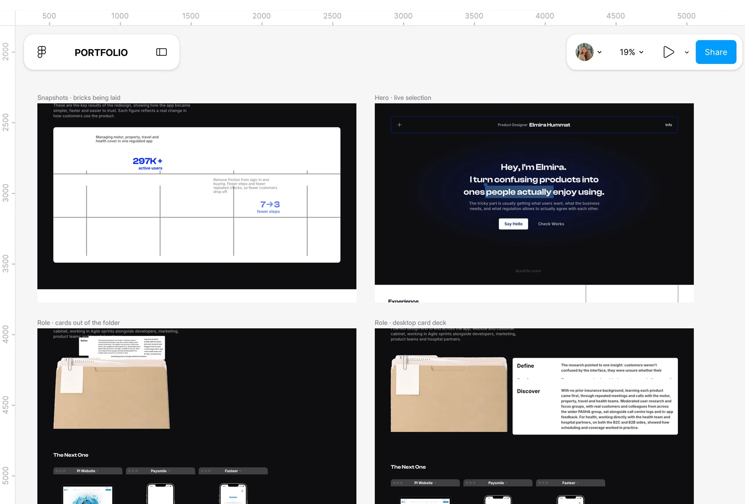
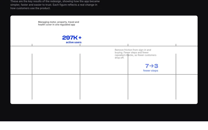
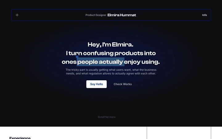
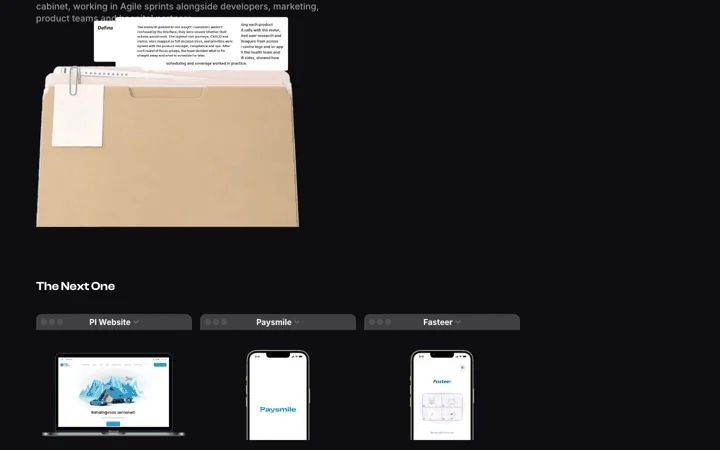
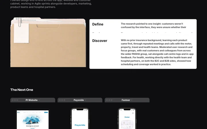
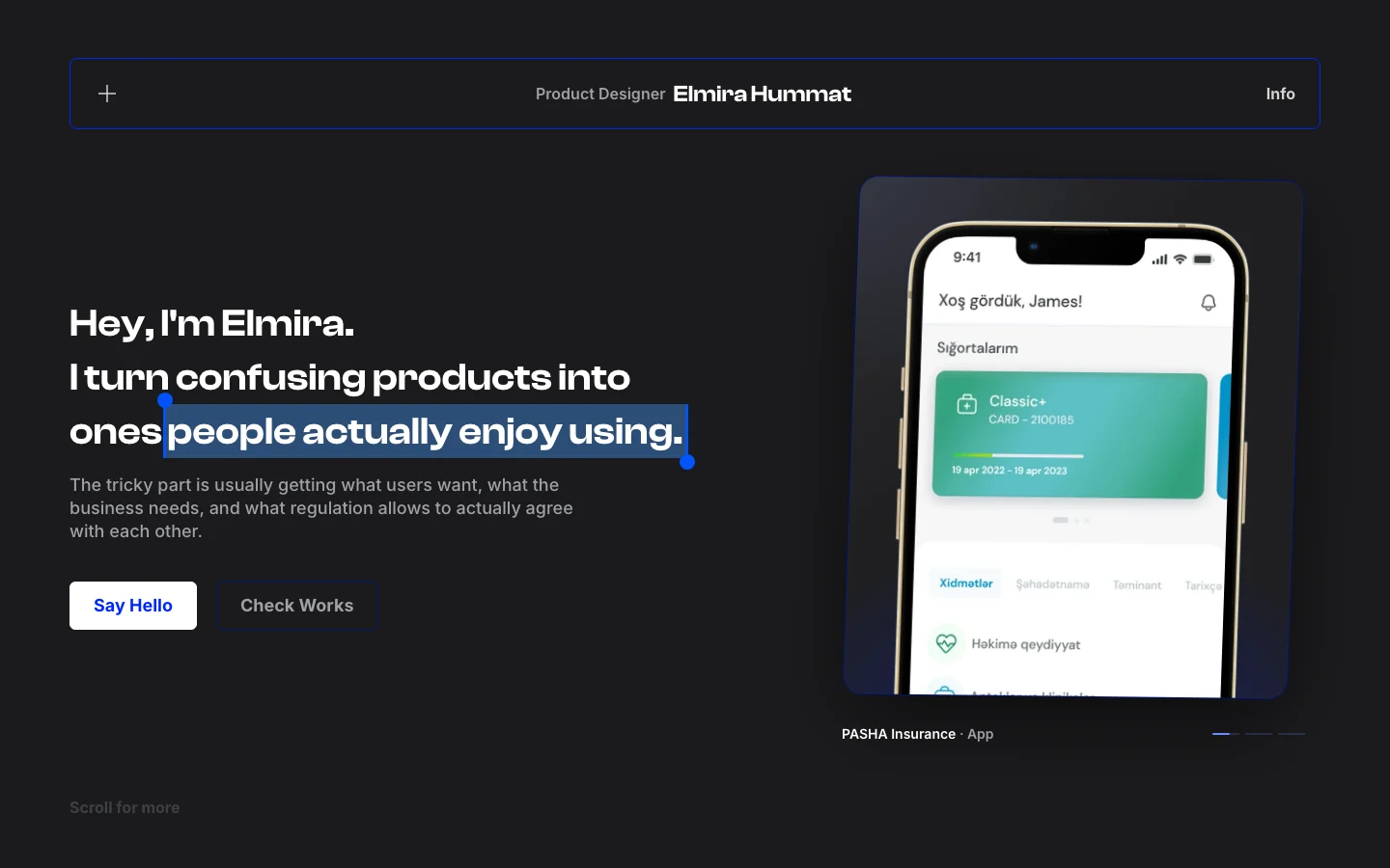
- I gave myself one rule: every animation has to explain something. Results arrive like bricks being laid, the lines between findings draw themselves as you read, my process cards come out of a folder, and the headline selects the part that matters.
- Each one plays once, when its section is properly in view, never at the same time as another, and switches off for people who prefer reduced motion. I reviewed every one as a screen recording and rejected more than I kept.
Playful physics
Pain Points
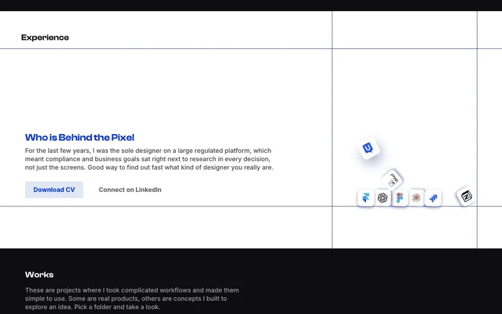
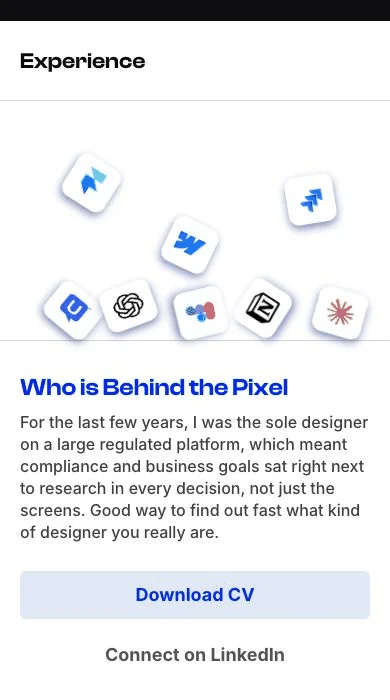
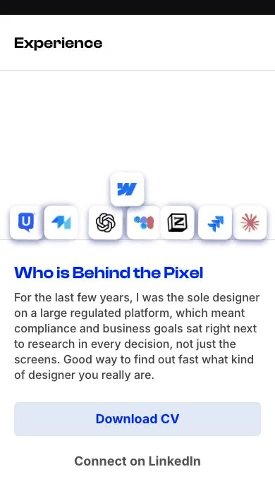
- The Experience section showed my tools as a static cluster of icons. It was tidy, but it felt lifeless, and it said nothing about how I like to work: hands-on, curious and a bit playful.
- The first attempt, icons sliding a few pixels into place, looked like a template animation. It needed to feel physical to feel honest.
What I Changed
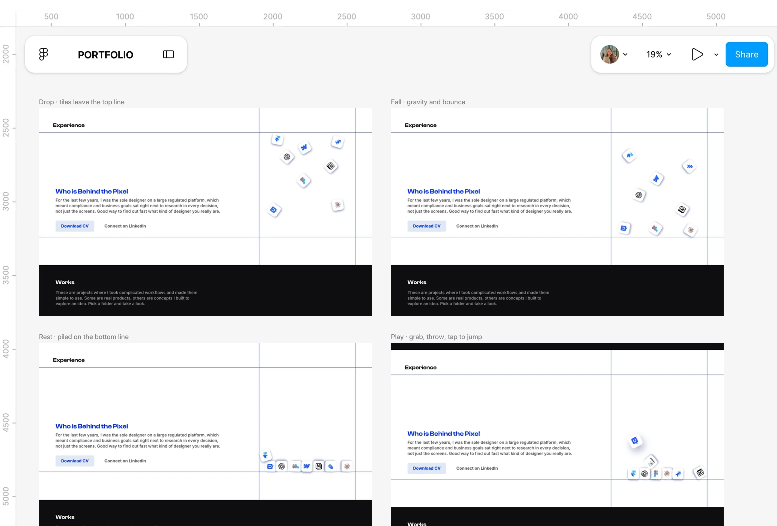
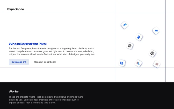
- The icons now fall from the top line, bounce and pile up on the bottom line with real gravity. You can tap one to make it jump, or pick it up and throw it.
- The details are what make it satisfying: a tile sinks slightly when pressed, lifts when grabbed, hangs from your finger on a soft spring and squashes a little when it lands. It pauses when nothing is moving, so it costs nothing on a phone.
Speed and SEO
Pain Points
- A portfolio is judged in seconds, often on a phone, often from a link shared on LinkedIn. If it opens slowly, looks broken in the preview card or can't be found by name, the design never gets a chance.
- My first build waited on a third-party font server before showing any text, which I could only see by measuring it.
What I Changed
- Fonts now load from the site itself and static files are cached for a year, so the page appears in about a quarter of a second, measured on the live site.
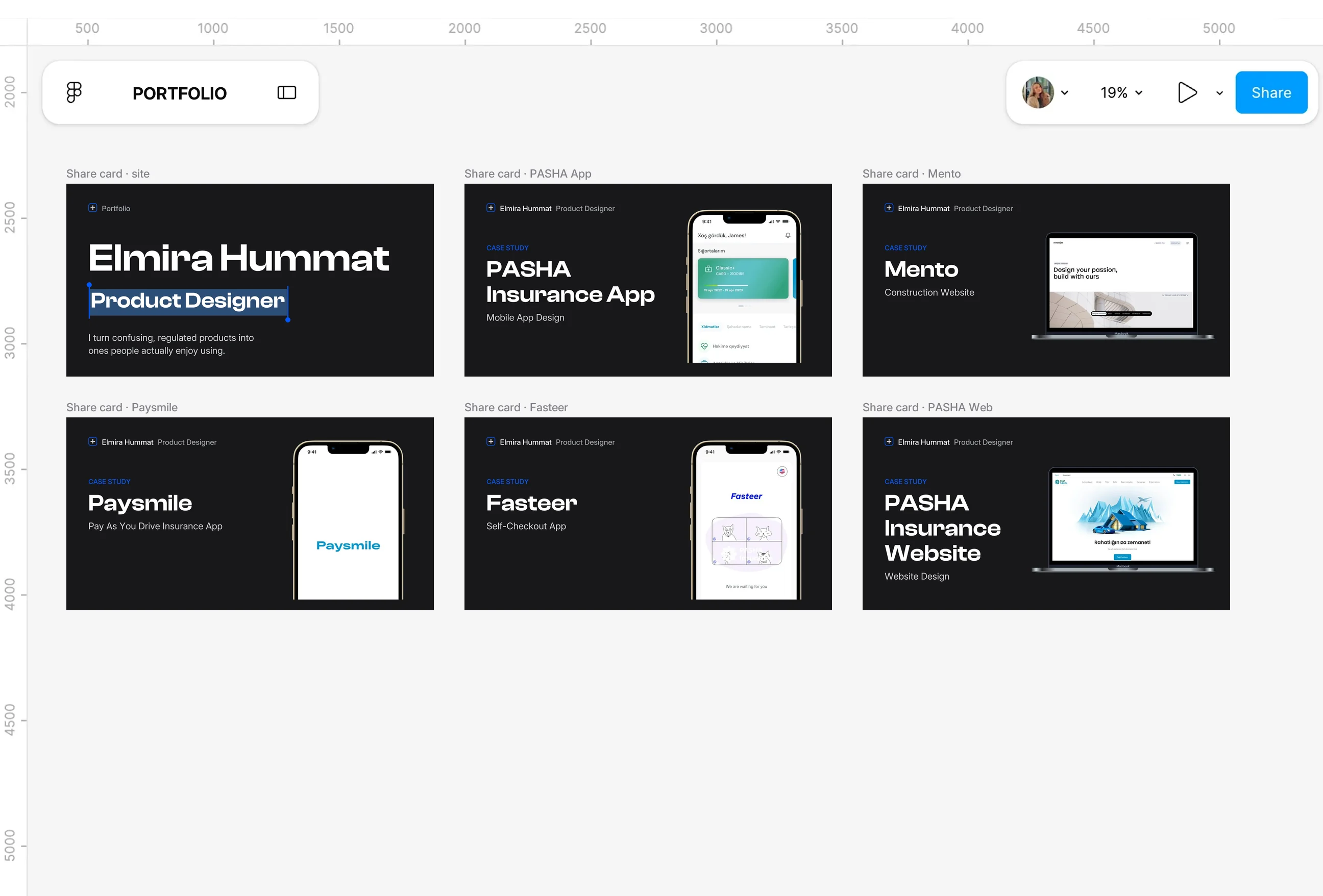
- Every page has its own title, description and share image, search engines get structured data about me and each project, and a sitemap lists what exists. None of it is visible, but it's the difference between a portfolio people find and one they don't.
What I cut
Pain Points
- The hardest part of building with AI wasn't getting things made. It was deciding what shouldn't be there, because everything could be built in minutes and almost everything looked impressive the first time I saw it.
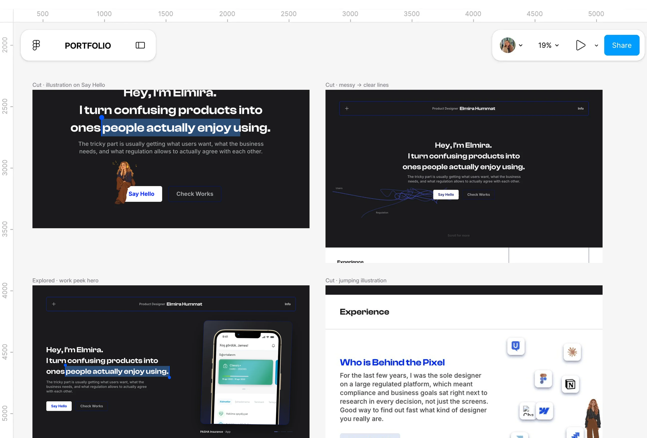
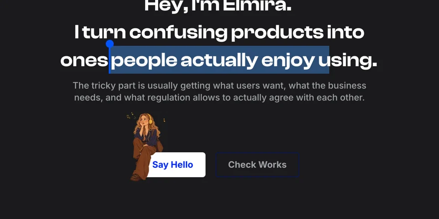
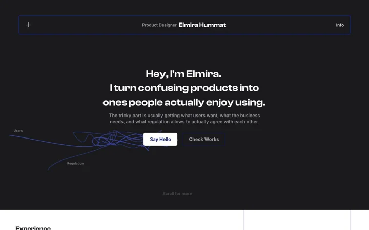
- An illustration of me sitting on the Say Hello button, a version of her jumping around the tools and three lines untangling behind the headline were all built and reviewed.
What I Changed
- I cut all of them. The illustration looped next to the main button and competed with the headline, the jumping version looked like a sticker, and the untangling lines made the first screen feel busy when it should feel calm.
- Showing what I removed matters to me as much as what stayed. Good product design is mostly editing, and this project was a lot of it.
Design System
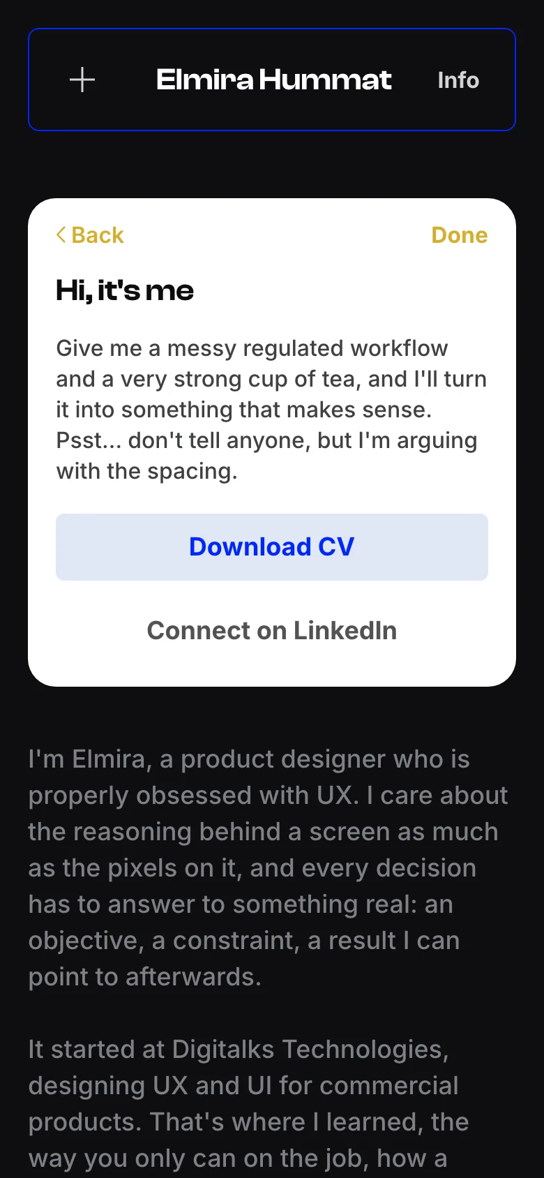
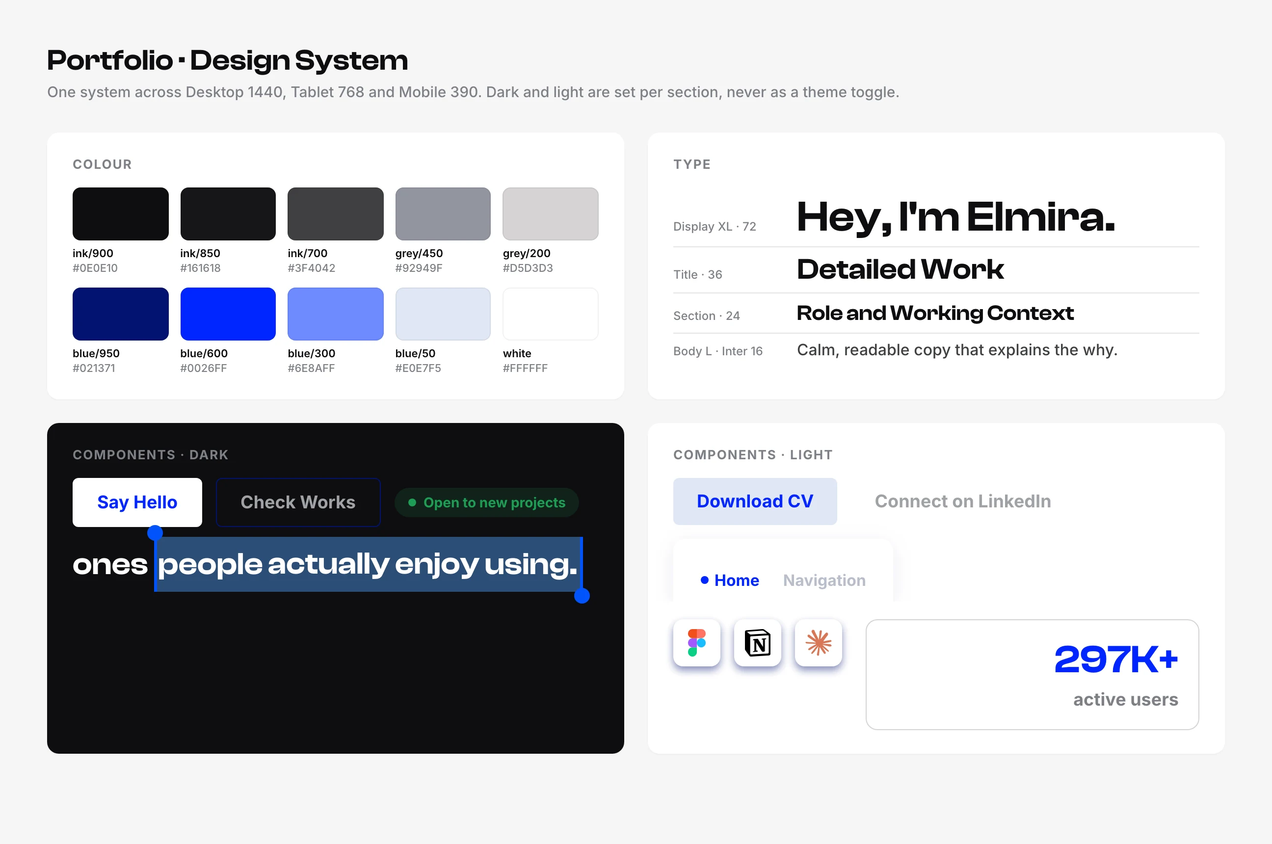
One set of tokens, a deep black and a single bright blue, Clash Display for headlines and Inter for reading, shared by every page and every screen size. Components were defined once in the brief and reused everywhere, from buttons to the tool tiles.
Role and Working Context
A solo, self-directed project. I designed everything, then directed Claude Code to build it, reviewing every change in the browser. My first time vibe coding, starting from knowing what an H1 is and not much more.
-
Discover
Collected portfolios I admired and ones I didn't, and looked at them the way a recruiter does: what can you understand in five seconds, and what makes you close the tab. Built a moodboard around calm dark layouts, one strong accent colour and motion that feels physical rather than decorative.
Looked at portfolios the way a recruiter does, what you understand in five seconds, and built a moodboard around calm dark layouts and physical motion.
-
Define
Turned that into two documents, a design system brief with every colour, type style, component and behaviour, and a content file with every word on the site. Writing the rules first meant every later decision, mine or the AI's, had something to answer to.
Wrote a design system brief and a content file first, so every later decision, mine or the AI's, had rules to answer to.
-
Design
Designed every page in Figma over five days, at desktop, tablet and mobile, with one case study template built once and filled per project. Motion ideas were written down as behaviours in the brief, what moves, when and why, before any of them existed.
Five days in Figma, every page at three sizes, one case study template, and motion written down as behaviours before any of it existed.
-
Deliver
Built and shipped in two days with Claude Code, then iterated live: reviewing screen recordings, adjusting timing and cutting what felt busy. The site is tested on every change and deploys automatically, so a design decision reaches the live site in minutes.
Built in two days with Claude Code, then refined live from screen recordings, tested on every change and deployed automatically.