MENTO
Construction Website
Overview
Mento is a website concept for the construction industry, my entry to the Azerbaijan Design Award, where it won second place. I chose construction on purpose, as one of the hardest sectors to design for: trust driven, technical and still largely offline.
Research
I reviewed construction company websites across markets, from small firms to larger players, looking for structural problems rather than inspiration. Their Google reviews were the turning point: the problem was less about how sites looked and more about who a visitor could tell they were dealing with.
Design Approach
The benchmarking gave me the priorities: help a visitor understand the company within seconds, and use typography and spacing as trust signals rather than volume. The visual language came from my own judgement, built to be the strongest entry I could make.
Project Snapshots
A snapshot of what came out of a one month, self directed process, from award recognition to the structure produced. These figures reflect scope, not measured impact, since Mento was never tested with users.A snapshot of what came out of a one month, self directed process. These figures reflect scope, not measured impact, since Mento was never tested with users.
2nd place At the Azerbaijan Design Award
No client, no brief, no real content
Every layout had to be designed around placeholder copy and imagery, with no way to test how it would hold up with a real company's content.
One month, solo, alongside a full-time job. The entire process, from benchmarking to final UI, had to fit around an existing role at Digitalks Technologies.
A coherent system, not just a homepage. Six sections share the same layout language, so the site feels predictable and consistent as someone moves through it.
Desk research instead of user research. So priorities came from competitor benchmarking and reading Google reviews rather than direct customer input.
Google reviews
-
2nd place
Azerbaijan Design Award
Recognized in a national design competition for construction industry design.
-
1 month
solo, self-directed
Built alongside a full-time role, from benchmarking to final UI.
-
6 sections
one coherent system
Homepage, About, Services, Projects, Resources and Contact share one layout language.
Detailed Work
A closer look at each page: desktop and mobile pages built from the same sitemap and visual system, shown with screens throughout. Names, locations and contact details shown are placeholder content I wrote for the concept, not real information.
Brochure homepages


Pain Points
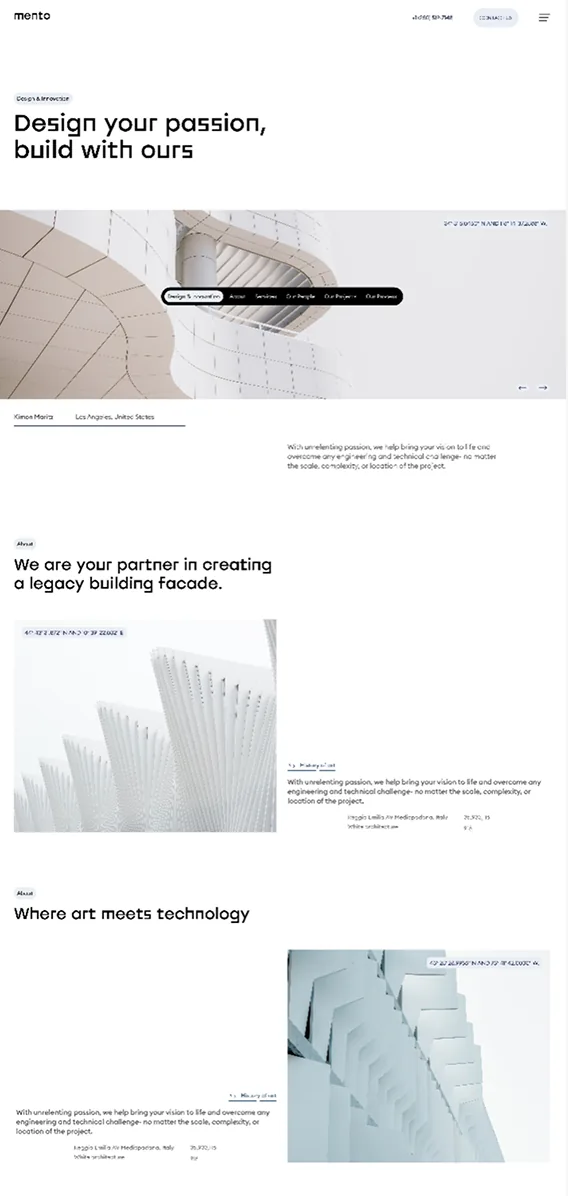
- Nearly every construction homepage I looked at tried to say everything at once, services, projects, credentials, contact details, all competing for the same first glance. There was little difference between what actually mattered and what didn't, so a first-time visitor had to read a lot before understanding what the company actually does.
- That pattern showed up across small firms and larger players alike, which told me it wasn't one bad site, it was how the whole category had settled into designing. Nobody had stopped to ask what a visitor actually needs to see in the first five seconds.
What I Changed
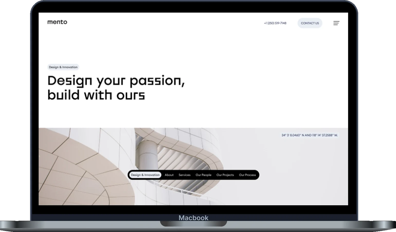
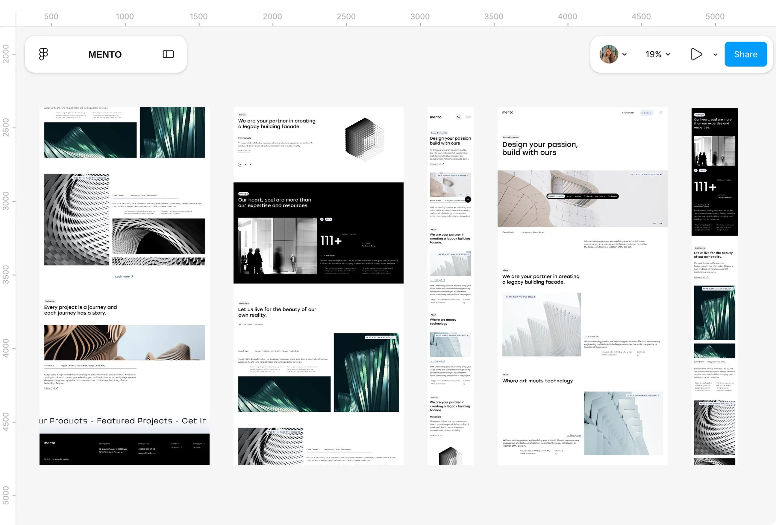
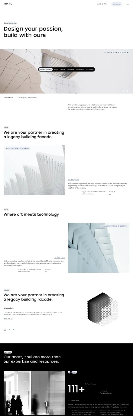
- I designed the homepage as an orientation layer rather than a summary of everything at once. A large headline, a full width architectural image for scale, and clear entry points to the main sections give a visitor somewhere obvious to look first.
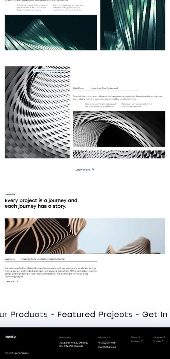
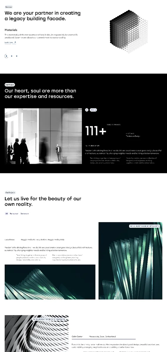
- Below that, alternating image and text sections and a dark stats section communicate experience at a glance, without asking anyone to read a paragraph to understand it. The goal was a homepage you could understand while scrolling past it, not one you had to stop and study.
Navigation
Pain Points
- With everything competing for attention on the homepage, it followed that navigation had the same problem. It was hard to tell where to go next, which made the first few seconds on the site more tiring than they should be for an industry that's already asking visitors to trust it with something expensive.
- That friction compounds quickly. A visitor who isn't sure where to click next doesn't dig deeper, they leave, and in a trust-driven industry like this one, that's the whole battle lost before it started.
What I Changed
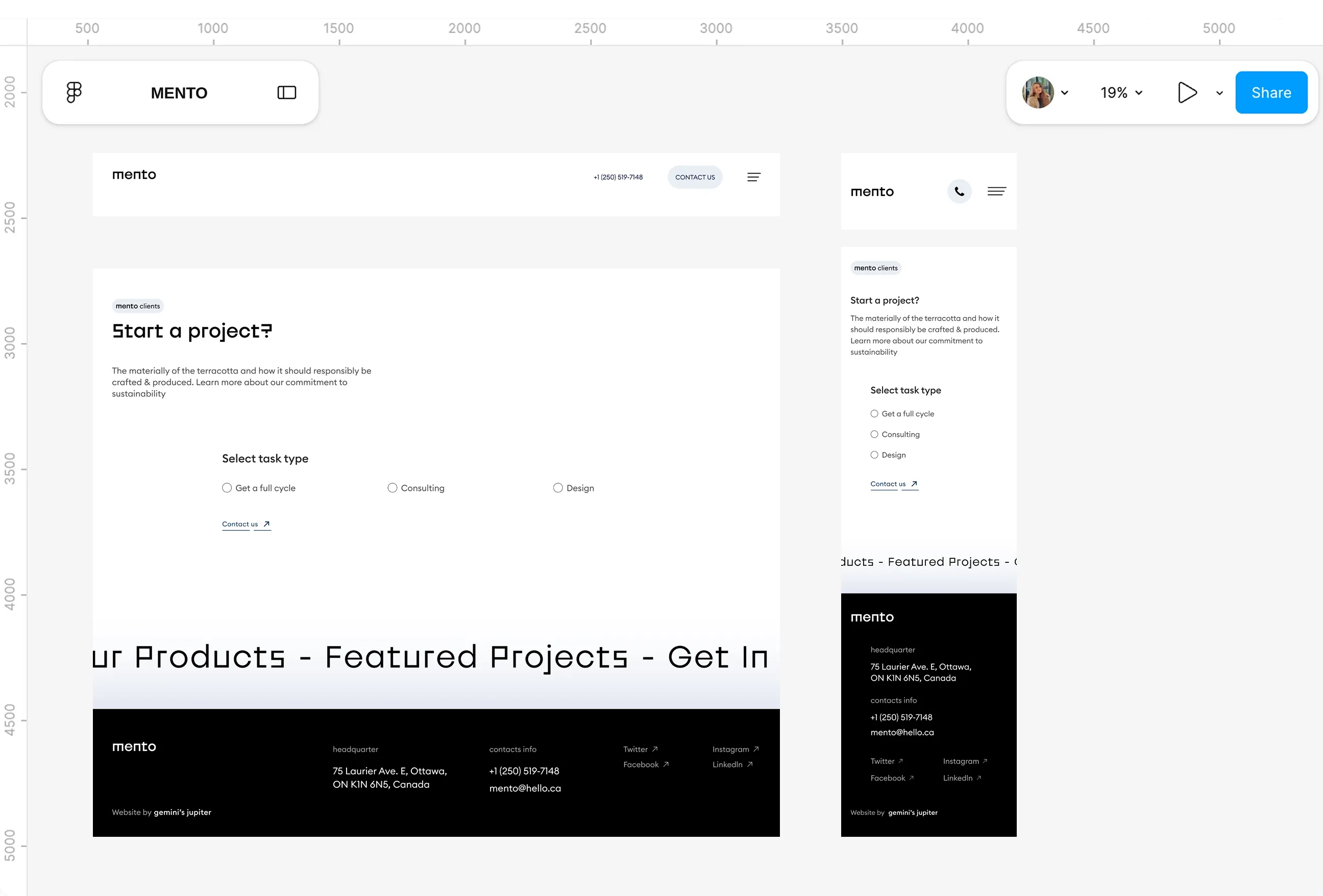
- I placed a dark pill shaped navigation directly over the hero, so the main sections are visible the moment the page loads rather than tucked away in a header someone has to look for. It sits confidently on top of the imagery instead of competing with it.
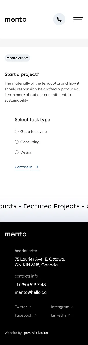
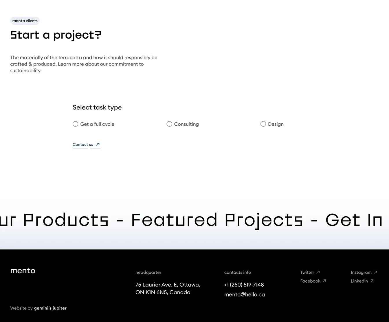
- A phone number and a Contact us button stay visible in the header throughout, so the next step is never hidden no matter where someone is on the site. Whatever page a visitor lands on, the path forward is always in the same place.
Projects
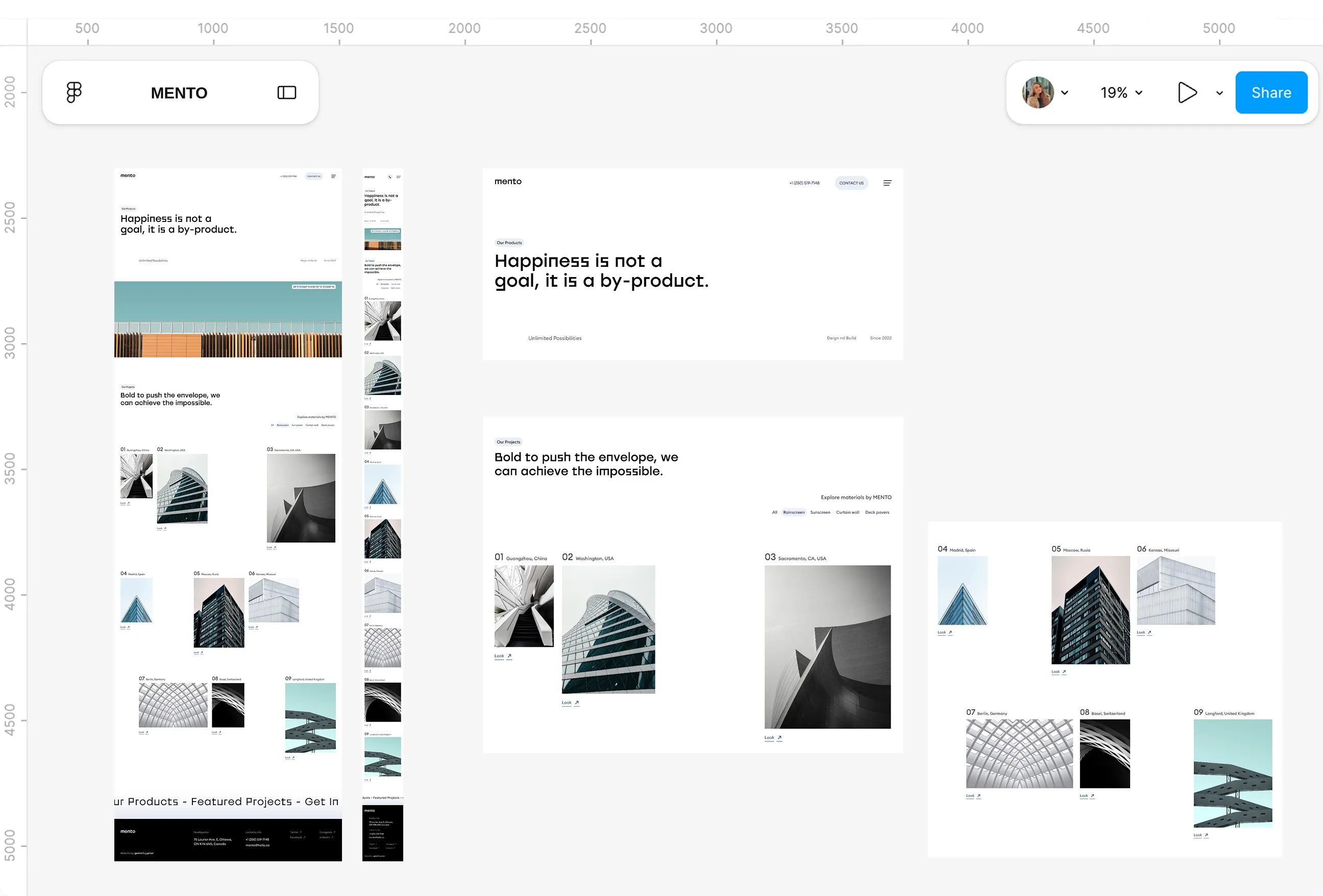
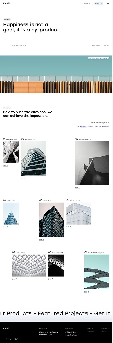
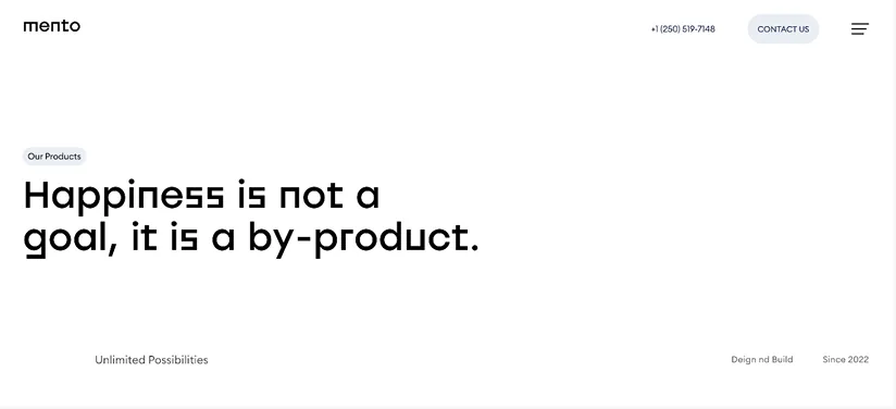
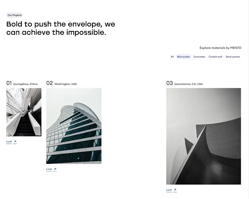
Pain Points
- Project pages across the sites I reviewed behaved like image galleries, a photo, maybe a name, and not much else. They showed results but said nothing about scope, type of work or relevance, so they did little to actually build trust with someone deciding who to hire.
- That's a strange gap for an industry built on physical evidence. A finished building is the strongest proof a construction company has, and most sites were wasting it by showing the photo without the story behind it.
What I Changed
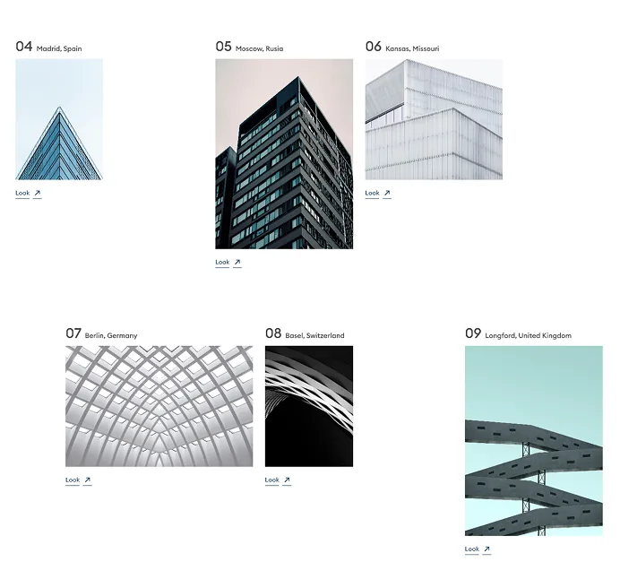
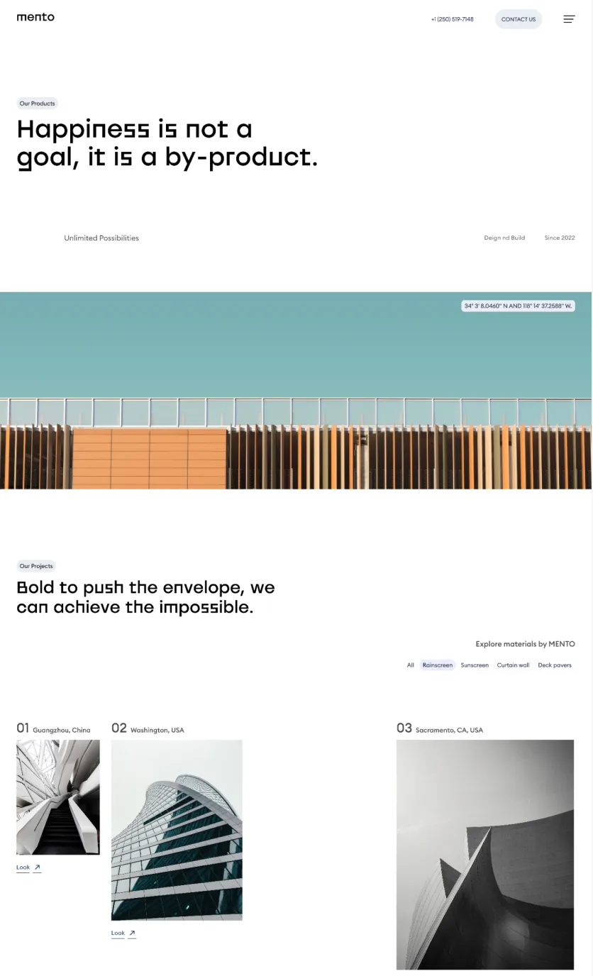
- I designed a numbered projects grid and a project detail layout structured to always hold the same information, location, client, scope, images and a description, so every project can act as evidence of capability rather than just a picture. The content in the concept is placeholder, so this shows the structure a real project would sit inside.
- Numbering the grid was a small decision that did more work than expected, it turns a scattered gallery into something that reads like a body of work, one entry after another, rather than a loose collection of images.
Services copy
Pain Points
- Service descriptions across the sites I reviewed tended to be broad promises, organised around what the company wanted to say about itself rather than the questions a visitor would actually ask. "We deliver excellence" tells someone nothing about what the company does.
- That kind of copy also tends to blur together with the About and Projects pages, since they're all saying similar things in similar language. A visitor comes away with a feeling rather than an answer.
What I Changed
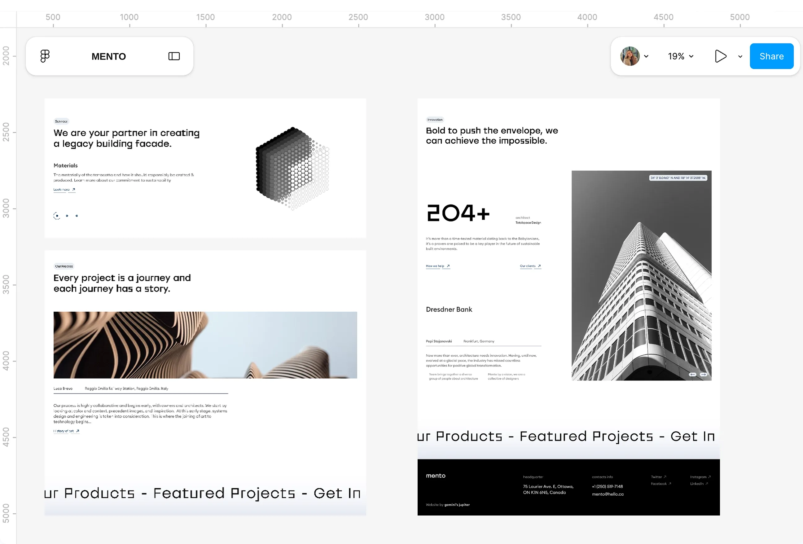
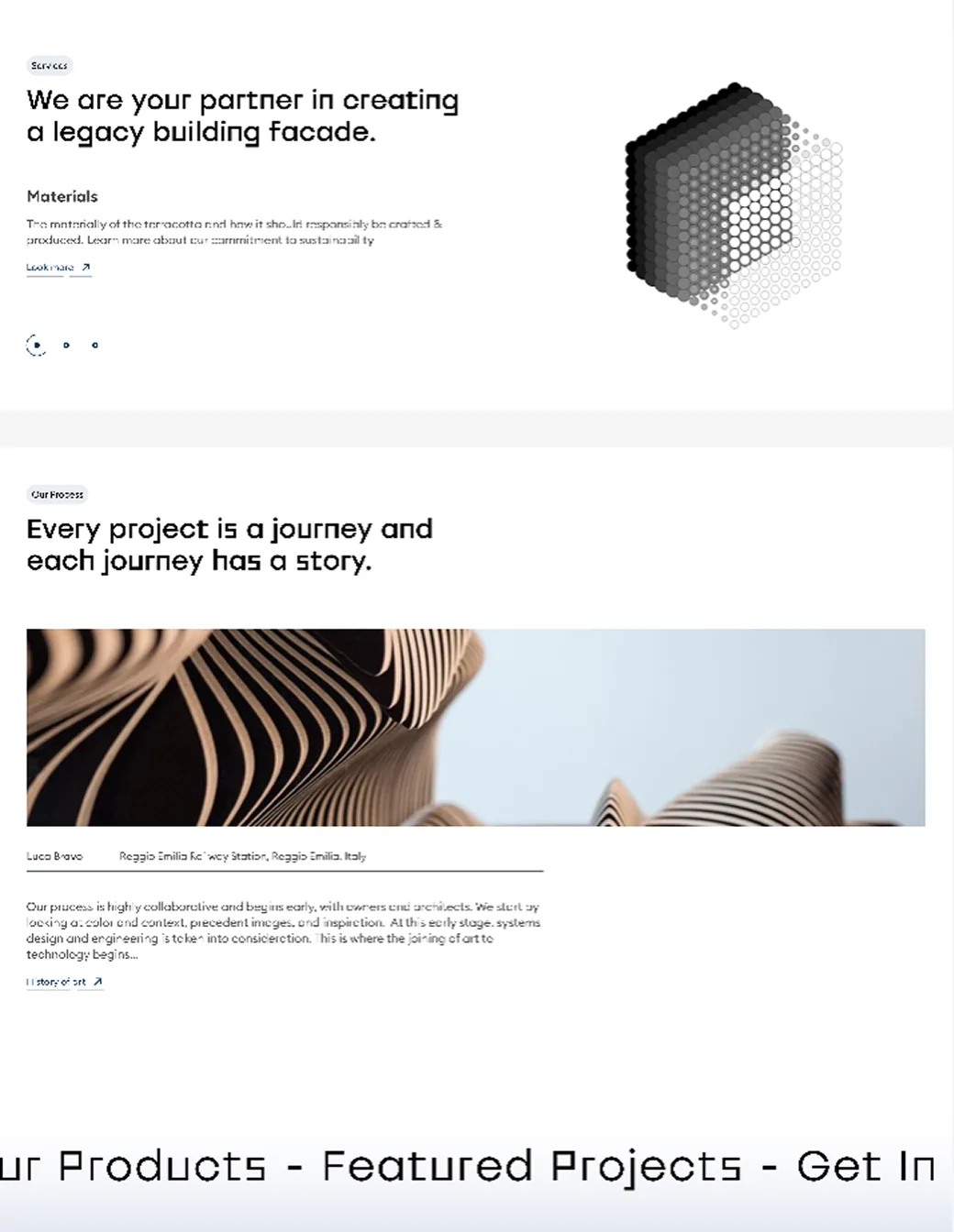
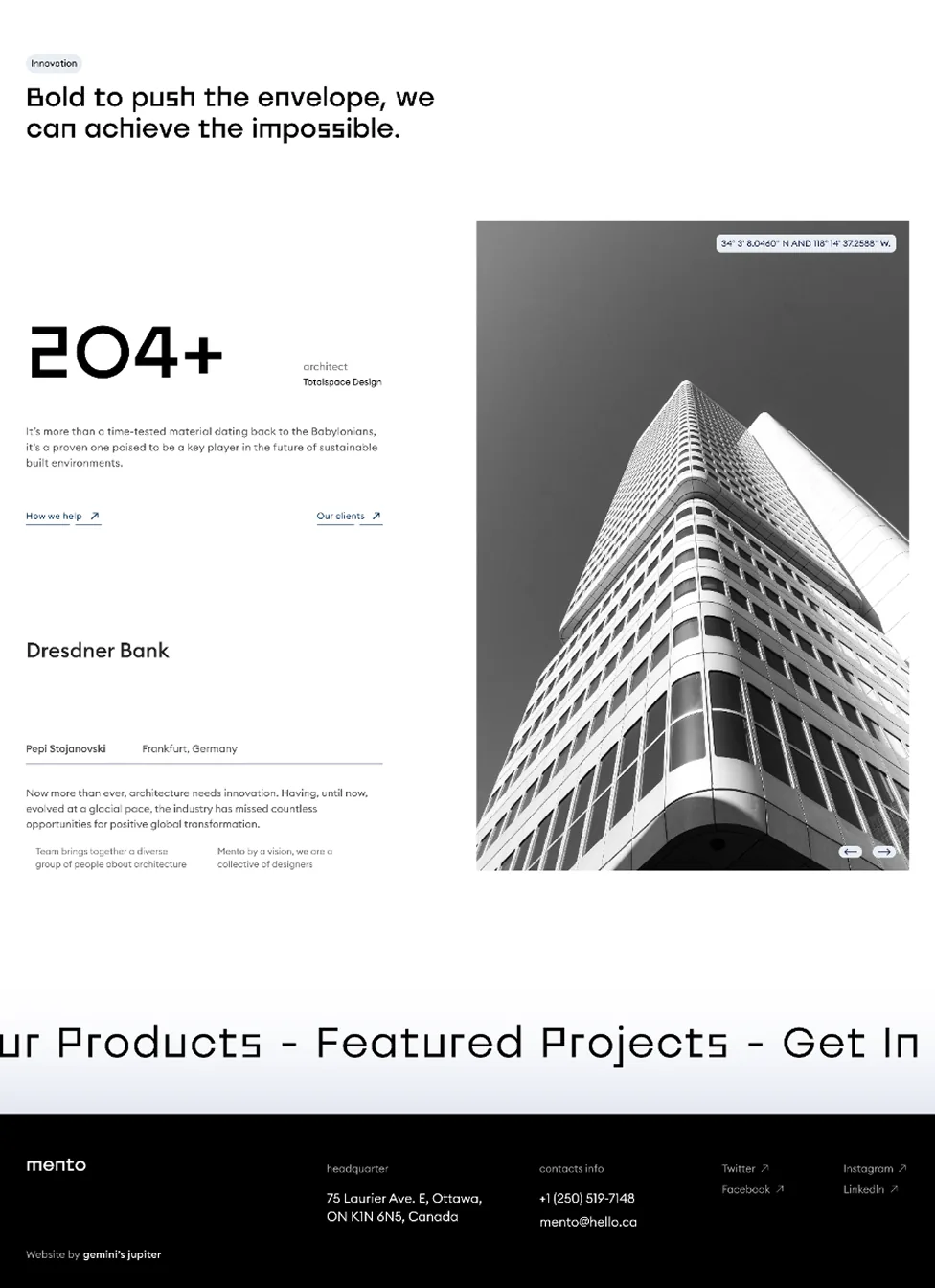
- I defined the services section around clear, specific offerings, full cycle construction, consulting, design and a sustainability approach, so each one answers a real question a visitor might have rather than a vague claim. Separating services from projects and about meant each page finally had one job instead of overlapping with the others.
- That separation is the part I think matters most here. Once every page answers exactly one question, a visitor doesn't have to piece together the company's identity from three pages that all say roughly the same thing.
Contact friction
Pain Points
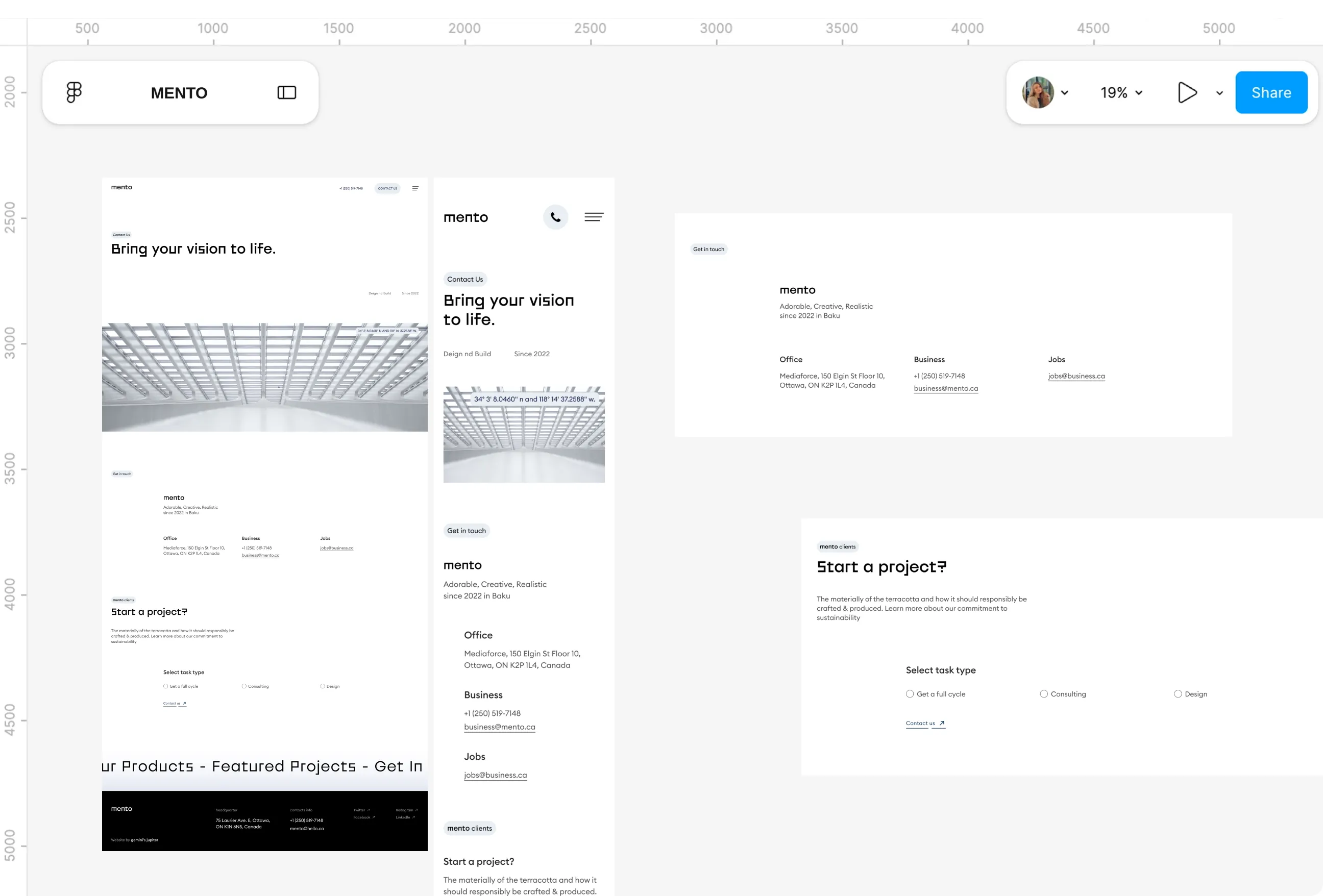
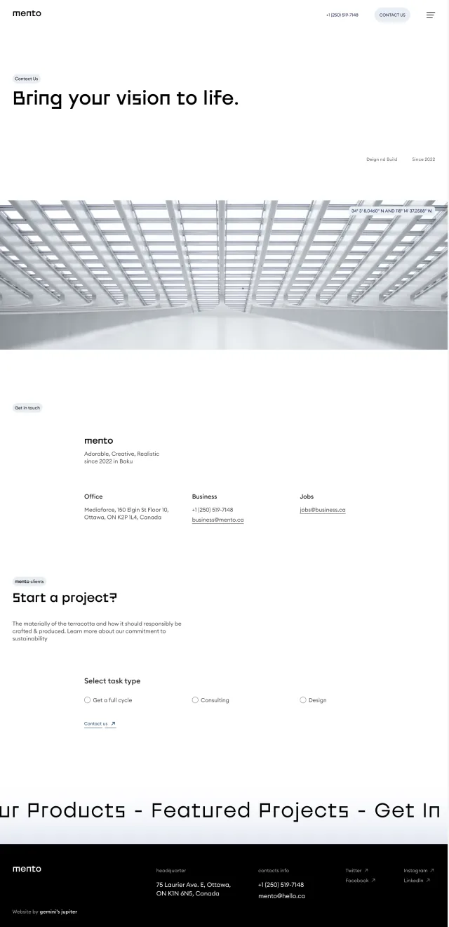
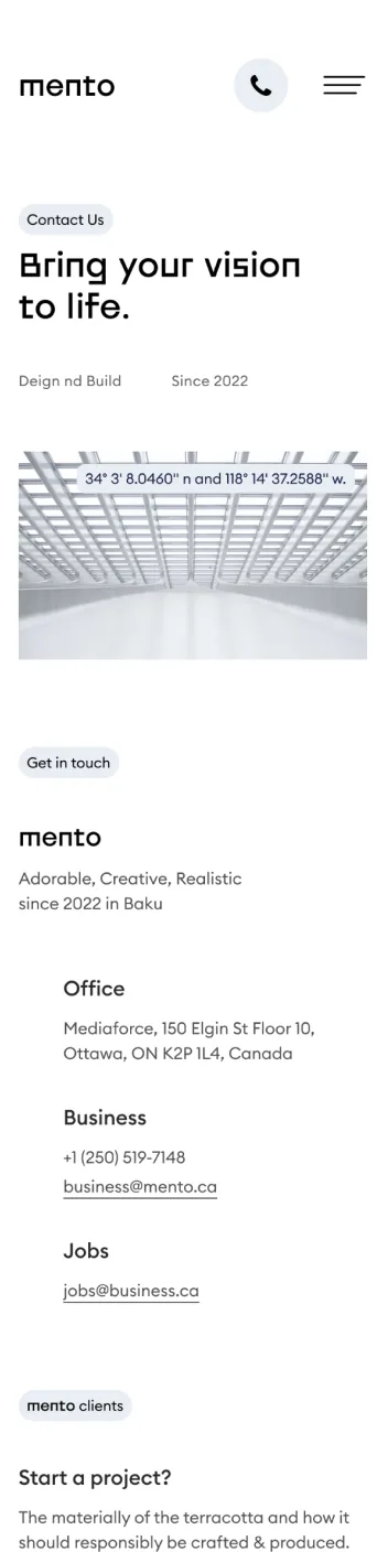
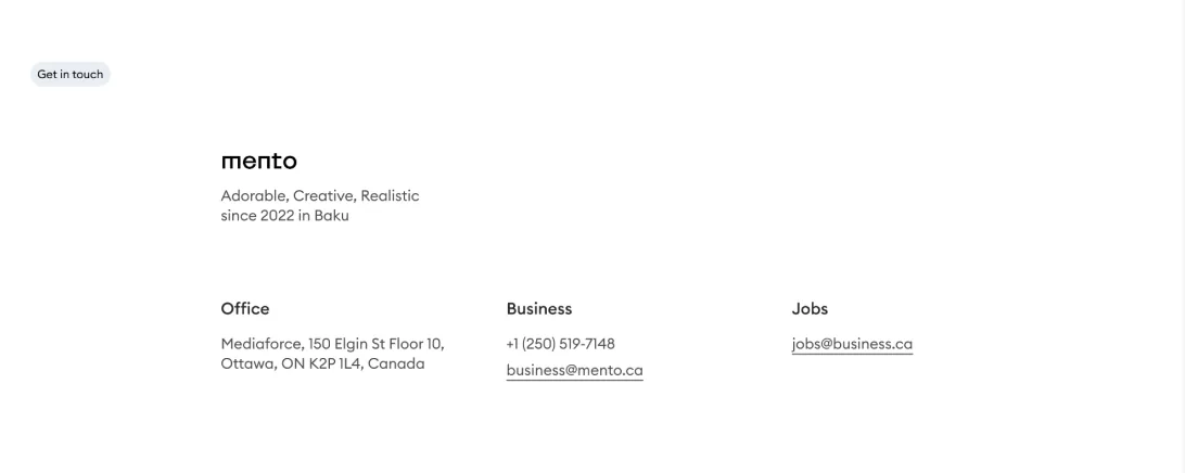
- Contact pages on the sites I reviewed often added long forms and unclear next steps, which loses exactly the visitors who were already convinced and ready to reach out. That's the worst place in the whole site to introduce friction, right at the moment someone has decided to act.
- It's also where the trust-driven nature of the industry showed up most clearly. A visitor ready to discuss a construction project wants to know they're talking to a real, reachable company, not filling in a form that disappears into nothing.
What I Changed
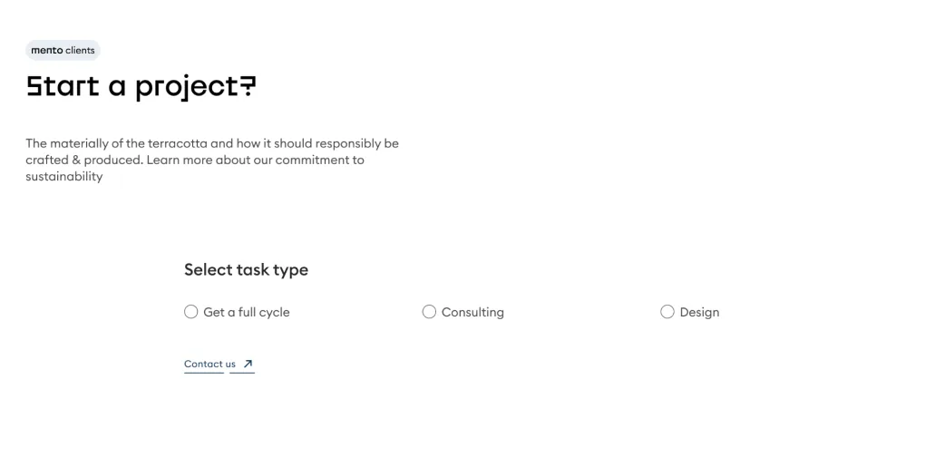
- I kept the contact page short and built around action, a brief "Start a project?" enquiry form with a service type selection, rather than a long list of fields asking for information that could wait for a real conversation. Direct contact details, office information and a map sit alongside it, so a visitor who'd rather call or just knows where the office is can skip the form entirely.
- A separate route for job enquiries kept two very different audiences, potential clients and potential hires, from being funnelled into the same generic form. Each one gets exactly what they came for.
Visual tone


Pain Points
- The sites I reviewed either felt heavy and cluttered or leaned on decoration that added complexity without adding meaning. In an industry where confidence is already low, both of those failure modes work against trust rather than for it.
- That tension was the hardest part of this project to get right, since construction needs to feel solid and serious, but overdo that and a site starts to feel cold and unapproachable instead.
What I Changed
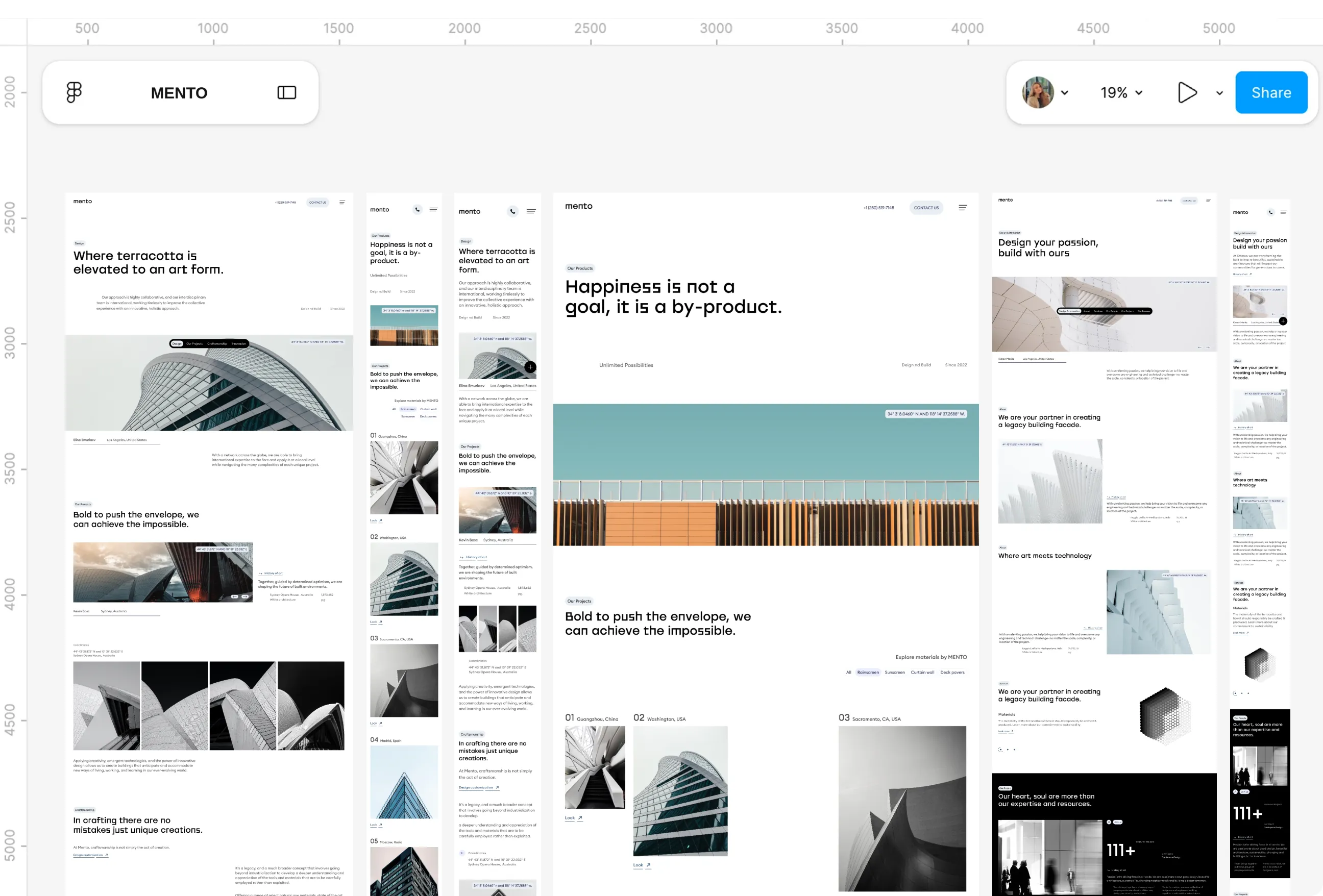
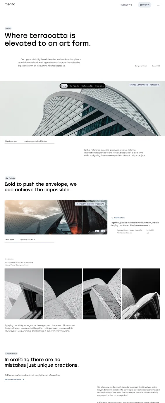
- I chose a restrained monochrome palette with black accents, large architectural photography, generous spacing and a bold geometric typeface, then repeated the same layout patterns across every page so the site feels consistent and predictable rather than surprising. Consistency itself became a trust signal, not just the colours.
- I shaped the direction through moodboards aimed specifically at solid, reliable and professional, three words that kept pulling me back whenever a layout started to feel decorative for its own sake. The visual language came from my own judgement, built to be the strongest entry I could make within the deadline.
Design System
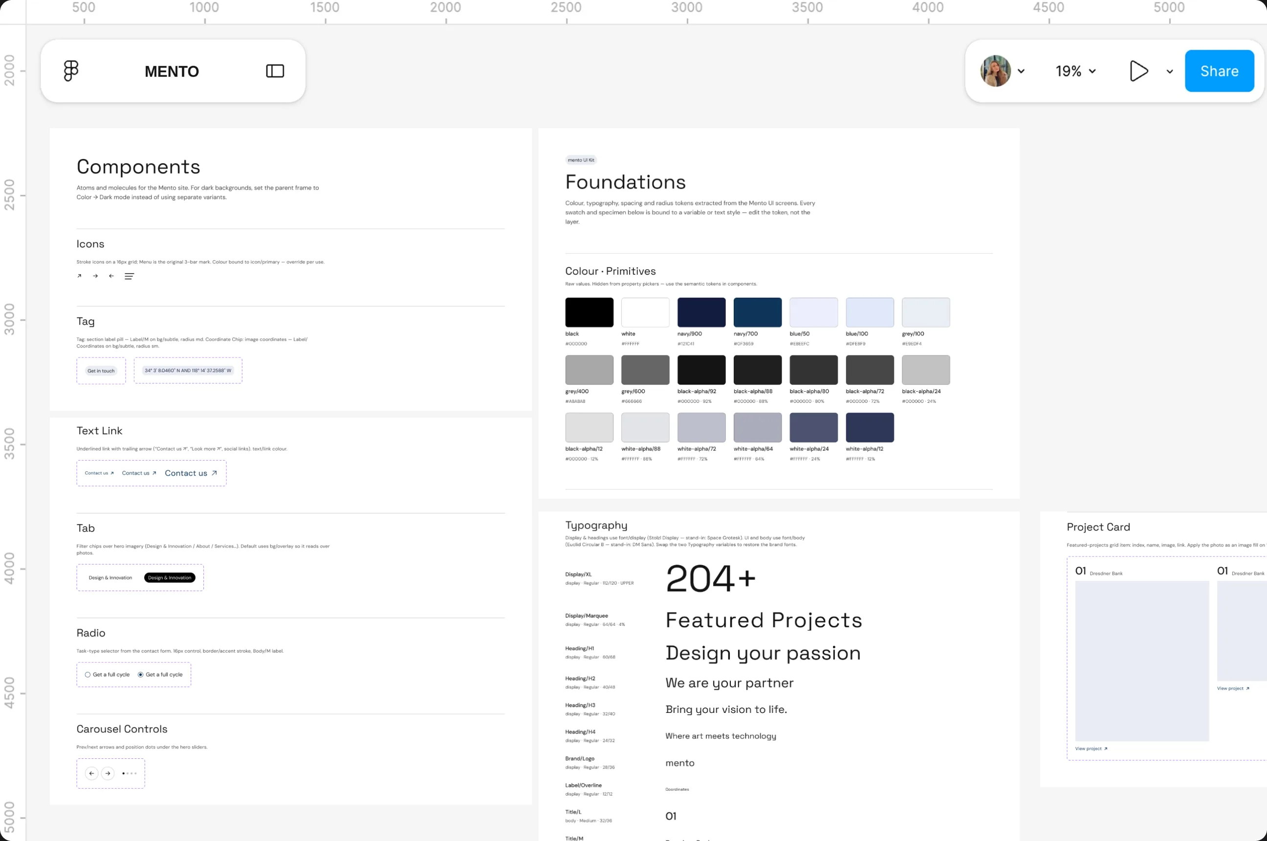
A restrained monochrome palette, bold geometric type and generous spacing, repeated across every page so the site reads as one system, not five separate designs. No component library behind it, just a visual direction built from moodboards and benchmarking.
Role and Working Context
A solo, self-directed project, no client, no brief, no team, built alongside a full-time role in about a month. Every decision, research through visual direction, was mine to make and justify.
-
Discover
Benchmarked construction company websites across local and international markets, from small firms to larger players, looking for recurring structural problems rather than visual inspiration. Reading their Google reviews was the turning point: the issue was less about how sites looked and more about whether a visitor could tell who they were dealing with.
Benchmarked construction sites across markets for structural problems, not inspiration. Reading Google reviews was the turning point: visitors couldn't tell who they were dealing with.
-
Define
Turned the benchmarking into a simplified sitemap, six sections, Homepage, About, Services, Projects, Resources and Contact, each chosen because the stronger sites in the research shared that structure. This became the skeleton every later design decision had to answer to.
Turned the benchmarking into a six-section sitemap, Homepage, About, Services, Projects, Resources and Contact, the skeleton every later decision had to answer to.
-
Design
Designed the homepage as an orientation layer rather than a marketing wall, then carried the same structure through Projects, About and Contact, a numbered grid instead of a gallery, concise positioning instead of narrative blocks, a short action-first enquiry form. A restrained monochrome palette, large architectural photography and a bold geometric typeface tied every page together, chosen mainly from my own design judgement within the deadline.
The homepage became an orientation layer, not a marketing wall, carried through Projects, About and Contact with a numbered grid, a monochrome palette and one bold geometric typeface.
-
Deliver
Delivered as a responsive concept, desktop and mobile versions of the homepage, projects, about and contact pages, submitted to the Azerbaijan Design Award and awarded second place. Since content was placeholder and no user testing was done, delivery here means a finished, judged concept, not a shipped, measured product.
Delivered as a responsive concept for desktop and mobile, submitted to the Azerbaijan Design Award and awarded second place, a finished, judged concept rather than a shipped product.